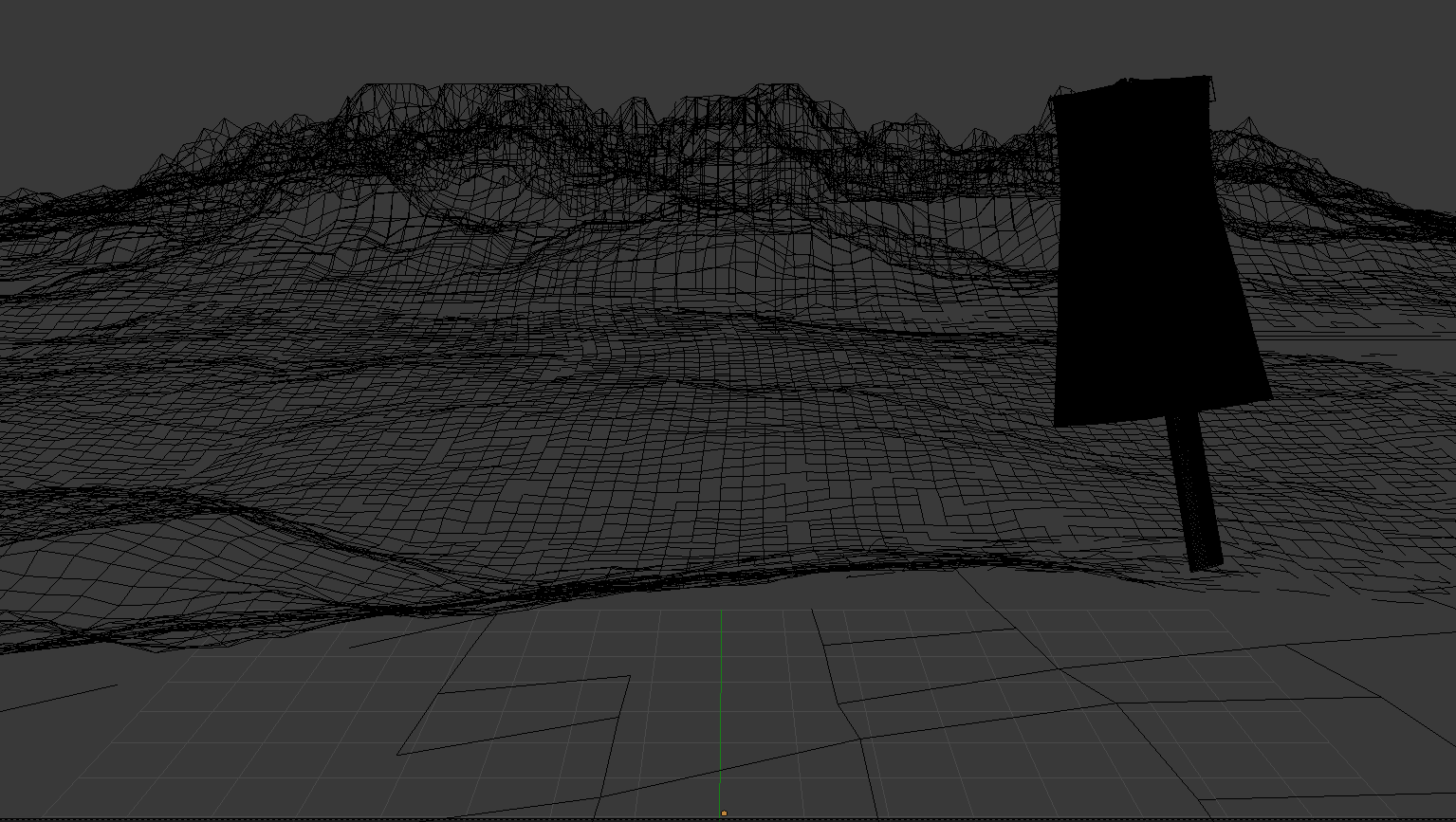
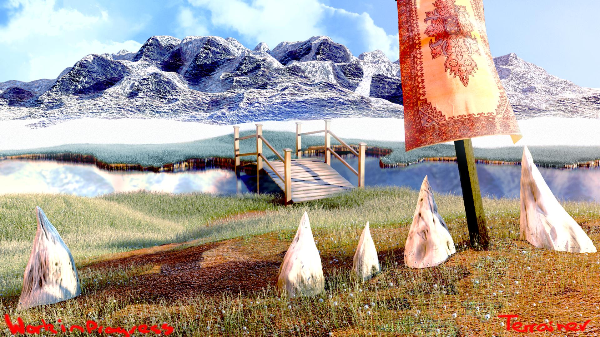
Was thinking like something out of a World of Warcraft cinematic. Anyway, here it is:

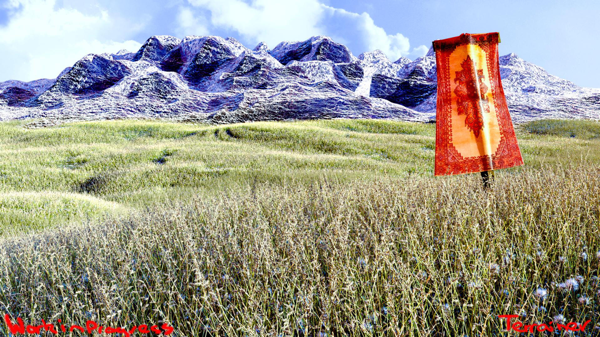
I think it may be a little over-saturated? Also the banner looks a little off to me, but I don’t know why.
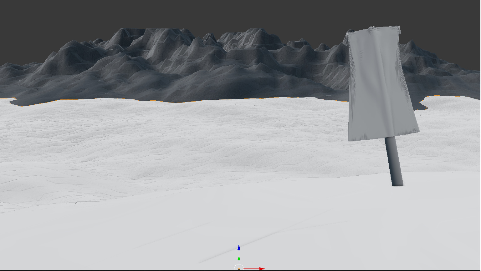
Was thinking like something out of a World of Warcraft cinematic. Anyway, here it is:
I think the biggest part that still needs work is the banner.
To me, the banner looks quite shiny, as it is is made of a more synthetic material, which isn’t in keeping with the whole wow style, I’d tone down the spec/gloss a bit here.
It also seems relatively small compared to the grass, banners are designed to stick out and impress.
I’d try and change how the banner is draped so it looks a bit more dynamic (add a little bit of wind or something, not too much or you’d need to change the grass as well).
Having a banner there on its own seems kind of odd, I think there needs to be a little more man made stuff around to tell a bit of a story.
I thought that maybe I should write what I was thinking because I saw you updating the thing. Not sure what my comments are going to sound like or if they make sense, hopefully they give ideas and actually help in some way but I don’t have time to sugar-coat my thoughts at the moment.
I’m not sure it’s working too well.
Could polish and tweak stuff all day long but what the image is showing? What interests the viewer in the image and what does it tell. The banner is an anomaly in it, why is it in the middle of high grass and what it’s supposed to indicate? There are strange lines in the grass further away, looks as if someone was driving offroad there. Are those hills covered in snow/ice and if so, why snow and ice come all the way down to the field level where things grow nice and green? Which of those makes it a fantasy scene?
The elements are sky, hills, banner and mostly grass.
If they showed those elements in a World of Warcraft cinematic the shot would probably be there to show a epic scale and maybe environment effects (weather, wind, scrap). Otherwise the shot would probably include something else, characters, town, signs, even more dramatic environment effects and so on, so that the viewer keeps interested. In a game all cool environment things are still condensed, there’s no travelling for 80 actual days to go around the world and see a pile of big rocks naturally arranged in a interesting formation. There will be things to look at one after other.
You could make a beautiful landscape without telling much of a story but that too needs something to look at and composition rules apply. The banner indicates there should be some story, a meaning, but the image doesn’t include clues about what that could be. It raises questions but doesn’t give answers or even a hint, so the viewer gets disapointed.
For a pure landscape shot a much larger scale would probably be more interesting which the game cinematic would also show. Mountains, maybe a waterfall and a river, river side, scary weather. Fantasy elements could be anything out of the ordinary, like strange animals, plants growing upside down, etc. How to do that? Matte painting for long distances and 3D modeled high detail for the foreground.
Or go with the story route and make the foreground elements mean something. Signs, banner telling what district it is perhaps, a road/pathway, strange plants or other elements that are in the foreground and you could indicate their presence next to the hills/mountains with just some color. Whatever supports the story you’re trying to tell and don’t forget it’s supposed to be a fantasy scene.
Woah! This is the best ‘Focussed Critique’ I’ve got ever! I’ll be working on this right away.
I am re-rendering now with some added elements (some are kinda placeholder so take it with a grain of salt when I post the image).
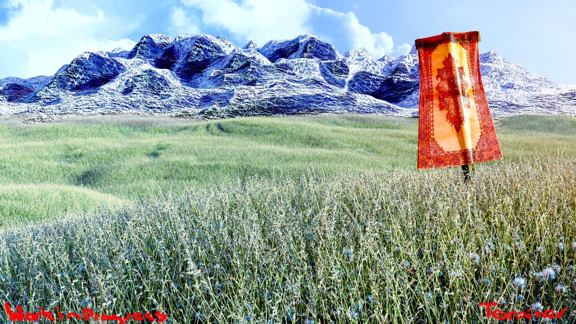
There are more things to look at, more interest points but still not quite sure what all of those elements are. It starts to look like you’re making it more icy which might look great if that’s what you’re heading to and can pull that off. That’s difficult to paint though if you want to show a very big scenery, for Blender parts there would be a tutorial to help https://www.youtube.com/watch?v=WLdnV1YpKR4
River going from side to side isn’t quite used to guide the viewer to anything and it kind of cuts the image to sections and the scale doesn’t quite work. It looks as if it were just few steps to the riverbank and the hills would start as far away from the other side. A river going towards a horizon line and disappearing before it, coming from the mountains because the ice melts, or going through them could lead the viewer to them, if that’s what you want. Or could have a river going mostly from side to side but have a bridge crossing it and then the bridge would work as a guide.
I did a super quick photobash to show a rough scale I meant. It’s not a suggestion for a direction to go for. (And this time I left it so crappy that hopefully no one will mistake it as another iteration in a critique thread like last time.)
I can certainly find room for a bridge. Also, just for the record what is your opinion on the quality of the river, spikes and path? Not as in guiding lines and stuff, just general quality
Texture detail is probably good enough for foreground wood, and ground. Banner could use a specular and bump texture. Everything is so blown out still, hard to say more. The banner might look more like it belongs if the wind was blowing it but then the river would need waves too. Riverbank is quite clean cut which could be a style thing but otherwise it could be more random and there could be long grass and other plants in the river.
Making an interesting image is not just one thing. The image might be about just one idea but the rest of it is then built and organized to support what was planned. It’s the same for photography and shooting footage for a film. 3D guys tend to like their hard work they put in the models that it’s hard to separate storytelling from the assets used to do that. Not a problem for moviemakers, they drop months and sometimes years of hard work put into assets if they don’t work. Not that there’s any quality issues or anything, just won’t be used because they don’t make sense in the movie.
Thanks!
I use Blender + Image Editor (GIMP or Photoshop works)
Equal parts of post-processing were done in the compositor and external image editor.
Next render:
[ATTACH=CONFIG]377470[/ATTACH]
Oops.
Sorry for the double post.
Not sure how to critique because I’m not sure if my previous critique was helping or hurting but I’ll try.
To me it’s too saturated and blown out. The whites are practically full white in the background, which is not good for readability. Should use those sparingly on really harsh highlights. Same with the other end of the scale, should have close to full black only where the light is not getting light almost at all and/or where the contrast makes the shadows appear darker to the eye/camera than they actually are.
You didn’t mention if there is a story or what you’re going for with the background elements and the foreground spikes. I can’t identify or relate to those. If they’re supposed to be ice, it doesn’t look very believable because of material/textures and because there is ice with green grass. Camera level ground is clear of ice and snow so there shouldn’t be any at the level on the other side of the river. Ice/snow covered mountains would only be visible on a larger scale, where big mountains much further back get that on the top parts.
The idea might be to get that ice coming through the ground as a fantasy element but it’s not working. It’s really hard to pull off so that it still looks believable.
So the scale looks off. And because the top half of the background is so blown out and strange, in your face style, my eyes rest when it’s taken out and just filled with black. Could use aerial perspective to get the background elements pushed back. With that, contrast and saturation decreases. When the seen distance starts to get really big, colors start visibly shift towards the sky color because there is more air to look at than there is reflected light getting trough off the far away surfaces.
The image is visually a bit unbalanced to the right with or without the background. Isolated spike creating contrast on the left with water reflections on the left don’t quite win the battle against many spikes and a red banner on the right.