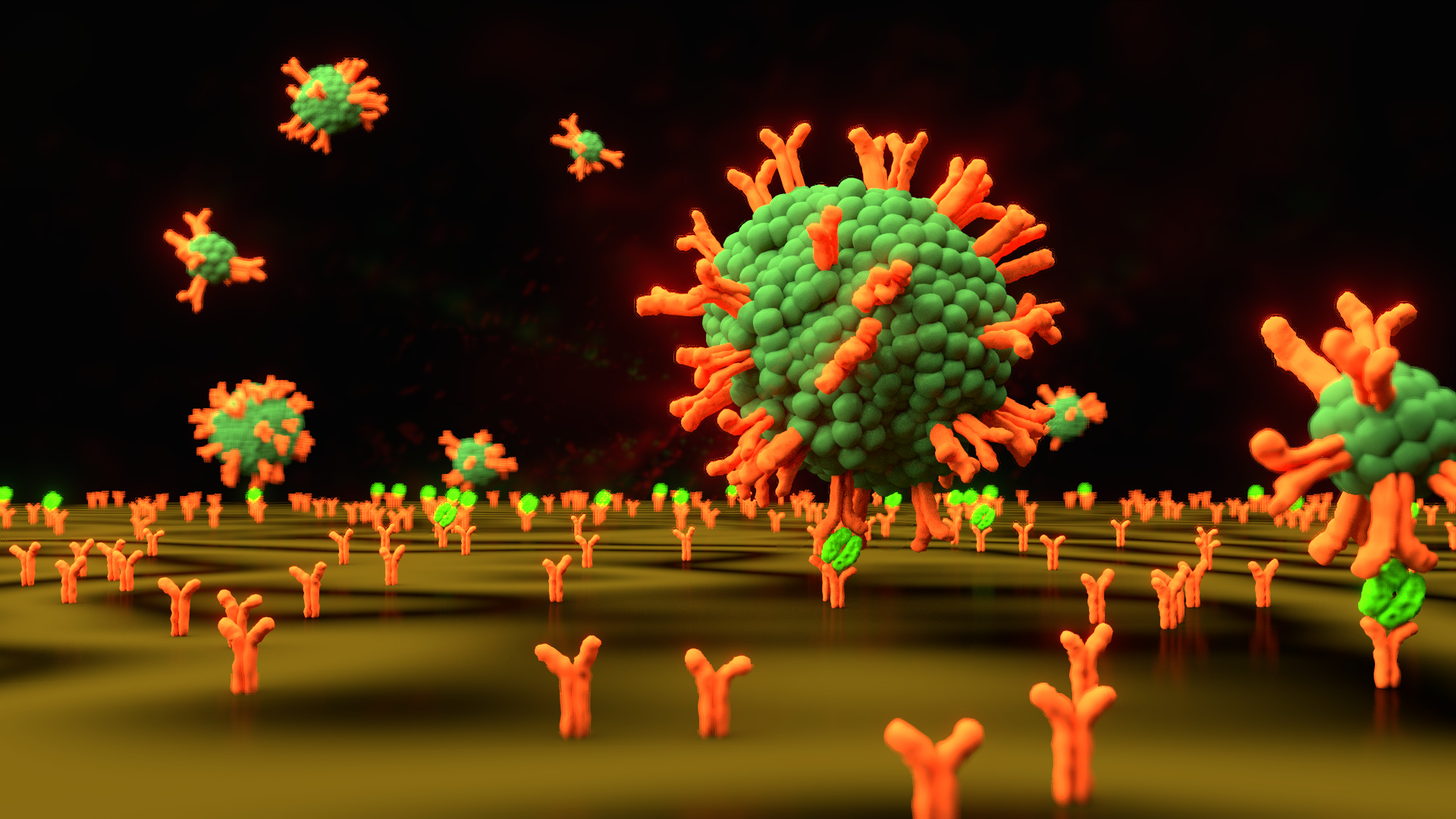
Hello Blender world. I picked up blender about a month ago for use in 3D printing as well as general CGI. Here is a graphic I put together for a research project of mine. This image shows immunovesicles; imagine them as synthetic, empty cells (dull green) with antibodies dotting the surface (orange). The same antibodies are bound to the gold surface of an instrument, and then the target protein (bright green). I’d like any and all critiques you have: color palette, composition, lighting, etc. I also have a few specific questions:
DOF was added in the compositor. It seems to have added a strange outline to my objects. That may also be the “fog glow” I added, but I believe it’s the DOF. Does using the DOF camera settings work better than adding it in post?
I have about four or so “seed” antibodies for the plane surface, which are added as a particle system. Is there a way for the particle system to randomize the orientation of the antibodies around a given axis? Right now the antibodies are all “facing” the camera, which seems a little unnatural.
I added displacement noise to the surfaces of the vesicles since I hate when people show fluidic biological objects as perfectly spherical. Is it too much, too distracting?
I went for a “golden ratio”-esque curve to place the background IVs. Is it too blatant? I worried that having too many IVs would make the image too busy.
Probably depends on the style and what the image is for. As a artistic illustration of the thing for general mass there could be some things to consider.
People might not expect sharp edges and sharp textures on organic things. Irregular, rounded, translucent, subsurface scattering could be things that make them more believable. Hard and manmade stuff can look rough. Another thing people might not expect is a perfect horizon line.
Since it’s so small scale, the surroundings can look very big. Might be able to use space/sci-fi related reference material to find inspiration.
I think this looks good so far! The bright colors to differentiate things reminds me of something you might see in a biology text book. I would suggest working on the gold surface a little more… I know it’s an instrument of some sort but nothing is ever that smooth when you are looking at it at such microscopic levels, even if it is made of a metal of some sort.
I concur with @JA12, you should kick up the DOF (makes sense of microscopic imagery, just look at macro photography) and probably randomize the particle rotation a bit.
overall though, looks well put together and quite professional.
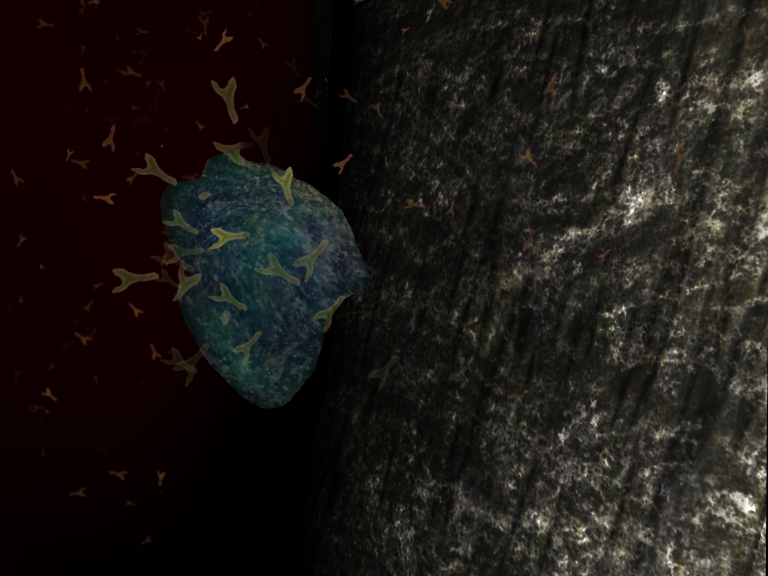
Thanks for the feedback! JA12 - is this the kind of translucent glow you were thinking of? (Not my image - from a Google search) Is subsurf scattering the best way to achieve that?
I’ll try ramping up the DOF, though I’m cautious about that since so many people seem to think it’s an overused effect. I’ll also put some grooves or some noisy deformation onto the gold surface. “Biology textbook” is roughly what I was aiming for. This will likely be used as a “graphical abstract” - essentially I want it to be an attractive image that a scientist in the field can glance at and intuit what we’re doing, and a layperson can “see” what we’re doing with just a little explanation. I’ll hopefully be putting out more images along these lines as time goes on.
Tried to list few features that make soft organic things look like soft and organic.
By translucency I meant partially transparent, such as
Subsurface scattering scatters light inside. It has an effect of showing light through solid, changing color and making surface texture soft.
Might not need much depth of field, depends on the look you’re going for. I went for deep water look in my crude example but DOF is an easy way to make something look tiny though, like in tilt shift photography.
the effect in the image you linked is achieved by converting the angle of the surface relative to the camera to a color value, in this case with straight-on being dark and glancing angles being light green. It’s pretty simple to achieve a similar effect; add an input>layer weight node, run it into a converter>color ramp node, set the colors you like in the gradient, and then run it into your diffuse shader.