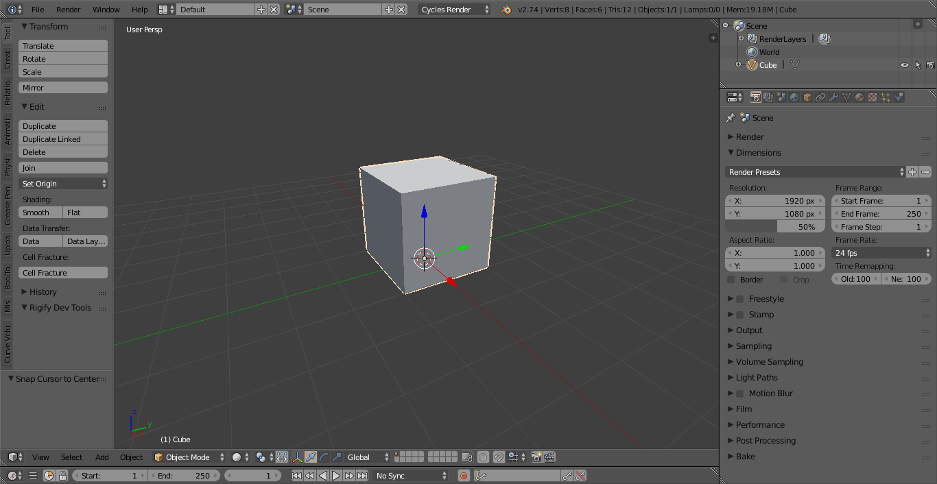
I decided to release my theme to the public after using it for some time. I created this theme to resemble the original Blender theme but darkened and flattened. I also took elements from the Graph theme. As I liked the style of it, but found it too high contrast in some areas.
If you have any suggestions please tell me! As I’m always looking for ways to improve this theme.
Nice theme, I like it bcause it’s close to the original one, but less eye-catching. It is just a bit too much desaturated, and I changed the yellowish color to a blue one, for my personnal usage.
Thanks !
I hope the color of marker color can keep the origin color,for example the selection cube can keep orange outline as same as origin, it’s good for the old user, than the tab with small black triangle,I hope that can a little different with unfold panel, much more catch the eye than same color, just my suggest, sorry for my bad english, thx
hi @Johnson-Martin its a great theme. Is it possible for u to make a classic white theme in ur style. That will be great really try it so often to make my own themes but i think im to stupid for it ^^
VERY Thanks YOUR THEME, the node editer is curve?I haven’t donwnload it, if possible,I hope the noodles is the curve, and not straight, the default noodles with curve is look good, but the" flatty light" theme in v2.74 default with straight noodles,some little not look good,sorry my bad english
I’ve now released version 1.1 of the theme. It’s mostly minor updates. I changed the startup file and some colors. Such as the selected object color is now white.

 - Reyn