Hello everyone. I’ve been working on this Image for quite a while now, for the Blender Guru Competition Another Planet. I still have a bunch of stuff to change, but I would really appreciate if I could get some serious critics in here. Please comment what you guys think could be better, what looks bad or what could be changed. I am open to any ideas and all feedback is really appreciated.
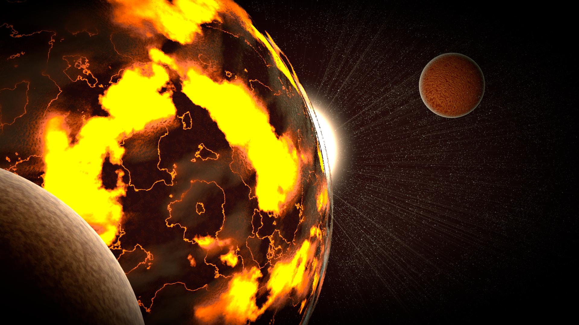
This is my 14th version, and the whole scene is to scale except for the stars in the background (Camera clipping wouldn’t allow for me to do real sized stars at a acceptable distance)
Here are the Scale references
The main planet is 12.365 KM from side to side
The sun is 1163.418 km from side to side
The main planet is about 14000.000 Km away from the sun.
The Moon close to the planet (the one on the Left) is 3.222 Km from side to side
The other Moon (The one on the Right) is 2.423 Km from side to side
Please comment and critic it harshly. I will update the planet with modifications and tweaks as much as I can.
Thanks in advance
The competition is close i think now.
I don’t like so much this work.
I think need some job on lighting & texturing here.
The camera is good and you can take a good render but need much work on it.
Use matte painting for a space background.
On black background set the lighting to suggestive scene, then work on (search some tutorials) on the texturing of the planets.
Need to “build” a suggestive space lighting here, is very important.
Thank you GIKKIO! The Conpetition is still open, it ends at 8th of April. I do want to change the background but I don’t know how to do a matte painting, but I’ll look it up and try something better. I’m not sure of what you mean by setting the lighting to suggestive scene, do you mean to focus on the main planet? I agree with you on the planet texturing, and I’ll see if I can get a better result by painting a texture or with a procedural texture. I’ll post an updated version maybe on Friday or Saturday, if I have time. Thank you so much for your feedback!!!
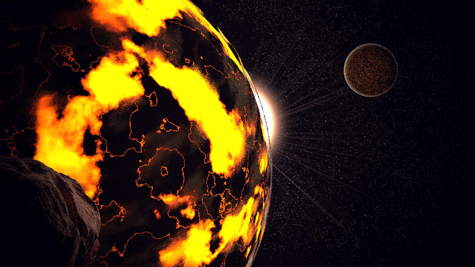
Thank you!! I’m trying to make the left moon into a asteroid (or meteor, whichever is the one still in space) so it will add a bit of story and it still will be physically possible. The main planet was not to be a newly formed planet, but rather a planet with large lave pools, or seas, but That does make sense, and I’ll try to make the moon have a bit more gas and improve its texturing. The moon also could have been another space body that got “trapped” in the main planets gravity field and then because a moon over time, but regardless I’ll work a lot more on it, maybe even make it a lot darker as to not bring much attention to itself. Here is my latest version, but it is at a very very low amount of samples, 10 only.
I’ll add the debris around the moon and maybe some around the planet. Ill try to make the moon more of a gas ball, and defiantly improve the texturing of the asteroid. I’m still figuring out how to add motion blur to it
People commenting here are spending too much time talking about the textures. Yes, the textures need work, but there are bigger problems that should be addressed first.
WHAT IS GOING ON!!! Seriously, what is this supposed to be? I don’t want to sound too harsh, but there really isn’t any sort of story going on here. Why did you pick these planets, what is interesting about them? There are the kind of things that are going to be judged by.
Colors: I’m not really seeing any good fundamental colors here. I’m seeing way too many saturated colors, and they don’t really mix right. Here’s a tutorial that you should watch on it http://www.blenderguru.com/tutorials/understanding-colors/.
Ok, so you have this highly saturated orange planet, and then you have a really small planet on the other side of the screen. The planet automatically grabs all the attention, but there isn’t anything to balance it out on the other side, what does this mean? You need better composition. Here’s a good video on it: http://www.blenderguru.com/tutorials/understanding-composition/.
Scale, how can I tell what the scale of these objects are? The big one in the front could be the size of a ping pong ball and the one in the back could be the size of a planet? How am I supposed to tell. There’s no sense of scale or distance. How do you fix it? Make sure you have a proper foreground and background. This is part of composition.
Lighting/Textures: Ok, now I’m comfortable addressing it. You textures on the big planet don’t make much sense. What are they supposed to be? Is it a lava planet? If so, there should probably be some modifications to make it look like lava.
I hope this is helpful. I know I was a bit harsh there, but you asked for it, plus, the image needs a bit of work.
Thank you so much TARDIS Maker!! I have watched already both the tutorials more than once, and I tried my best to apply them. I agree that I don’t have a story, but i wanted to create a beautifull image, not necessarily a meaningful one, which I know was probably a mistake, and I did learn from it. The scale I really don’t know how to tell the viewers. It is a space scene so the scale is really big. The sun on the background could be an indicator, but I agree that I should add something else to help. The composition I tried to make the viewer focus on the main planet but I added a moon to try to balance the scene and add some visual interest, but I think that I could have made a better one. The colors I tried to make most of it redish, yellowish and orangish, with a alugar hint of blue in the background since it Goes well with orange. The main planet is supposed to be rock and lava, and I’ll try to improve it if it doesn’t come out like that. I don’t have time to improve on this image as much as I wish, but I sure did learn a lot from the experience. Thank you for your critic, it helped indeed, and I will try to put to work better what I already know.
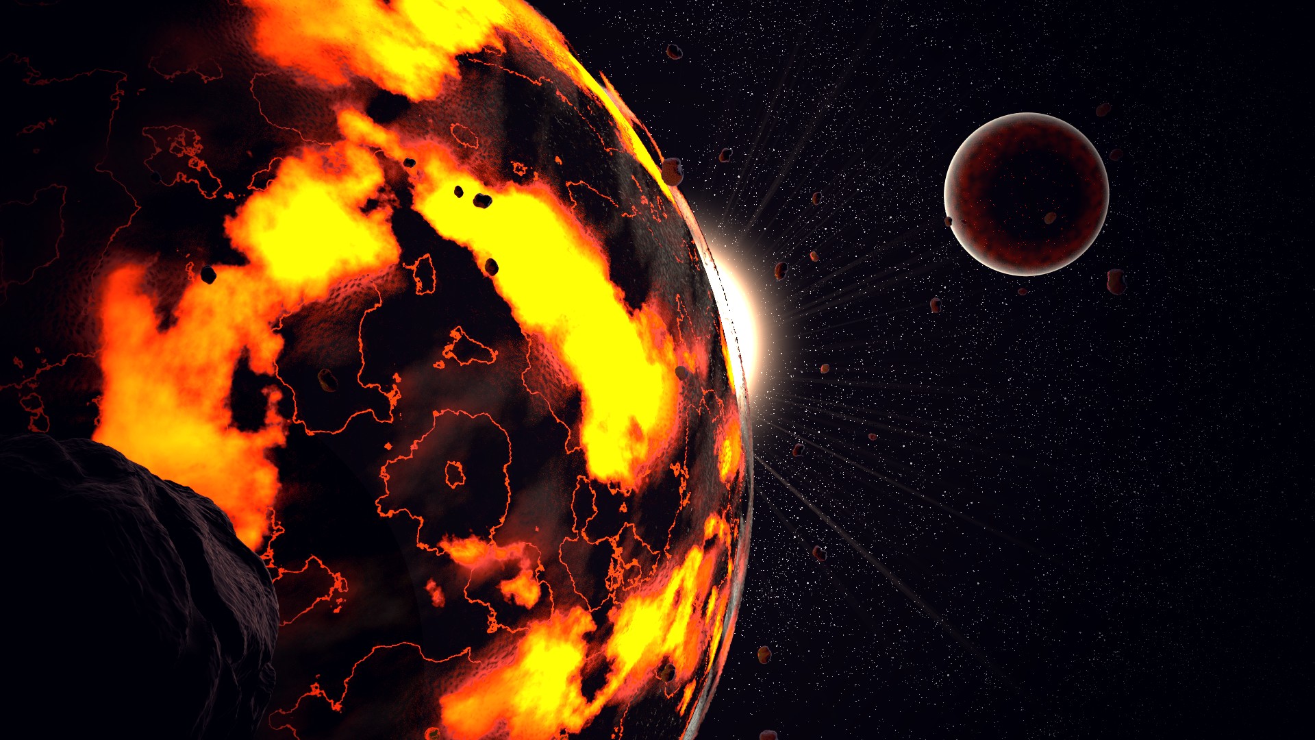
This is my final version I’m gonna call done. I just uploaded to the competition which ends now, (literally, 25 seconds). It says the image was received but I cant see it in the entries yet, I hope it did actually upload. Anyways, this is the final version
If anyone has any comments I appreciate, but I will not be working on this image for any longer, so the feedback I get I will only apply in my next project, just so you know. Thank you all for you awesome critics and feedback, I really appreciate it.
EDIT: The final version was rendered in 1000 samples and took 8:23 hours to render
Yeah, it’s usually like that. I posted my Christmas comp entry two days early, and it show up until the results where posted. I wouldn’t be worried about it not getting in. Good luck!
Thank you TARDIS, my image did actually show up in the competition, after it ended, so that was a relief…anyways, I’m just gonna say this once more, and then I’ll try to post this image at the finished section and some over places…Thanks everyone for your feedback!!!
Thank You for your appreciation JDaniels!! The competition is closed, but I do wanna start another personal project, and if I do, I’ll probably post it here, this is probably the most useful parts of the forum