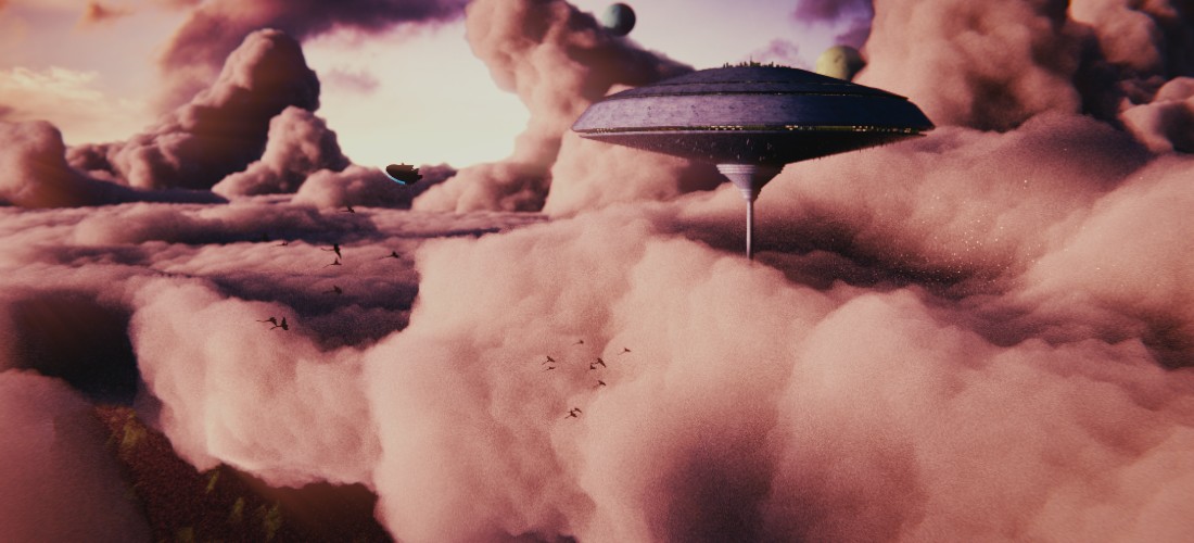
Hey guys! I’ve been working on my entry for BlenderGuru’s “Another Planet” competition, I would love your feedback, but be brutal. I’m looking for honest feedback. Although, ignore the noise, it is just a test render. Thanks!
I think it’s an interesting aproch.
The weak link in my opinion are the two planet in the sky that dont looks like planets and are not very well placed for readability and probably too small.
On second tought readability in general may be the first issue as there is mostly nothing that isen’t mixed with an edge of the clouds.
To me, those clouds can look very solid and pointy in some areas. I feel maybe they aren’t ‘fluffy’ enough? Especially compared to the clouds in the background of your image. I do very much like the warm colours though. Maybe your clouds need some smoothing (or perhaps they are too low poly)?
@Androol I agree about the planets, they don’t add anything to the image. I think I’ll just remove them.
@terrainer I agree, the clouds could still use some work. I’ll see if I can fix them.
Thanks guys!
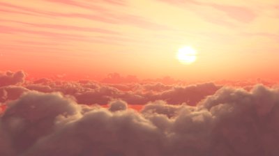
So I took what you guys said and changed some things. I removed the planets and reworked the front cloud a bit. Is it an improvement? Worse?

Thanks!
I think the cloud are better and that you didn’t get what I was trying to say about readibility. I’m not sure if removing the planet was the good way to go about them but it may be. You already have a lot of things to look at in the image so you may want to get what’s left better instead of loosing time on the planet.
I’ll try to explain the readability problem better. The little ship that look like the falcon milenium, his upper line is continuing the line made by the cloud behind him. That make it not very distince from the clouds. Especialy as it’s a dark ship on dark clouds so the lines are making the readability bad and the low contrast he as compared to the cloud behind him have the same effect.
There is some similar probleme with the biger ship, not as bad and the ship bein hudge it’s not as important, but still it will be more readable if his lighter part where over dark clouds and his dark part over light clouds. The left limit of the ship not mixed with another cloud line will help too.
I’d say have some more colour variants on the clouds.
I’d say you’re off to a great start. The main issue with your image is the clouds… Right now they look a lot like cotton candy.
I think that is due to the fact that the cloud colors are pretty even. It would make sense to add more variation there, possibly including more shadowing from other clouds in the image. I think light would pass through the clouds to make some deeper purples and reds, rather than just making the clouds darker in general.
Also, the edges should kind of wisp away. While these are clearly thick clouds, clouds never have such hard edges.
Take a look at these reference photos:
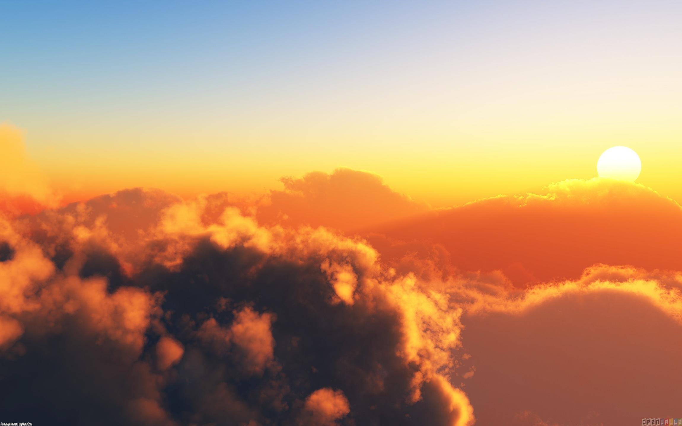
As you can see, even though these are big fluffy clouds they still have wispy edges.
Great work so far though, I love Cloud City!! I think it is one of the most beautiful environments from the Star Wars universe and you are doing a good job of catching that magic in your image.
Can’t wait to see what you produce!
Thank you guys for all of your comments! This is the finished entry:

I could have worked on the clouds forever, but I had a deadline. Thanks for all the feedback!
Looks great! I’m glad you moved the Falcon, that helps pull the image together quite well.