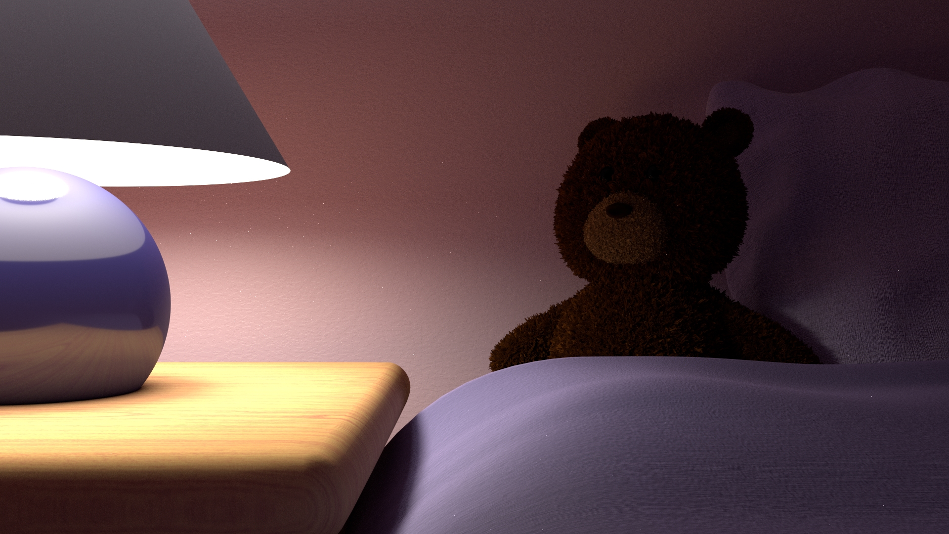
I just became the father of a beautifull little girl.
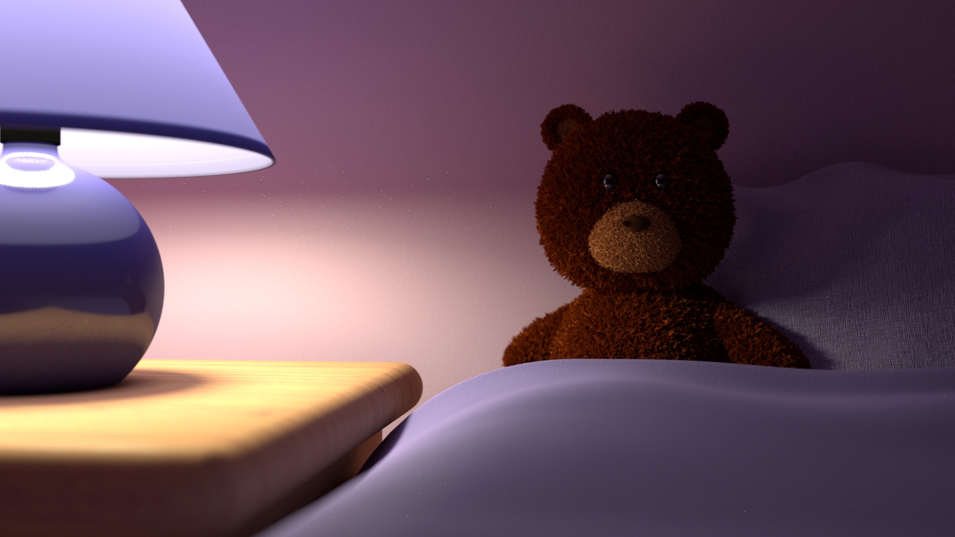
And during the pregnancy of my wife, I got this idea of a reassuring/soothing teddy bear in a peaceful place.
“No matter what happens, there is always someone waiting for you”
Objectives were : photorealism, aesthetic, story telling, emotion…
On modeling side, I still plan to add more details to the inside of the lamp, add an object on the table.
But my main concern here is the materials to reach photorealism.
I really need your help for materials/textures.
And every comment on photorealism, aesthetic, story telling, emotion… are more than welcome!
Storyteling wise, I think the face of the bear must be more in the light as he will be more reasuring this way.
Right now with this lighting, it’s hard to say if he has eyes well looking carefuly we can distinguish the right one (on the left). Giving him more colored and lighter eyes may help with this as it will pop out more on the dark fur. A lighter fur may have the same efect the other way If you prefere to keep the dark eyes. Adding a lot of glossy on the eye material may help too.
Let me first say that I really like your materials. The table in particular I really like! But one thing I will mention is the lighting. It seems like you want the bear to be the focal point of the picture, yet he is very dimly lit to the point where I can barely make out detail at all.
That is what I would say needs to be improved. Other than that, good job and keep creating!
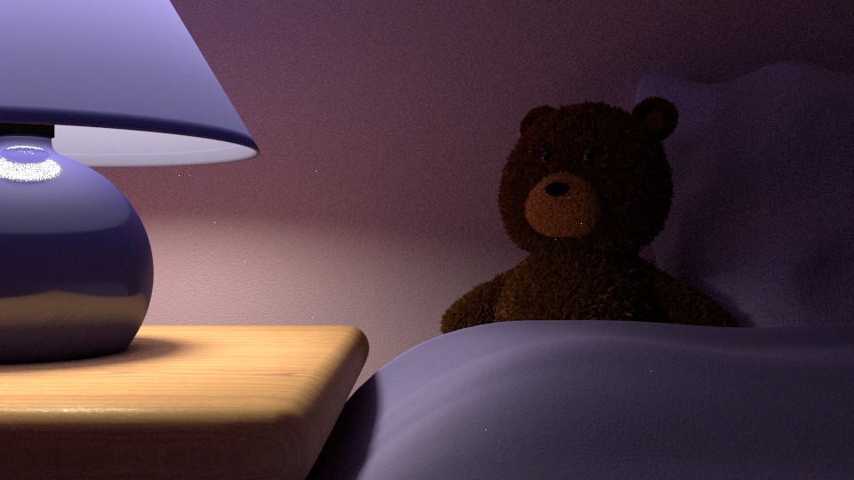
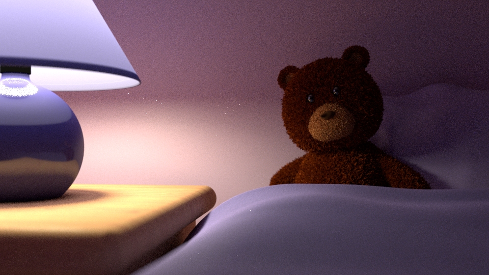
The face of the bear is far more readable now and the cuteness of your scene improved. I always wonder if the input I give in this forum are right or not. There is allways a gap betwin thinking something will be better done a way and how it end up once the theory is put to practice and I m too lasy to try my idea by postworking somone else image to be sure.
Depending if the nose is supposed to be of the same material than the eyes, you may want to add glossy on it too. It won’t solve any readability issue here as the nose show well, but if you wanted it made of plastic like the eyes it will make sens. Of course it make no sens if you want it to be made of fabric. It depend how it was modeled too.
No idea if you need to lighten the bear fur more. Now we see the eyes clearly enought I think and the chocolate brown make sens for a stuffed bear. You have to make this call or wait for somone more talented than me. I can’t tell this kind of thing without making test for my own work and probably make the bad decision in the end most of the time. O_o
Edit: I keep thinking geting the light a little higher will be better but it may not be that important now that the eyes are visible or I can just be wrong.
Thank you Androol!
You gave me helpful and right advices!
Thanks also Ethiczz!
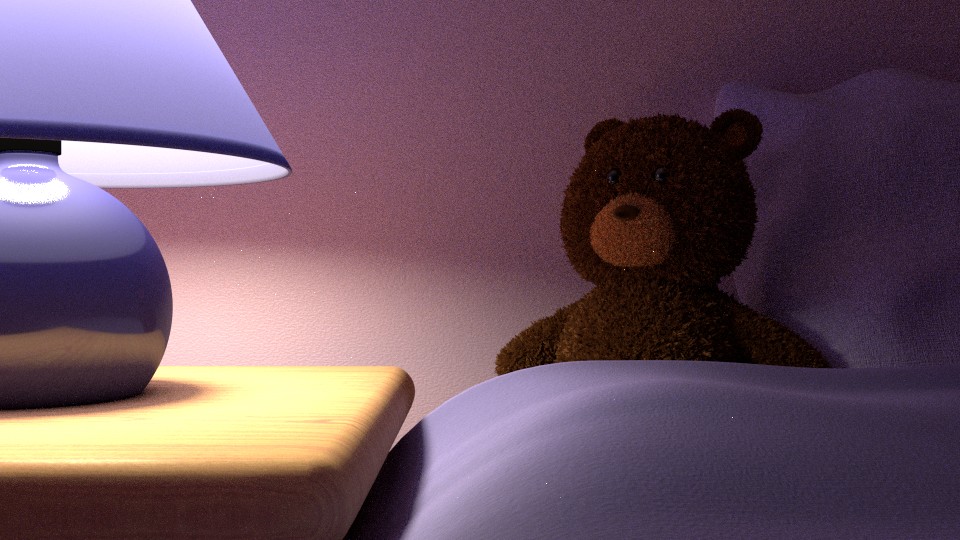
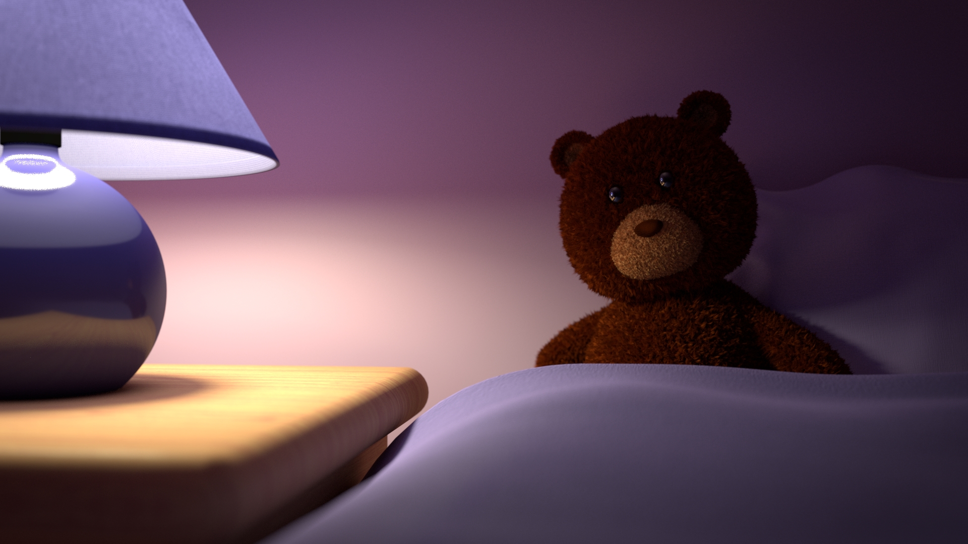
Now… how to make more focus on teddy’s head…
maybe small depth of field with focus on it…
A possibility would be to put more light (what I did in the following picture)
For the nose, I wanted to have a fur one, not a plastic one (I changed the color of it to align with the one of the fur)
Pushing the light dont realy help getting the eyes to the bear. If that how you interpreted what I meant by higher light it wasent. I meant higher in space on z axis. ( now I see it may be anderstanded the wrong way)
There is many things that atract the eyes in an image.
The more lightened place are atractive but pushing the light made everything more lightened so it dont change a lot. Geting the light higher to have the bear head more lightened without pushing the light everywere else may be a better option. It was more for mood and story telling purpose that I sugested it though.
You are right with the DOF as the eyes naturaly go to the part of the image that have clearer detail.
Using the perspective lines is also an option, having the vanishing point behind the bear for exemple may help attract atention on him.
Satured color are more atractive for the eye too but after the lamp I think your bear is already one of the more saturated thing in the scene.
Preacher of the rule of the third may say having your bear on a crossing of third line is enought, I’m agnostic about this, it’s mainly a convenient way to use diagonals and avoid to be attacked by the folower of the third.
I’m probably forgeting other way and I surely don’t know them all, but you dont have to use them all at once. DOF by himself can do it for exemple so you may be right to go for it.
I pushed the light to lighten a bit the whole scene also. I though having the bear clearer would help to focus on him… But well apparently not enough…
I did not put the lamp higher on z axe (but I keep this in mind), I put the light in the lamp lower, this should have a bit the same effect.
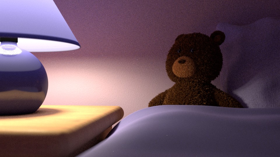
Thanks for remembering me the perspective lines, I should have though to this, I tried this on the following picture by moving the camera.
I tried also the DOF (and as you saw, I used the rule of thirds).
Well I think its good if I reminded you the use of vanishing point as a trick to get the eye where you want it. But when I saw your result I realised is didn’t worked at all as I planed it. Doing that you actualy created a second vanishing point on the left and yes it give some direction for the eyes to go to the bear head, but at the same time it created a movment to the lamp as well. I can’t decide if it ruin the effect as it may actualy strengten the tendency to look at the light more or if it’s even more brillant, thx to serendipity, because it make the eye go from one and another and return in a loop. The fact that your DOF is subtle and eficient dont help me to decide either.
The DOF was a good idea that I m sure of it.
I forgot one trick in my bag. Hue can help make things pop too as warm color are interpreted by the eyes as forgroundy and cold ones as backgroundy but the lamp bein bluish and the bear a warm brown you already have that anyway.
I dont think I can help you a lot more as I dont see any obviouse flow left. I can argue that bein the same color the cushion and the sheet must have the same bumpy fect of the fabric but that may be a choice you may want them of diferent fabric. Especialy as bump is tricky on surface perpendicular to the camera you allways miss some far from the camera or get to much on close up. I wonder if there is a way to make it good with a dept node but never seen any mention of that so I guess not. the DOf may solve this though. but I guess you just choosed to get fiferent fabric on both.
You may want to reorient the bear head to look at the camera. It will change the storiteling thoug as now the bear is waiting watching at an imaginary door, if he looks at the camera it will be more like the watcher of your scene is the one the bear waited and he look at you now that you are here.
I like it as it is now personaly, it give a mixed feeling betwin the idea that, as the title stat, there is always someone waiting for you, it’s chearing, but in an other angle the bear is waiting alone and it’s sad. It had another layer of contrast to the image. That said I read people stating that having eye contact to the camera strenghen an image. I think it tell diferent story and you have to choose the one your telling.
I launched a render during the night of my previous post (1920x1080 and 2000 samples)
I don’t have time now to take your comments in account, I’ll have a look as soon as possible
Thanks
Very cool render.
I still didnt see the tutorial you counceled me yesterday, as it was too late too start somthing at the moment and now I just woke up.
Androol, thanks again for all your comments!
You’ll see that tutorial is really nice and interesting (hope it will help you).
I will move a bit the head and arms of the bear making him more “alive”. (it was planned but not yet done)
I will increase a bit the DOF.
And maybe, saturate more the color of the bear (a bit more red)
If still needed, I’ll review the way of using perspective lines.
Yes I still have to work on the texture of the cushion, the cover and also the lampshade.
Nice idea and concept. My take on this would be we are looking at a scene of the bear waiting in bed for his/her little person to snuggle. In the real world we would be doing this through the viewpoint of an open door with presumably a light behind us. So rather than fight the colour of your lamp shade (pretty though it is) I would use the lamp as a warmer to the bedside cabinet and light the main scene ( bead and and Ted) through the door we are looking through. This could create a nice slice of light and shadow to highlight Ted and leave the table lamp is just providing some fill.
I think that now the focal point is on the bear! Hope you agree, if not tell me.
Now my next focus is on the texture (cushion, the cover and also the lampshade).
I prefered the position of the head of the bear before but I already said why befor you turned him, it depend on the storyteling angle you choose if you choose too keep this eye contact angle you may want to tilt the head a bit one side or the other (with keeping the eyes in the direction on the camera) it will make the bear look cuter.
The hoter brown is not a bad idea, it look more toyish and attract more atention to the bear.
It’s an old tricks to get a cute effect. I think it come from ethology that discovered that, because baby have trouble to maintain their neck straight, human are programed to think this bearing is cute.
I’m happy if it helped you.
I do critiques for my own improvment. Iit’s a great tool to think on a lot more images, often better than my own, and improve my own skill in the process. I can do like 30 critiques, and sometime event see the result when the artist think they are of some value, in the time I do one of my own project So I think its efficient as a self learning exercise. That plus the fact that I like the mental gymnastic it provide.
So I’ll probably have more reason to thx you.