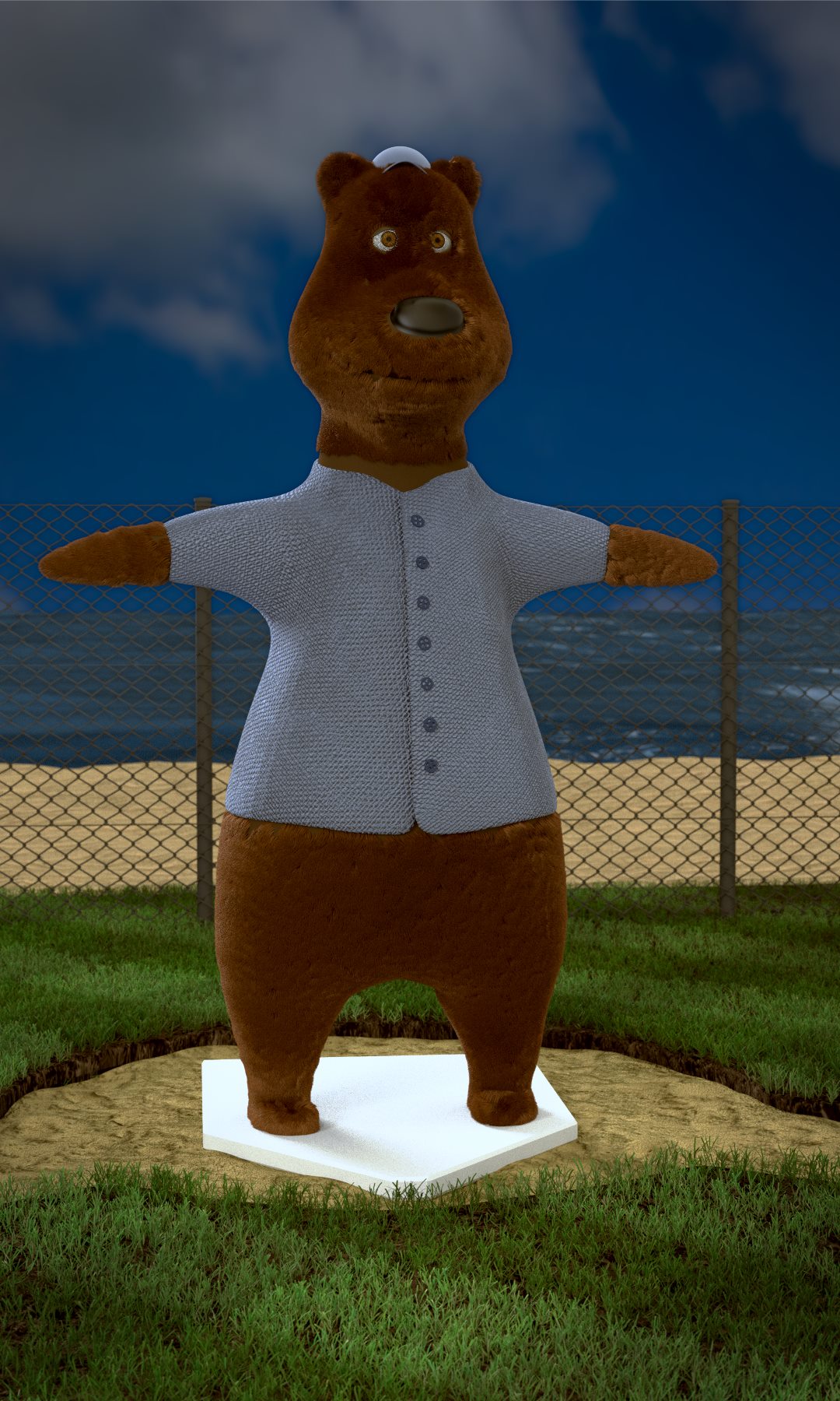
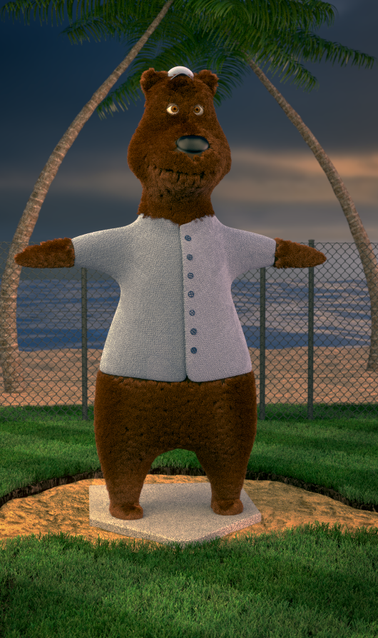
So I won the state competition for computer modeling for Business Professionals of America and will be competing in the national one in may. The topic is to create a baseball mascot. The only problem is I am the only one in my class who knows how to use Blender and no one really knows how to help tell me where to improve on stuff because of that so that is why I am starting this thread. I already got a near perfect technical score for the state level and am aiming for improving it for this level. This is what I have so far for the redone image (which might be the best quality because of downloading it from facebook):
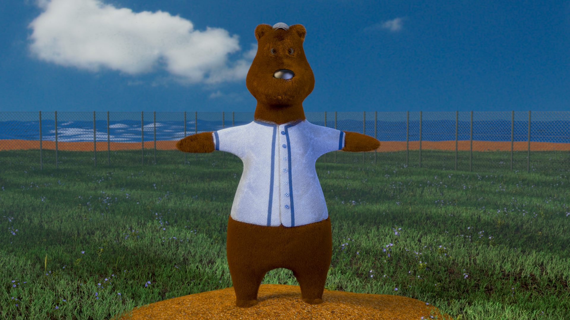
I know there are some places that need to be improved like the sand looks a bit off, the shaders for the shirt need to be improved, the fence probably should be scaled up, it doesn’t contain anything related to the sport other than the background, there is no texture yet on the base thing, and the fur isn’t fully covering the neck, but I was wondering if there was anywhere else I could improve on?
This is also the entry for the state competition so you can see how I improved it so far.
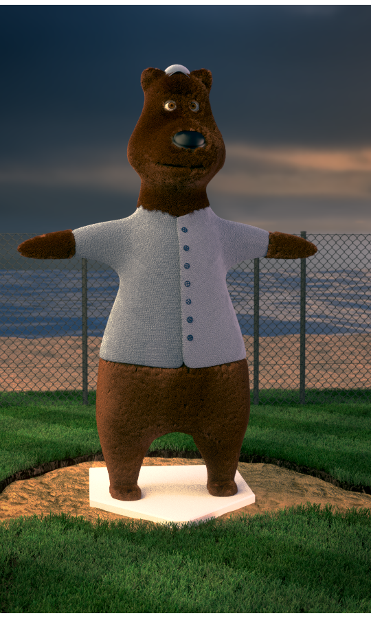
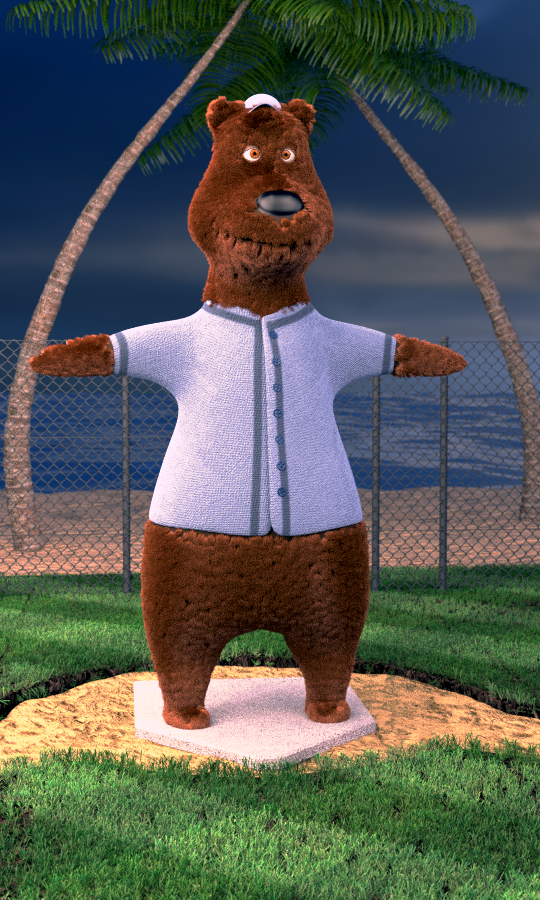
I did a complete redo of the lighting and found an HDR image that worked for the scene so the background is no longer added in using the compositor. I also scaled up the bump map for the shirt part so it is smaller now and lowered the strength of it, but it still appears to be a bit too strong. I also reset the scaling for the fence so it does not look squished like in the pervious image and made sure the fur was missing in no visible places. I still need to work on the trisition from ground to sand but don’t really know how to make it look more natural. Does anyone have any advice for this?
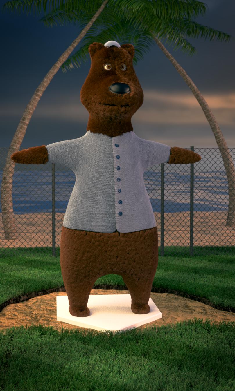
I added palm trees to the background to make it seem less empty. I also don’t know what is happening with the one side of the face being lighter than the other and it almost being spilt down the center of the face.
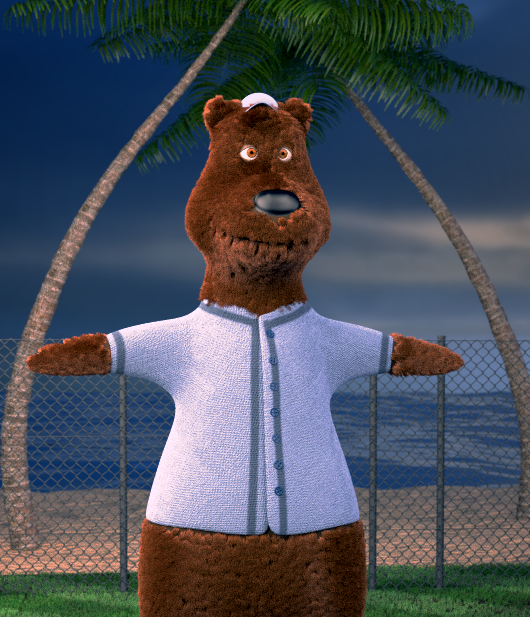
I found out today is my last day to work on this and I probably should focus on very small details and rendering today so this is pretty much the final render. It isn’t as good as I had hoped it would turn out but it is mostly there and I am happy with how far it has come from the state competition one.
You might try putting a ‘baseball’ logo on his shirt. Not for any particular team, just a stylized baseball. Also, the shirt seems too small for the bear, it’s compressing his fur. I’d think the bear would pick a size that lays comfortably over its fur, not one that squashes his fur against his skin.
I brightened up the sky a little bit. I might do the suggestion of the baseball logo but as of now I think I am pretty much done with this because it has to be submitted tomorrow and have been working on this for months and am tired of looking at it now. Thank you everyone so much for your feedback!