Still working on it, but critique appriciated.
***Current:
***My portfolio: http://adamszablewski.cgsociety.org/
***Current:
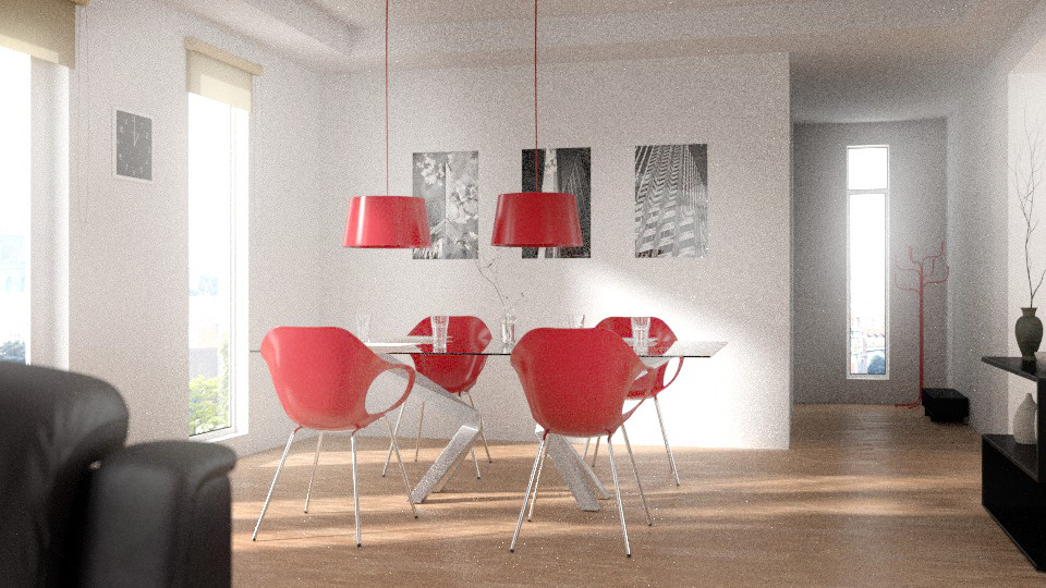
Ok just when I thought nothing I can critic here, aint the grain but thats probably because its not the final render, and I see it!
The shadow give it away, your chair are flying.
I guess you will have spoted it too at a point and get them back on the floor where they belongs.
You have a very nice foundation here… consider adding some base moulding. Androol is correct about the chairs, they are floating slightly over the floor.
Yep I have spotted the floating chairs, I’ll post the update soon***My portfolio: http://adamszablewski.cgsociety.org/
Having something in the foreground is most of the time a good idea, but here the couch doesn’t let the image “breathe” on the left side. Keep foreground objects for close ups, with nice DoF.
Check out the work of famous architectural render artists to give you some ideas of composition (Bertrand Benoit, Peter Gunthrie, Alex Roman, Evermotion forums, etc…)
This is a good start, keep it up  And try the portal lights builds from Lukas Stockner if you want to dramatically reduce grain (and render times).
Great advice!
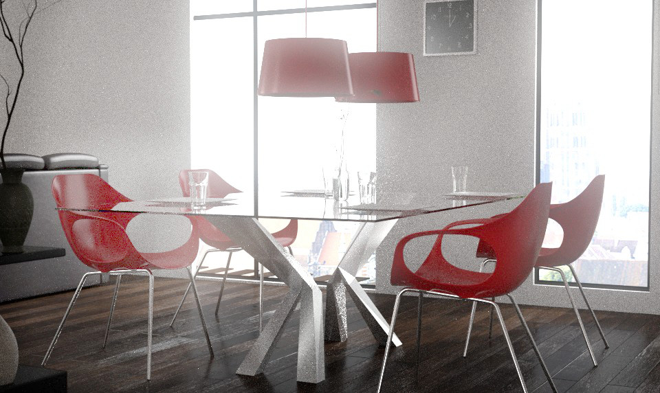
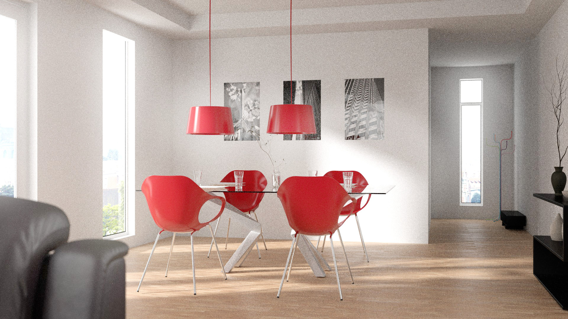
I would suggest trying different materials on the chairs lamps and coat rack, instead of them all being the same.
the composition seems fine
try working on the materials and lighting (the sofa seems plastic)
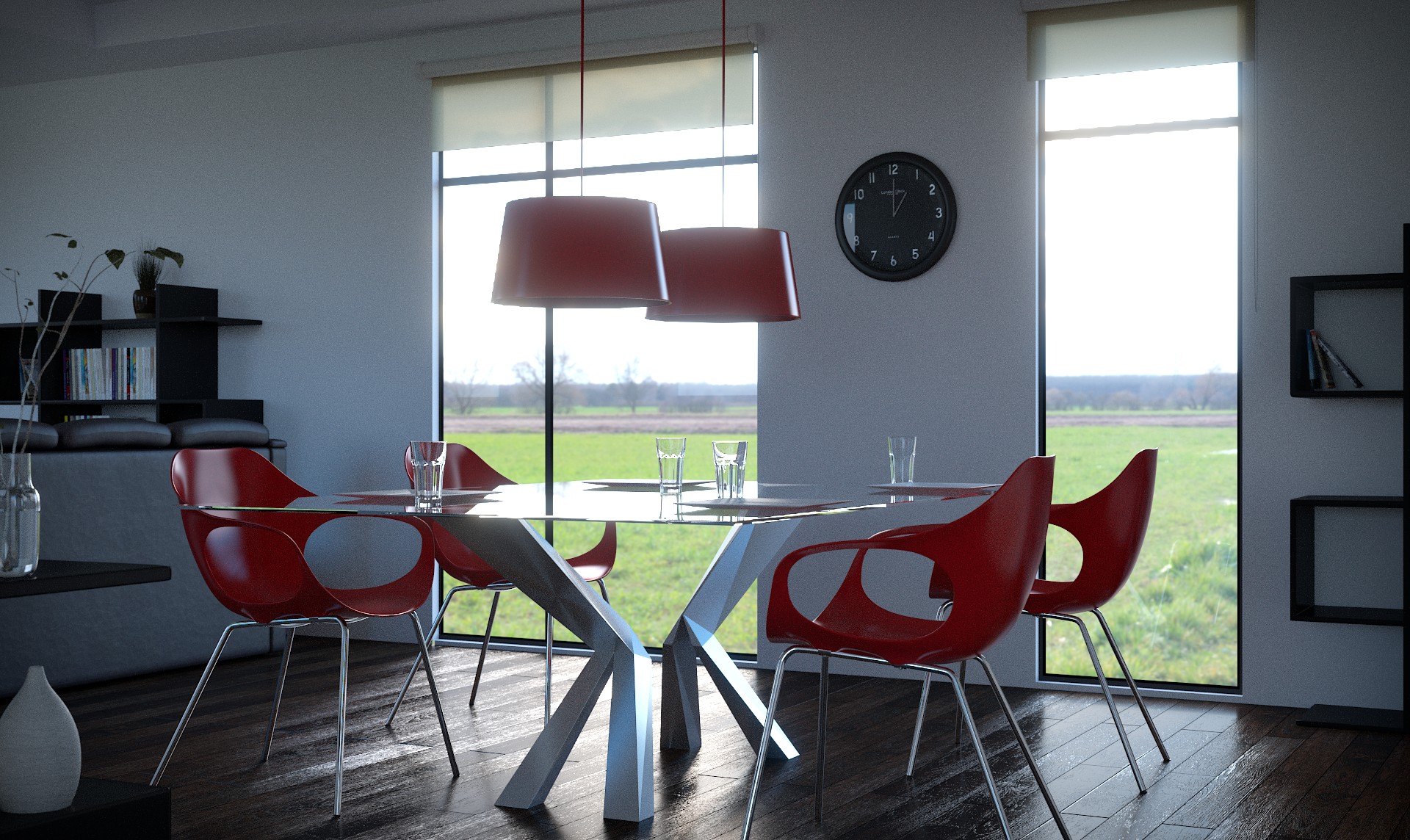
also the overburn lighting effect from the window seems too strong - but that may be subjective
the note papers seem too perfect too - even, flat and lifeless - get some mess there…
It looks very good.
Are the images on the far wall meant to be hanging paintings? Or are they applied directly to the wall? If the former, I’d expect to see at least a slight shadow along the edge.
The left lamp cable looks thinner at the base, and not the right one. But maybe it’s the background color.
Must be the background, cause those are exact copies.***My portfolio: http://adamszablewski.cgsociety.org/
Update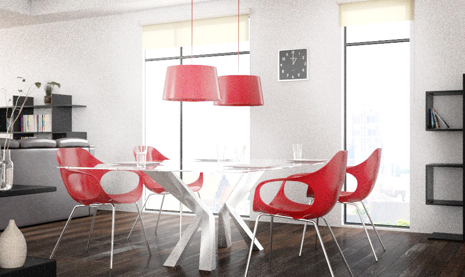
I actually prefer the first render…
I think there is too much white going on in the scene. Also the couch looks unnatural, it’s too rounded.
It’s a bit disturbing to see the glass on the glossy table with at the background the windows.
Well done anyways,
Ivan
I like it, good work mate !
The outside is not up to the chalenge provided by the quality of your interior.