Hello, this was a something I completed a month and a half. I upload it for you to give your opinions.
Thank you
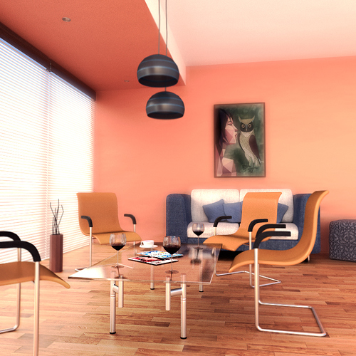
There is a good looking room. the table, the seats and the sofa is very good moulded. But I think the blur is too much. The blur on the table is good due to the fact that the table consists of glass but otherwise it is too much.
But altogether good work!
A nice bright scene, well lit but not over-done. A lot of nice colours and contrasts.
My attention keeps getting trapped on a couple of key areas though.
As Karstem mentioned, the reflections on the table look quite rough for (what appears to be) a glass top. I might suggest making the reflections a bit crisper, more in line with what we might normally expect from glass.
I’m also drawn to the light shades. Very dark, and very solid looking. Maybe some translucency in the material used here would help? They may be up an away from the main focus of the scene, but they are still very much in the middle of it and grab attention quickly.
