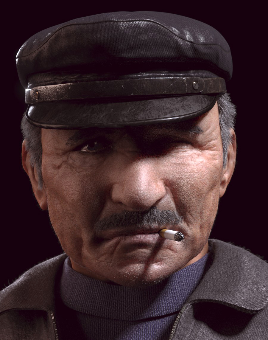
Hey guys,
some of you may have seen this in the WIP section… I’d like to post this here in FC as well for some serious feedback. this is nearing completion.
thanks,
-G:eyebrowlift:
Hey guys,
some of you may have seen this in the WIP section… I’d like to post this here in FC as well for some serious feedback. this is nearing completion.
a good portrait. i like the materials, in particular the hat material… the sculpt looks good too. two things stick out:
a last minor thing is that the nose wings would be narrower at their top than at their bottom, so that the outer line of the nose wings slants inwards from bottom to top. a quick stroke of the crease brush whould correct this.
Skin shader looks a little bit off, I think its too glossy.
I love the shadow the cigarette casts across hiss chin. Some subtle smoke rising off it would add a lot.
A bit of dirt or worn patches on the clothes would be nice.
Hair shader is great.
The one visible eye looks really well done. It’d be nice to see a small bit of his other eye instead of it being completely closed over.
thanks people! 
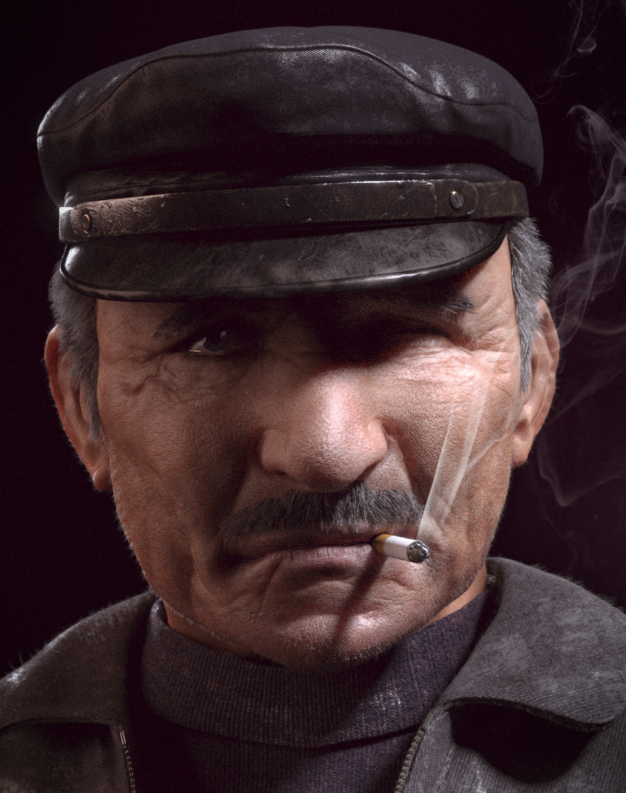
@ Doris: I worked on the stuff you mentioned… particularly the position of the coat, and the length of the forehead… I also did a little tweaking with the nose, but not quite sure its there yet. I also made the neck more visible:
@M1C4HTRON13: thanks a lot for your input mate! I’ll take a look at the points you mentioned.
more C&C is welcome! 
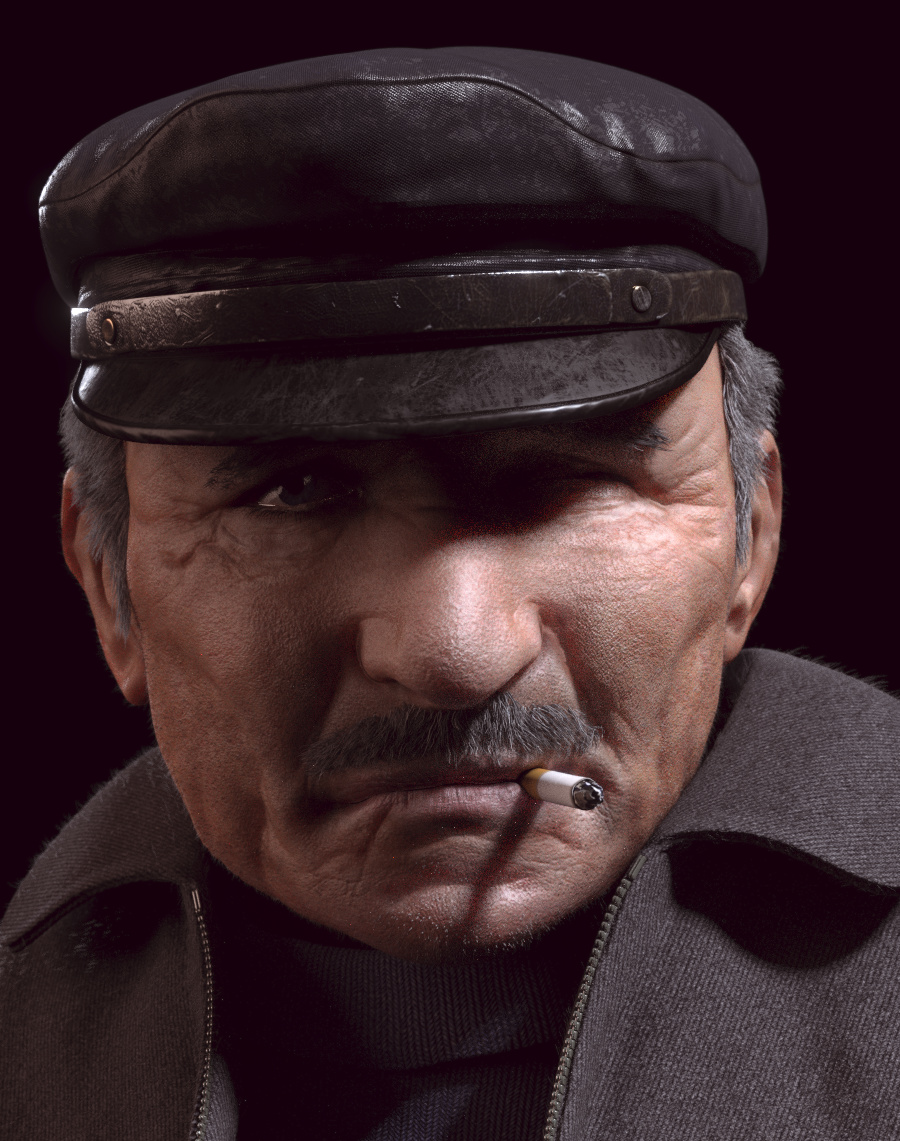
A few points no one has mentioned yet.
The wear marks on the bill of his cap: wear would indeed show there, but the marks look like scratches. The bill would be worn in that location from repeated handling by fingers, which would leave smudgy looking marks rather than scratchy marks.
The curvature of the bag under his left eye should match the bag under his right eye, which looks very realistic. His left eye is in deep shade, so he wouldn’t be squinting with that eye, besides, squinting doesn’t change the shape of the bag under the eye, just raises it up a bit.
Given how attached he is to his old hat, I’d imagine the same would be true for his jacket, and possibly his turtleneck as well. Both those articles of clothing look new.
That’s realy impressive. I especialy like the coat material, the hat is very good too.
One thing that seams a little off is the hair and mustache that look fake, especialy where thes join the skin but not only that. It looks slightly like syntetic hair for some reason.
I can hardly say why as hair is somthing I didnt have done myself. One thing I have seen in other work is to paint hair on the skin so it smooth the transition but I dont realy know if its one of the probleme here.
thank you all!
@Orinoco: I changed the wear a little on the bill of the cap to look more “smudgy” in areas where he’s likely to touch it, and I also worked on the area under his eye… I put more imperfections/stains on his clothes, and I added smoke from the cigarette, to give him a valid reason for squinting like that. thanks for your input, it’s been really helpful.
@Androol:I’ll take a look at his hair shader… maybe I can get it to look more realistic. thanks 
@M1C4HTRON13: I added smoke. as you can see, it really adds to the image. (IMHO anyway :P)
Thank you all for your incredible feedback! I’m calling this artwork “done”, I’ll be rendering out a High-res version of this, and I’ll do the final color correction/compositing in post-pro.
I realize there are still many ways to improve this work, but I think I’m wrapping it up for now. Remember to keep an eye out for the final render in the Finished Projects section! 
thanks again,
-G
EDIT: and feel free to critique some more if you want 
The nose/cheek crease could be defined a bit better on the model. I’d also tweak his shoulders, neck and chest proportions. After that, more work still on the skin shader and lighting which is coming along and looking pretty good in your latest renders. Nice piece, looks great, gl with it.
Absolutely amazing I would say it is perfect how it is however my only critique would maybe be to move the lighting to make the hat cast a shadow completely over he right eye as it looks a little of to me at the moment. I may be wrong as this is just my opinion or it maybe a choice you have made. Awesome anyways James
Very very good, I like it
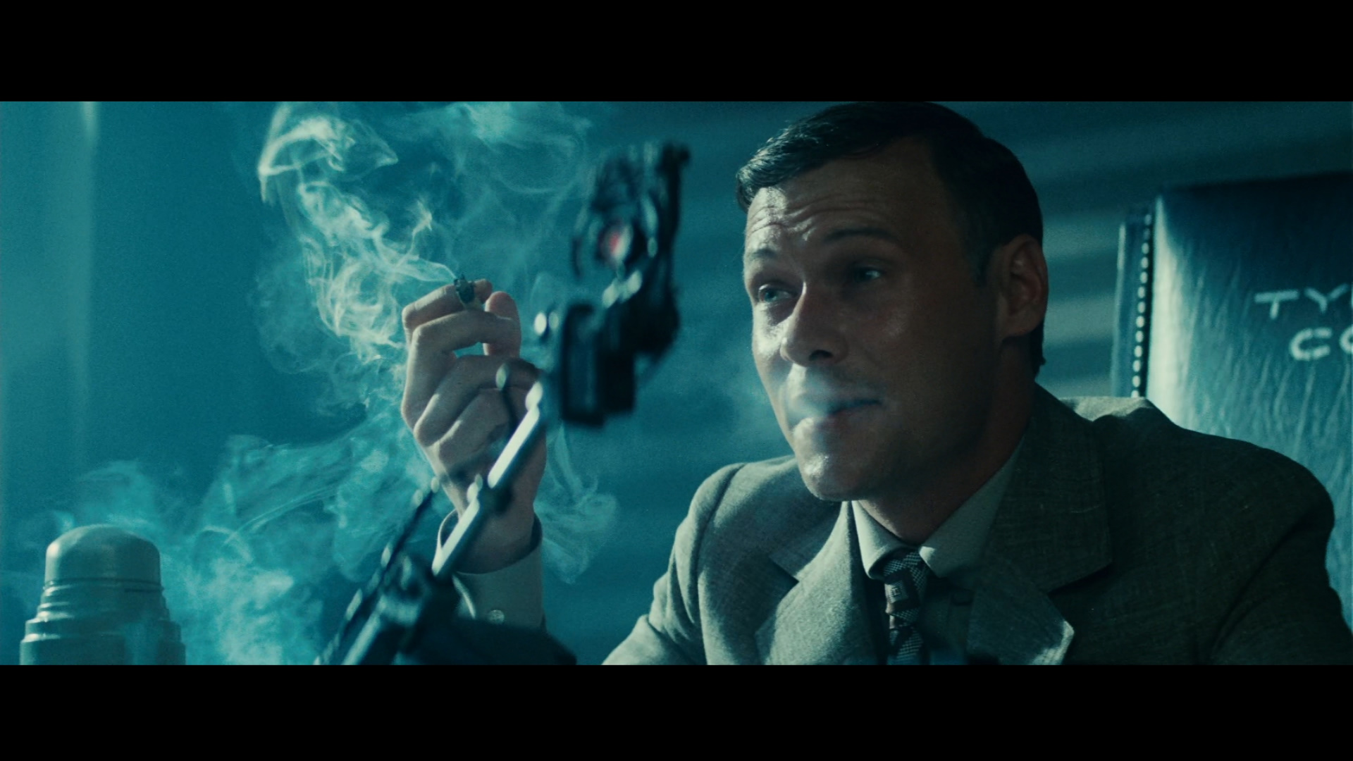
As an ex portrait photographer I can say that whilst the sculpting and shaders are really, really good I’m just not feeling the lighting at all.
For a moody subject it’s way too bland.
If it were my project I would look for inspiration in Film Noir:
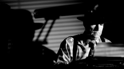
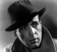
Jim
The only thing I’d really look for is some kind of “catch-light” in the left eye, unless the left eye is gone.
The lips need to come apart where the cigarette goes through them.