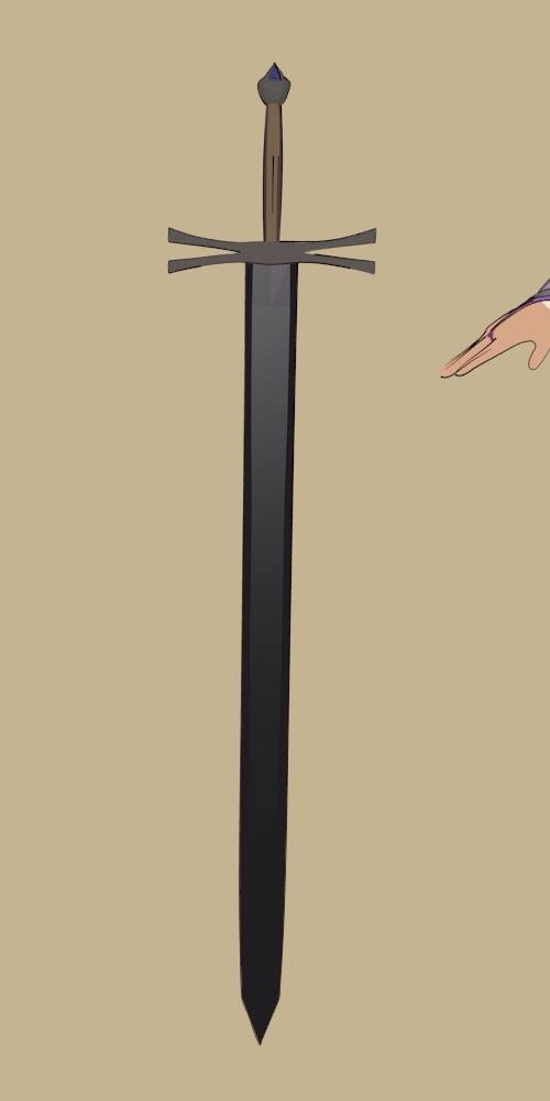
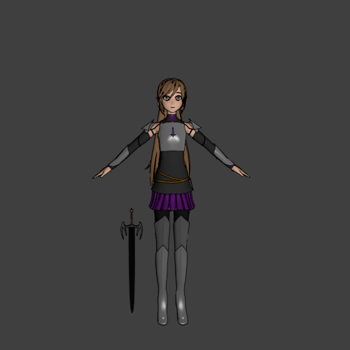
I like the blade and handle, but the guard seems almost too garish; might scrap it and go simpler.
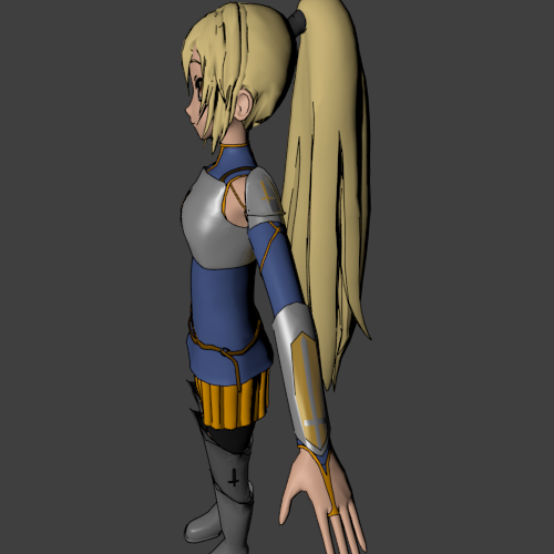
Size comparison, as a one handed sword.
Probably going to make it longer.
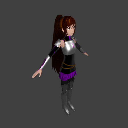
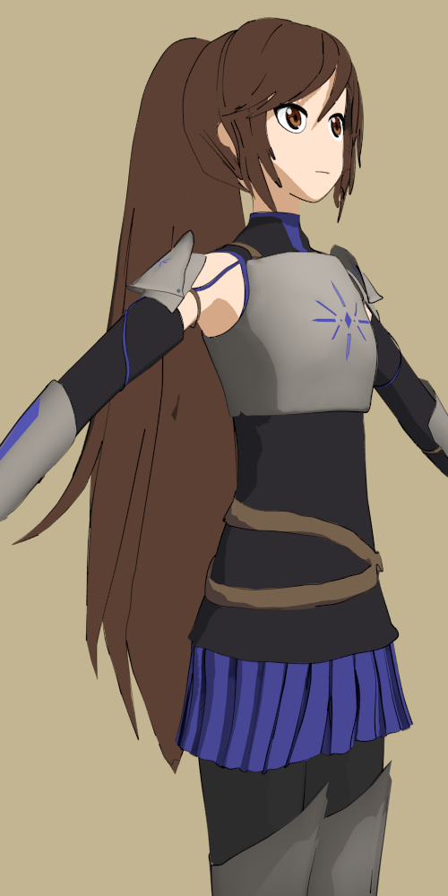
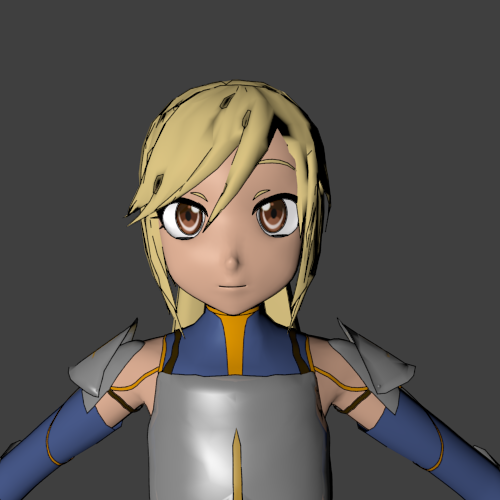
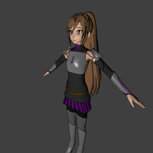
Progress on our hero!
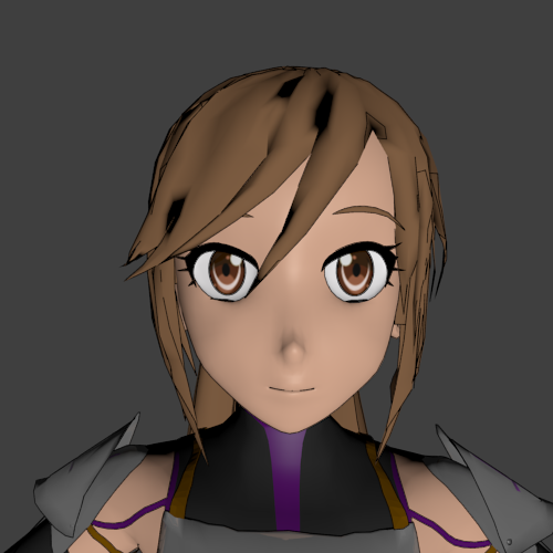
Changed around the colors, and worked on her face, making it less blocky and more smooth.
Things to look for:
She still needs a name!
Is the belly area still too bare?
Does Nyx look good?
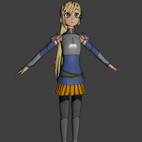
Is the size between the hero and Nyx good? More, less?
Is there a way to make the metal look grainier? It seems too flat.
Nyx, mark II. Not sure how I feel about it yet, but there’s a very thin line between too garish and too plain.
Started rigging, using rigify (and the very helpful tutorial associated with it), and it’s proving to be difficult. I may be forced to make my own rig, which is both good and bad, all things considered.
Some things I need some help with:
How does the face look? Something looks off, but I have NO CLUE as to what it is, but it’s bugging me.
~still needs a name~
How to make the metal look grainier? Without texturing, something with the light?
That is awesome O.O
Definitely gave me some ideas for stuff in the animation, thanks!
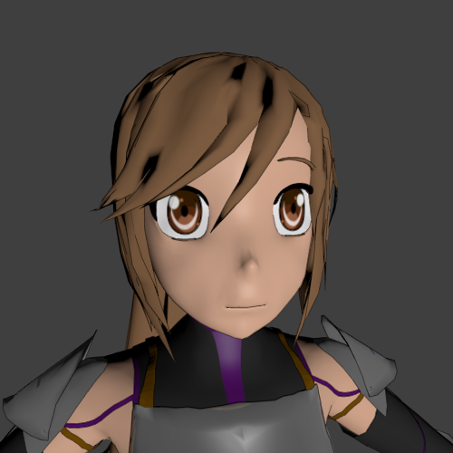
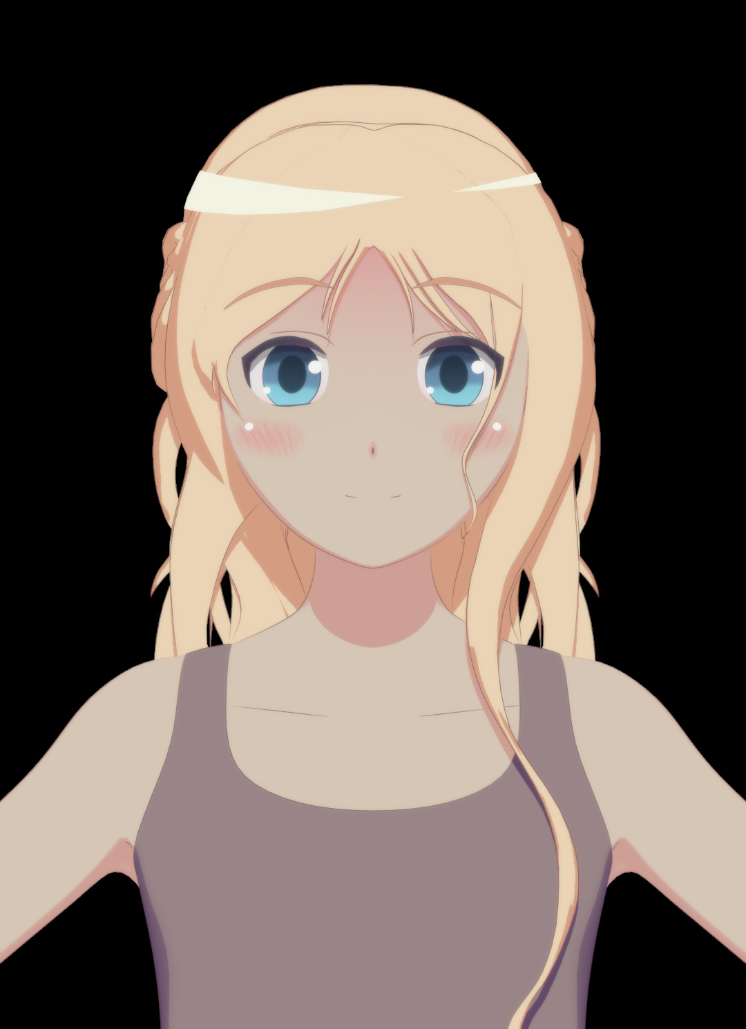
Modeled the face a bit to change it…
Before:
After:
Better? The eyes seem farther apart again, but I feel the face looks better in general.
Found the problem with rigify and fixed it, so now i’m rigging the rest of the body.
Thanks for looking!
EDIT:
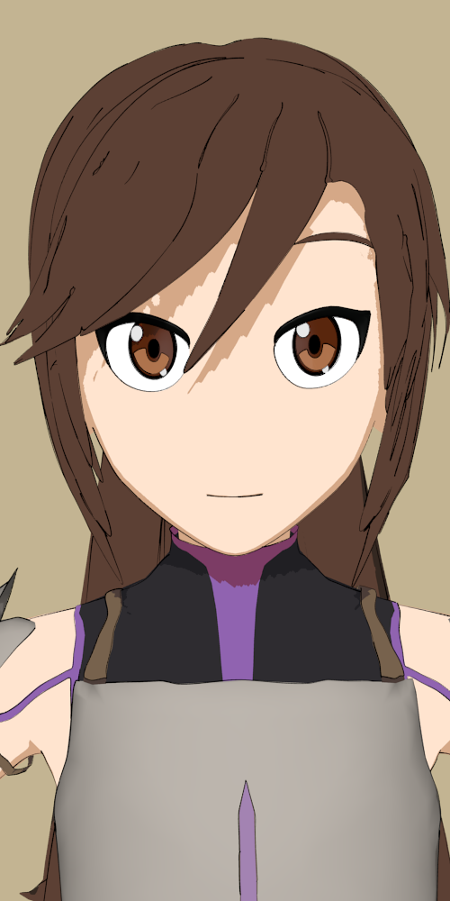
Was messing around with cycles and got this:
I thought it looked cool for just messing around.
EDIT 2: also, how do you get rid of those little sparkle looking things in her hair and near her boots in cycles?
those “sparkle looking things” are a phenomenon known as firefly’s in cycles. they are a side effect of caustics. you probably wont need caustics since you are going for a stylized look so you can disable caustics by going to the render panel (the camera icon on properties window) and scroll down to the light paths tab you will see 3 check box’s in this tab. in top to bottom order shadow, reflective caustics and refractive caustics. un check the 2 bottom box’s. leaving the shadow box checked (sorry if that came off as condescending i don’t know how long you have been in blender and it can be hard to follow instructions via text XD.) best of luck to you.
Interesting character :rolleyes:
You should check out the Facebook group link I have in signature there is a lot skilled NPR artists there.A bunch of them do anime.
Since Briar is relying on just a belt (no shoulder strap) to carry that sword, the belt should be three or four times wider than it is. What she has now looks barely strong enough to hold a hunting knife or a dagger. Plus a wider belt with a big buckle would go a ways toward solving her plain belly problem.
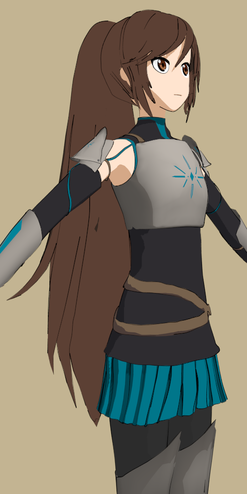
I prefer Briar’s ‘before’ face, but either looks pretty good. She seems to be shaping up nicely.
I’ll definitely make the belt bigger then, I didn’t realize it needed to be bigger.
Briar… I like the name, might go with that.
I’m still not 100% satisfied with the face, so it’ll probably get changed again; hopefully it’ll look better.
Progress!
Changed the shading a little bit, along with tweaking some colors. Made the sword belt bigger (is it big enough?), and changed the eyes to look more 2D.
Strong enough to carry her sword, which is turning out to be pretty heavy, and stiff enough not to get all floppy on her when she draws it in a hurry. That would be bad…
Briar’s main color is her brown hair. If you bump up the saturation and value of that particular brown, you get orange. Complement of orange is blue, so blue wins. But a cooler blue. Something like R 000 G 180 B 255.

 ~
~