Hi,
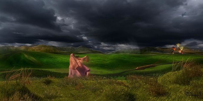
I will be happy if you could offer me your criticisms on this image.
Thank you.
It’s an interesting image, but I would suggest adding a grass particle system to the background as well. The grass in the foreground looks fantastic. All you have to do is add it to the background.
Coté composition on met generalement le vide dans le sens du regard du personage et/ou du mouvement de l’objet photographié. La tu a fait l’inverse.
J’aime beaucoup l’idee du train a traction par cerf-volants.
Alors tu pense qu’il faudrait supprimer le monorail pour laisser un vide à droite?
So you think we should remove the monorail to leave an empty right?
Non, enlever l’élément original de l’image n’était pas exactement ce que je disait. La troisième ligne de mon message peu donner un indice a ce sujet.
En fonction de ce qui existe hors champ, soit je tournerais la camera un peu vers la droite pour avoir le dégagement du bon coté de la dynamique de l’image. Si il n y a rien a droite hors champ, je cadrerais plus serré ( ce qui est souvent une bonne idée de toute manière si on en crois kappa) pour supprimer un bout de la zone a gauche qui ne raconte de route façon pas grand chose. Ou alors, je déplacerais le personnage et le monorail sur la gauche dans la scène 3d.
Même si je reste un petit peu sceptique, je vais tenter suivant tes remarques. J’ai utilisé la règle des tiers pour cette construction d’image. Je te remercie beaucoup pour ton interêt sur cette image.
Although I remain a bit skeptical, I’ll try following your remarks. I used the rule of thirds for the construction of image. I thank you very much for your interest in this picture.
La règle des tiers n’est pas la seul règle de composition. En photo ( et l’usage de la camera 3d c’est de la photo) on dégage de l’espace dans l’image dans la direction du mouvement ou, si le sujet est immobile, dans le sens du regard de l’animal ( humain compris). La ou ça deviens compliqué c’est de mixer les différente règles de composition entre elles. Ou pire quand il ne vaut mieux ne pas les suivre. J’ai du mal a y arriver moi même.
The third rule isent the only rule of composition. In photography ( and a 3d camera work like a real one) we let the empty space in the direction of movment or, for still subject, in the direction of the ligne of sight of the subject if its an animal ( humain included ). The hard part is to mix multiple composition rules together. Or worth when its better not to folow the rules. I have trouble do it myself.
I tryed to translate the previouse message but some words are missing of my english vocabulary. As I’ve seen other post with mixed languages, I assume it’s ok.
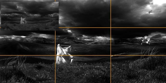
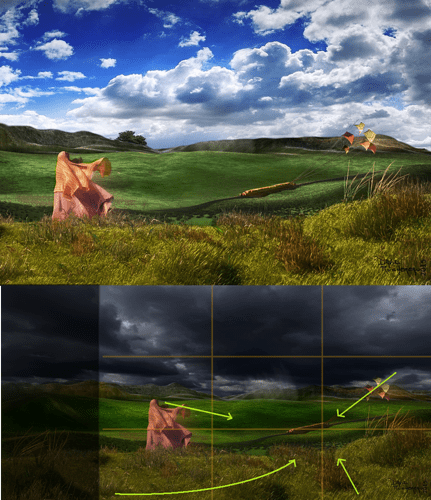
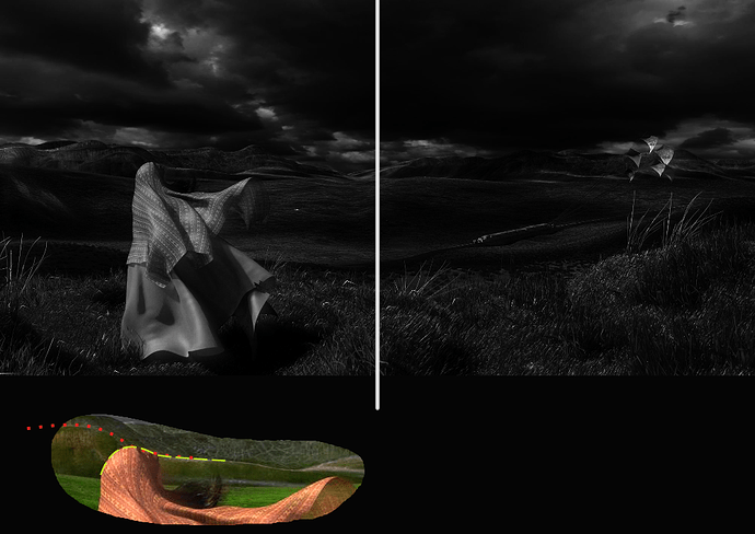
Some visuals of what was mentioned about the composition
Yes it follows the rule of thirds but that’s not the problem. Foreground element is the first read because it’s a big high contrast element next to rule of thirds point. The main subject matter however is lost in the image - It’s small and not enough value contrast to make it pop from the background.
Original scaled down to see the overall composition and first read. Larger image shows level adjusted values. The original image is about the foreground element.
Reframing should help to shift the focus to the monorail itself. Giving it a bit more light helps to extract it from the background (with other effects). The monorail could also take larger portion of the image.
Green arrows are suggestions for composition lines that guide the viewer to the subject matter. Some of them already do, like where the foreground element is facing, cables, but could also enforce/enhance that with other lines like making contrast on the foreground and having hay point at it. Shadow lines in the background, mountain lines pointing at the subject matter, etc.
A big thank you for your advice, the text is difficult to follow (even in French), but the pictures are really very telling. I find them very explicit with it quick to understand the flaws and especially how to remedy the problem. Give me a few days and I will present the result.
Another big thank you.
I would like to keep the format but I think this will complicate my task.
Depends, these aren’t set in stone. If you orientate camera again a bit, maybe change the focal length, it has all changed. That’s why photography was mentioned, it is like looking through a viewfinder and finding a shot.
You probably already understood my post how I meant but just to make sure there’s no misunderstanding about the guiding lines:
When you consciously add them, those have to have a reason to be on the image and preferably very subtle. You don’t need to use every trick to get those in, especially if the major changes already serve the composition well enough that the viewer doesn’t get lost on the image. Too much is bad, I just listed some possible examples.
There are compositions with obvious guiding lines, like with symmetry or just otherwise very strong. Those can be obnoxious. Same if you force too much of the image to guide the viewer when less is already enough. With images like this it’s best to use cunning - If an uninformed viewer ever gets an idea there is something in the image that makes him/her look some part of it, that person can’t find evidence about the great conspiracy, only suspect that. Effective and visible, but hidden.
You have motivated me, so here’s a quick test cropping and some modifications. As you can see, I continue with my size in the obvious hope of retaining it. You have motivated me, so here’s a quick test cropping and some modifications. As you can see, I continue with my size in the obvious hope of retaining it. What is your opinion?
I have to admit I put less time and have little talent compare to JA12 who brillantly demonstrate the importance of many other point.
Its always impressing how you can change an image with some postwork skills.
The image size can work but as is, it’s now unbalanced.
Left side of the image has more visual weight than the right side. Visual weight meaning more interest points, contrast, value changes, contours, detail to look at. Brightening the image would help with that, getting the main subject matter more prominent and seeing more of the right side could make it more equal. If that’s not enough to balance the huge foreground element then perhaps subtle changes to foreground grass or cloud pattern could help with that, less interesting on the left and more on the right.
There’s also a potential tangency issue with the head and background mountain. Their contours aren’t that perfectly aligned so might not be a problem with futher changes when there is more separation, but a potential issue anyway.
If I understand correctly, it would attract a little look on the right side?
Using a stronger lighting, a few more details, lines to guide the eye, …?
(Automatic translation poses many problems for me to understand).
Yes. Or in other words, the viewer wants to look at the left side more, instead of the side where the subject matter is.
More light make the details show up better on the dark parts. It helps the right side more because it’s darker overall and there are details currently in low light.
If you want to make a dark image, that could be a problem. Might need to resort to adding lights inside the train.
Don’t know what to say to that but thought I have to at least say something. Thanks, I guess, but composition is not an exact science like you implied so everyone’s thoughts of what looks good or weird is as valuable. Can only try to find why using composition ‘rules’ and tricks and suggest changes but it might not help at all, depending on what the artist’s vision is.
Edit
Sorry if it wasent clear but yes, it was a compliment on the time you took to make a postwork demonstrating what I was trying to explain by word with poor result and adding many other things in the process. Edit off
An human french translation of the previous critc of JA 12.
Le coté gauche de l’image a plus de poids visuel que le droit. Par poids visuel, j’entends plus de point d’intérêt, contraste, changement de tons, contours, de détail à regarder. Éclaircir l’image aiderais, faire compter plus le sujet principale et voir plus du coté droit pourrais rendre l’image plus égal. Si ce n’est pas assez pour balancer l’énorme élément de premier plan, alors peut-être, des changement subtile de l’herbe au premier plan ou de la disposition des nuages pourrait aider avec cela, moins d’intérêt à gauche et plus a droite.
Il y a aussi potentielement un probleme de lisibilité entre la tête et la montagne du second plan. Leurs contours ne sont pas parfaitement alignés donc ce ne sera peutetre pas un probleme avec plus de changement lorce qu il y aura plus de séparation, mais un problème potentiel quoi qu’il en soit.
Despite the problems of translation (again and again), I understand the comments of Androol, and they were a good compliment to JA12. The images have a stronger impact than discourses and this is especially true for me.
So thank you all both.
Anyway, when I present you the next version, you’ll see if I understood.
Hi all,
as it should finish one day or another, you can find this under the heading of finished projects. Thank you.


