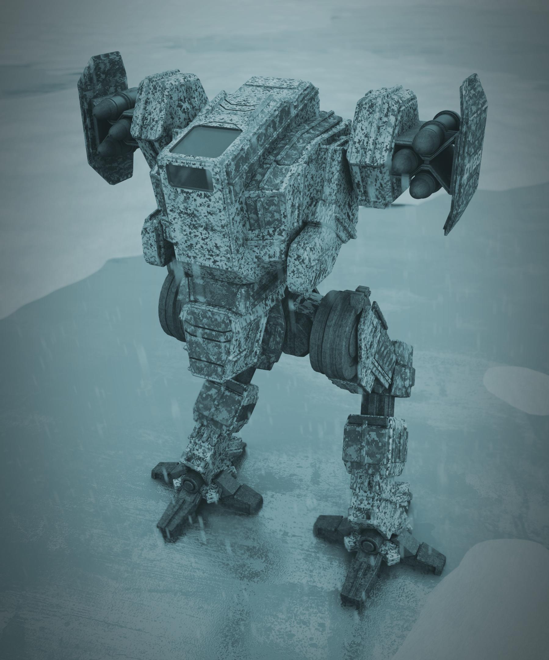
This is a mech i have been working on lately. I think the modelling is done, but any criticism is appreciated. I mainly need help with materials, composition and lighting.
I am using cycles render.
I have recently edited the picture based on the suggestions by Cancer, and did some extra post processing in gimp.
I love Gleb’s tutorials, and highly recommend them, but I would suggest learning the basics of the three-point lighting setup first, since a lot of his writing is reacting against that. You need to know the rules in order to break them, and all that.
The model is great, although something about the windscreens isn’t quite right to me - and since that’s sort of the proxy for the models “eyes”, I think a lot of people are going to look there first. My instinct is that the lower window is a bit too close to that front plate, so it needs to be moved down a bit. I kind of want to see the edges of the windows indented slightly too, but that’s more of a design choice I think.
I would say for the image itself, the background ground plane needs more surface variation. Right now it’s perfectly flat, which makes some sense for a sheet of ice, but there would still be some physical scratches in the ice with some like shaved snow around them to give it some depth, not just surface texture detail. On the Mech, I would say that his paint job is pretty well worn but I think some more attention needs to be paid to how the paint got worn and chipped away. The top of his head would probably have taken a few more dings at that point and anywhere there is an exposed edge is more likely to be dinged and chipped, worn and rusted more than the flat or protected surfaces and the non-exposed areas would have the least wear of all. This will make it look way more real.
Also add a photographic depth of field effect to the camera or fake it in composting.
The camera angle is a bit odd. The only way we would get that view of the mech is if we were sitting inside of a bigger mech or in a building. There should be some shadows to indicate this and the camera Focal Length should match the effect. Also, there isn’t enough shadow in the scene, aka the mech itself casting some shadow onto the ice.
I will try adding the snow clumps to the background, to make it more interesting. I am going to try my best with the wearing effect, i think i will end up manually painting the edges with vertex paint and using it to mix shaders.
As you can see in my comping setup, i already use DOF but i couldn’t get it to be more intense without blurring into the legs. I really don’t think that postpro could achieve the type of effect i am going for.
I am currently lighting the scene with an hdri with no real bright spots, so i need to add a sunlamp if i want strong shadows. I will see how this impacts the cool atmosphere i was going for.
I never really thought of the camera angle, as the scene was mainly made to showcase the model, but i will check some different setups.
The winter camo pattern could be better. Maybe think of why it’s applied, blenging in an enviroment when viewed from around and perhaps the pattern is different on top for when viewed from air. It’s also a mechanical thing that is used so the paint will wear out, panels might be replaced, oil leaks/spills, and it’s in snow so some of that will gather on the feet and fill some of the crevises.
A scale reference wouldn’t hurt. I placed it in another enviroment in Krita, see if it gives ideas
Could you be more specific because that comment doesn’t help me or the thread starter.
If you mean cast shadows and ambient occlusion on the people themselves, yea they don’t fit but the mech has the same problem, which is pretty obvious. The darker parts on the lake bed aren’t shadows, they are darker areas caused by differences in snow coverage and water being trapped in ice closer to the surface. It’s an overcast situation because direct sunlight is nowhere near and shadows cast on snow would be neglible. Overcast lighting is hard to get right on its own but even harder on snow, so didn’t even try.
The horizon line was estimated at the waterfront on the other side of the lake. The camera is on land, supposedly at eye level and it would be the same position on the other side next to waterline. Lake surface is not completely flat and the snow gives in so the humans were placed so that they are roughly at the same height. Lines on the mech aren’t reliable because its orientation/pose, lines on its parts aren’t level in rest pose and those that are can move.
I would appreciate if you or someone showed how to get the perspective better with such elements. If the perspective is not right then referencing scale becomes useless.
I am missing some color, or something to fixate my eyes on. Also, to add a bit more contrast, try adding a light source with a slightly cooler or warmer color from either side.