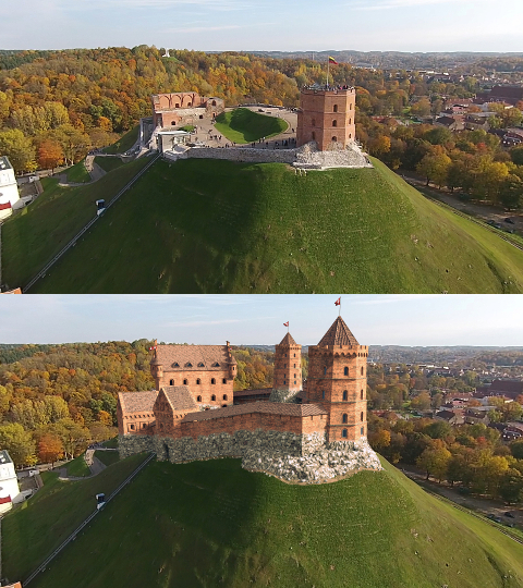
We are working on medieval castel video reconstruction/tracking project. Mostly all is done - we have model, tracking, etc. But I’m wondering how we could improve composition even more so reconstructed caste look was more nattural . Could you please advise any ideas? Thanks in advance!
Great work! I think, your the problem is, that there isn’t any shadow of the Castle on the hill. You should reconstruct the hill and put them to an backroundlayer
Thanks for suggestion. This will possible improve final image, however if we look at the original image I see no significant castle shadows, but for me castle still looks a bit like a sticker. Is there any specific filtering methods or something in composition I could apply to minimize this sticker effect?
I agree with VSE, adding shadows will make it look way better. Also maybe add in very slight atmospheric falloff/mist to make it a bit faded and to also give it more depth. Otherwise maybe fiddle with the color balance node to see if colour correcting it could help.
B.Y.O.B
(Node Preview and LuxCore Addon Developer)
5
Look at the wall in the original image, the shadows need to be more blue.
Hope that helps.
Your image looks pretty good to me. I understand what you mean about the sticker effect. It’s hard to tell from such a small image, but maybe a bit of ambient occlusion would help if it existed around the base where the CG castle meets the live action hill. Also, consider adding a few isolated rocks/boulder here and there around the castle base as well; right now we have a very clear defining line between the castle and the hill, so that should help break up the sticker feeling.
One last idea, make sure to soften your CG layers to match the softness of the footage- that goes a long way to convincingly blend things!
Any shadow of the castle would lie on the side of the hill that’s already in shadow. You don’t want double shadows. The only spot that’s maybe missing a shadow is at the very far left.
Strenght of the shadows are not the same compared to the original picture, too weak.
shadow colour on your picture is yellowish, probably inheriting simple uderlaying diffuse colour while on the pics, it’s bluish, so you must work on your shadow colour as well.
Kind of lake of contrast in general view, if you check youre reference, you’ll see the gap of colour from white to black while in your it stops from dark grey to almost white.
I believe that you could give your picture the realism your looking for with some curve and HS tweaking.
 . Could you please advise any ideas? Thanks in advance!