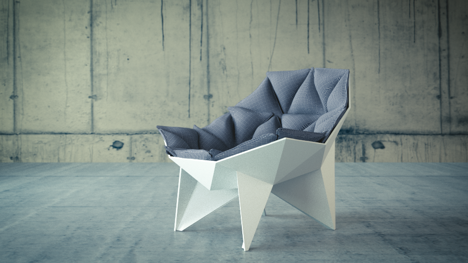
This is my first attempt to photorealism and i don’t have “fresh” look on this work. In fact im not sure is that whole scene looking photoreal. I would be happy if U can, give me some feedback.
i think it looks good , the thing about photorealistic is that its something that we can recanalize and its kind of hard doing that when the object is something this.
But looking at the reference it looks good, perhaps your chair dont have enough volume .
This looks very good. You did achieve your goal mostly. The only big issue I can spot is the background. In order to get maximum photorealism, you need to pay close attention to your background as well.
Right now, there is a visible seam where the wall and the floor meet. If you look closely at the reference picture, you’ll notice that there is a slight curve of paint going ~ an inch up the wall, that connects the floor to the wall.
This technique is used in real life concrete structures for the purpose of aesthetics (to cover up the gaps between the wall and the floor), and also to prevent occasional humidity from getting into the gaps and ruining the structure.
Here’s an image illustrating what I mean:
In order to fix your problem, you either need to connect the two planes and bevel the edge that connects them so that there is no straight edge between the wall and the floor
(you might also need to blend the colors of the textures in Gimp/Photoshop at the edge where those textures meet for more realism);
blur that seam in Gimp of Photoshop (as an additional and easiest stage of post process);
or you can simply add a plank or something to cover the seam up with.
Also, you might want to highlight the chair against the background a bit more. That wall’s blue-ish tones match the chair’s color, and that’s no good - makes the chair blend in with the wall, so you should either brighten (or change) the chair’s color, or darken (or change) the wall’s tones a bit more.
And I feel like you should numb down the reflectivity of the chair’s lower part (or lower the light gain in the compositor). It just feels a bit too bright (and has yellow on its right, where shadow should ideally be).
First of all: Thanks Everyone for good words and valuable
feedback!!!
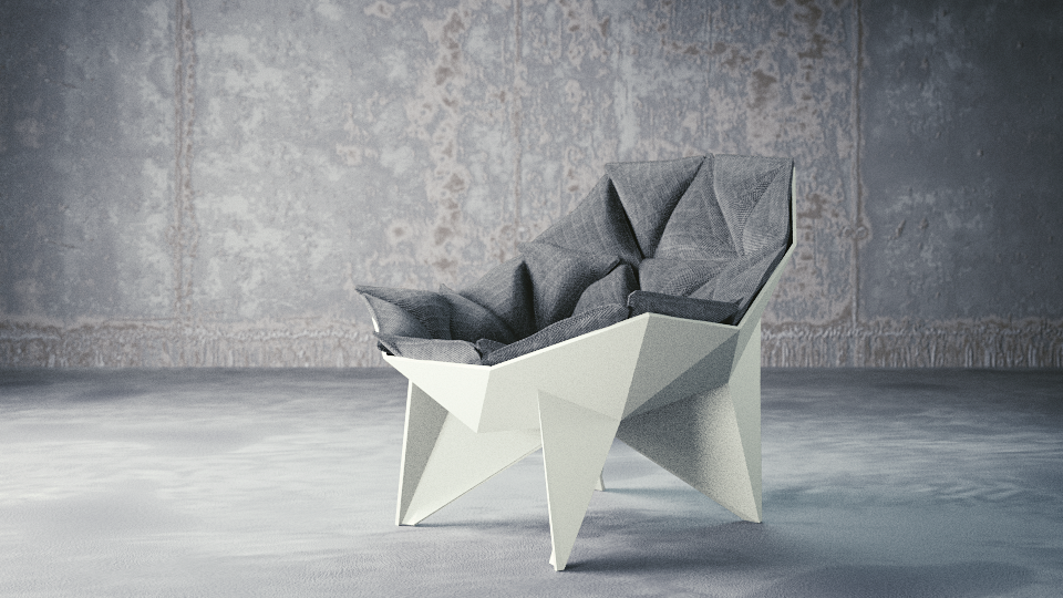
After huge amount of time i’m back with new
version of my image. This time i concentrate at proper texturing and
compositing. But unfortunetly i’m not so happy with result, because i
have strange feeling there something is wrong with cushions. I can’t
figure out what i should tweek to create expect final touch.
The cushions look fine to me, maybe a little flat but I thought that would be the design of the chair. I like the lighting here. How did you setup the lights?
Hehe, this looks exactly like the chair in the reference photo I think the reason you’re hesitating is the size of that lamp on the left. Don’t fret, it looks superb.
P.S. you could try adding creases around the edges of the cushions if you want. it’ll make the chair look just like the reference, but idk if that’s what you’re trying to achieve
->thelowlander
I get it, maybe in this version my cushions look more bumpy. In my scene i use 3 point light (area lamps) + AO=0,2
->Kroopz
Thanks for advice. In near future i will try add to cushions some signs of realism, like wrinkles or little sculpt. But for now im little bit exhausted of this work. :I
Far now im gonna freeze my work. Maybe after few days i will have some fresh look, until final touches. Big thanks for feedback!


 I think the reason you’re hesitating is the size of that lamp on the left. Don’t fret, it looks superb.