I am a big fan of the BBC series ‘Doctor Who’. And that brought me to making this. It didn’t come out quite the way I wanted it to look like. As you’ll probably notice the atmospheres around the planets are poorly done. I lack the knowledge and/or programs to create better ones. Any tips on that would be greatly appreciated, as well as overall feedback about the image itself of course.
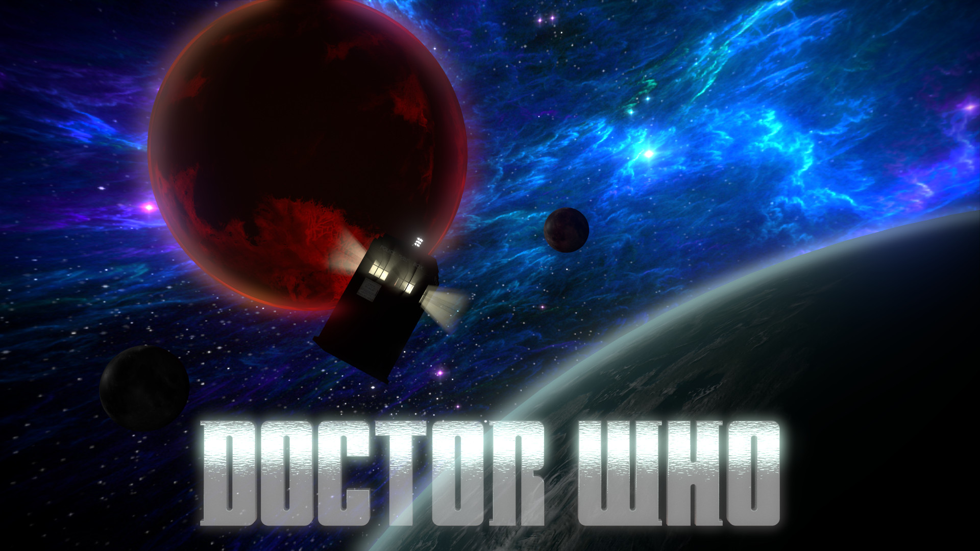
Really like the overall composition and colours on this, but you’re right that some of the details are letting you down. The TARDIS feels too dark and is blending into the dark red planet too much; try lighting it differently or compositing it on a separate render layer so you can tweak it. The god-rays coming out of it need to go, they stop too suddenly and don’t make sense anyway; there isn’t any atmosphere in space (not that technically accurate cosmology has ever been central to Doctor Who but the aesthetic illusion of it is important in some cases). How are you doing the atmosphere? Can you share your material setup?
The overall composition looks quite good, although the colour scheme needs some work. The background is too saturated. The TARDIS needs to be illuminated more and should be the focal point instead of the blue background. The god rays on the TARDIS look out of place.
I hope this helps, and keep working on it. It looks promising.
Thanks for the feedback. As for sharing the material setup, I don’t really know how to do that. And my .blend file is not uploading. I tried uploading it but for some reason it won’t show up