Any feedback welcome.
try to make the glare filter less “spiky”, and more “glowy” if you know what i mean.
also, at the end, i think the flashing is too quick. at 0:06, try to make it slightly slower. my eyes was looking at the logo, and my attention was drawn away from the VERTEX logo as soon as the flashy things started to pop up.
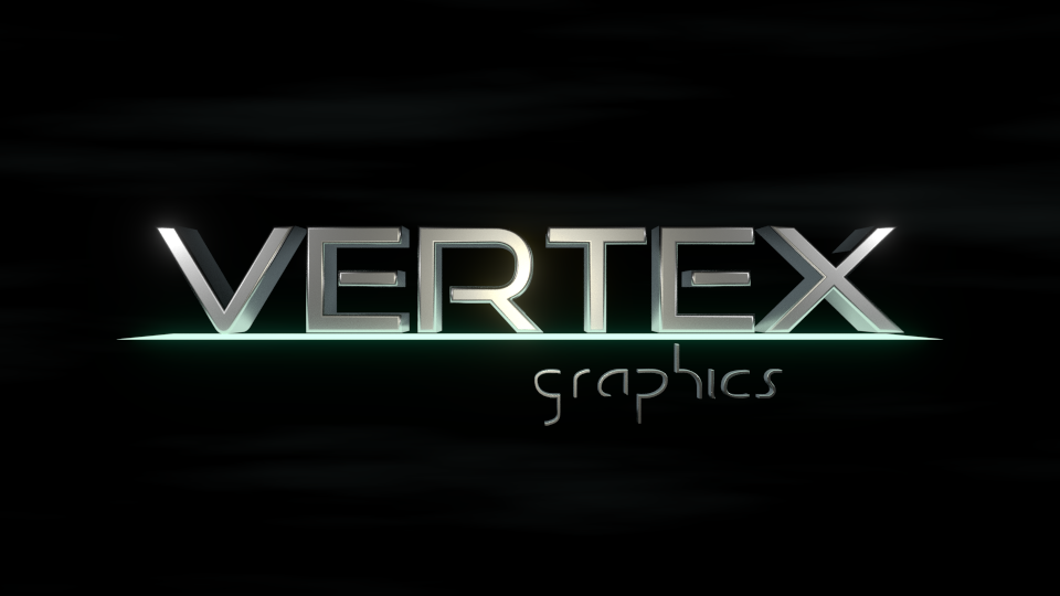
honestly, i really like the intro. looks very good.
but as i said the flashing is a problem, and the glare filter is a suggestion you should try, tho im not sure if it will make it better.
also, at 0:03 i got a “no, no where are you going” feeling. try to not move the text so far off the screen.
also, i noticed that the fog/mist in the background starts off slow, goes faster and faster, and then freezes at the end. dont make it freez, let it go off screen, so you have a black background when the logo is shown.
Thanks for the feedback. It focuses on the elements I was questioning myslef and it is nice to get wider perspective.
Hopefully, I will find some time soon enough to make a few alterations and post the result to compare.
after a few changes
much better. again try to make the glow on “graphics” a bit slower, and weaker. the way you made the mist fade out was really good. i also didnt notice the glare this time, witch is also really nice.
however, i see the text is accelerating at 0:03, try to smooth that a bit.
next would be to add sound. hope to see the next render soon! 
A few further tweaks and I consider it finished. It is time for a new project.
Looks decent, but try to smooth out the animation. It looks too sharp in few different places.
The animation is a little rough. Add some slight overshooting (camera movement, text filling up) and some anticipation (light line, tagline).
Read up on that in wikipedia