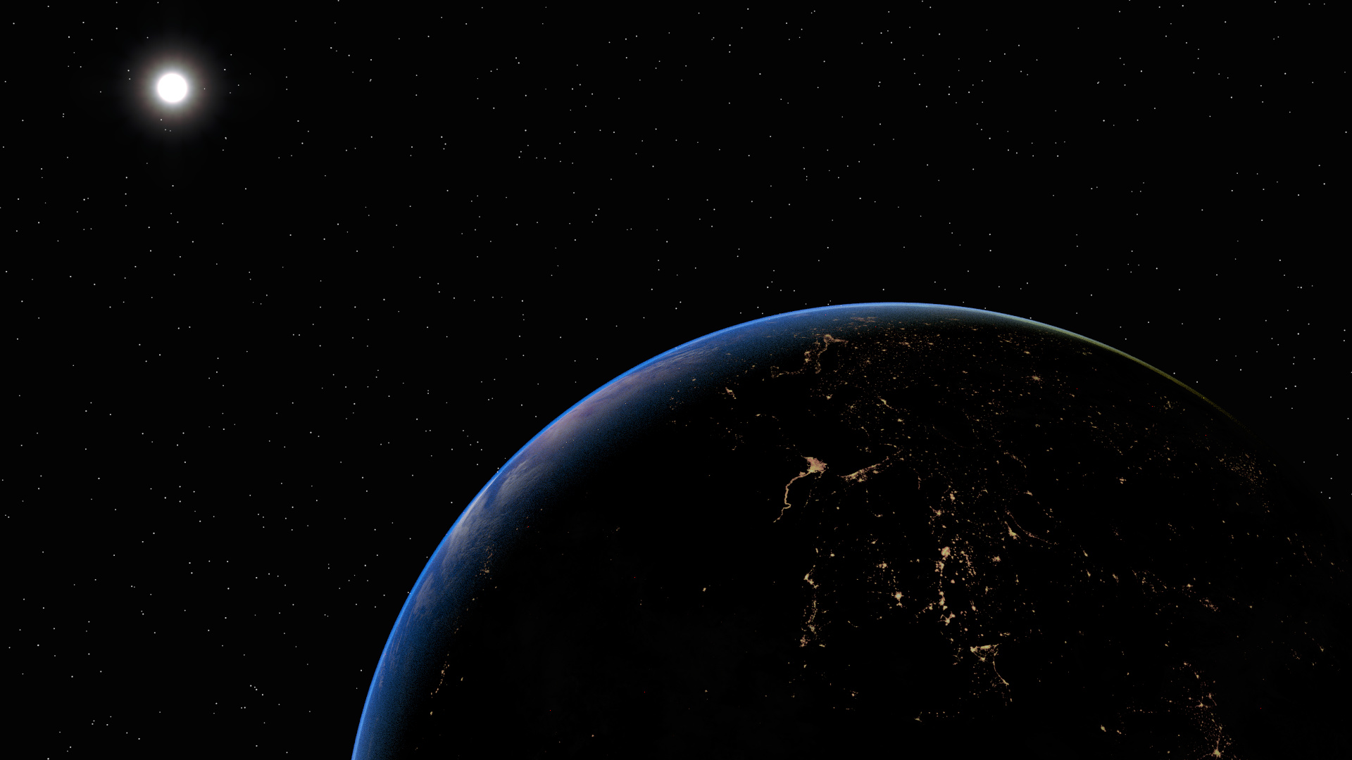
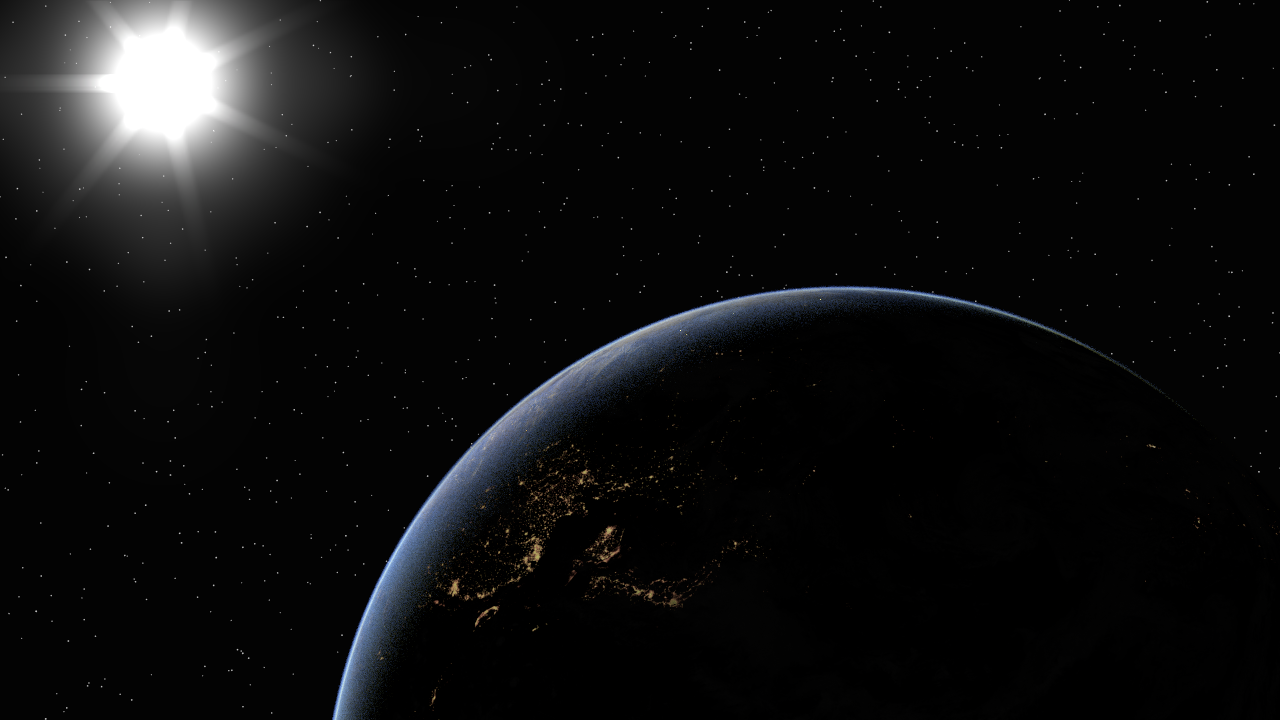
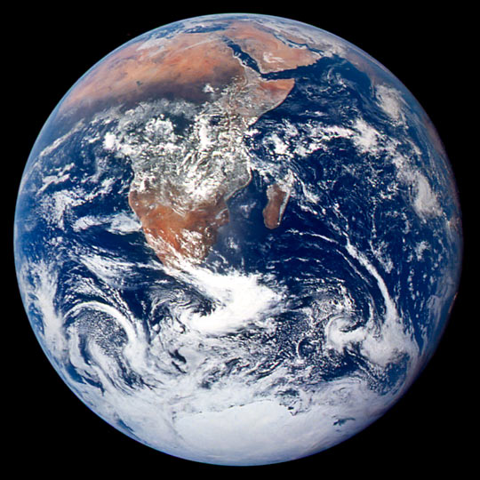
Always wanted to take on earth in blender. Below is my result so far. My goal was to do a realistic earth, while still allowing some freedoms like visible stars and a visible back side of the planet. Afaik if you’d adjust your camera that the lighted side of the planet is lighted properly you would neither see stars, nor anything on the dark side. I didnt want to do “fancy” and “romantic”, but simplistic and close to realism.
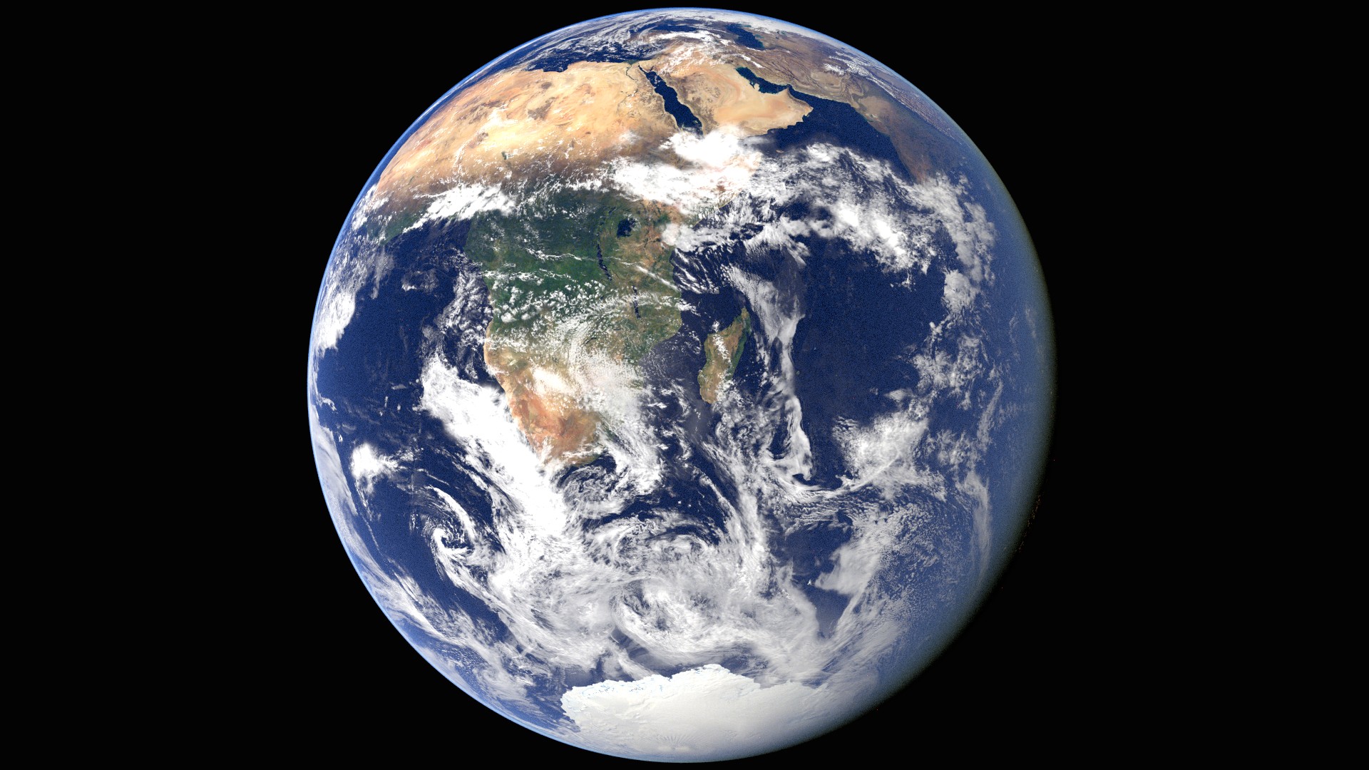
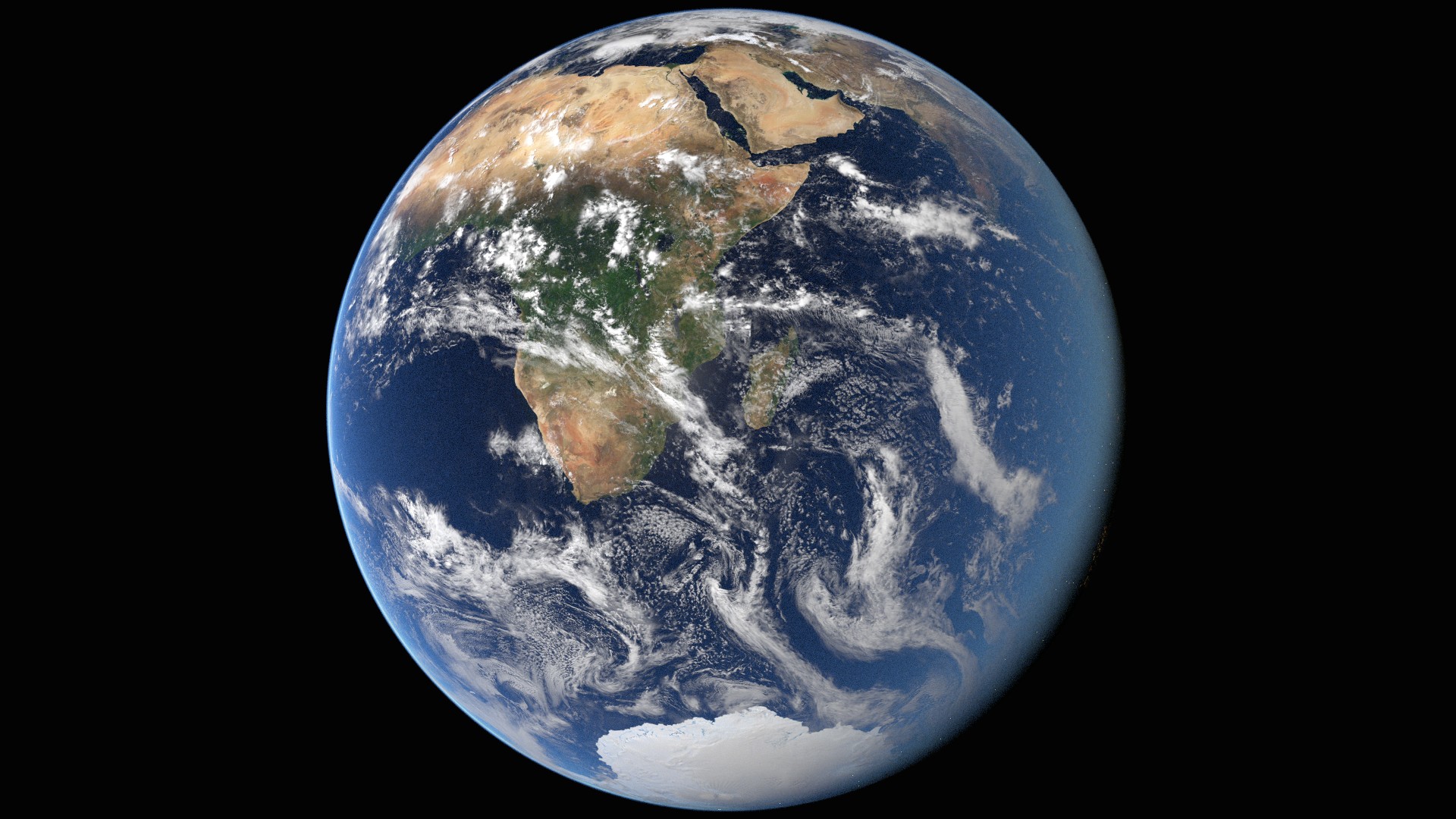
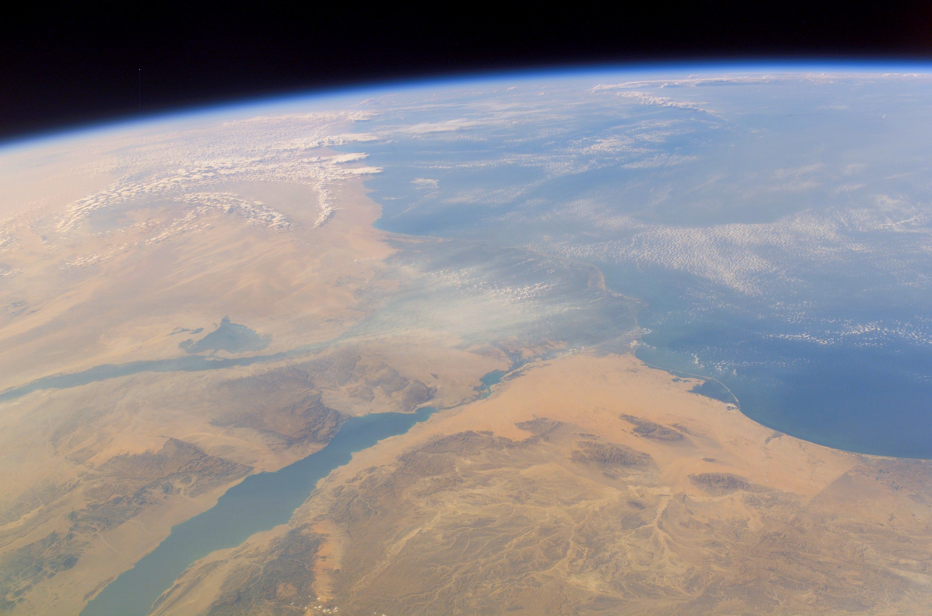
For the earth itself i try to stay as close as possible to actual photographs (many pictures i found werent actual photos), mainly this one on the nasa page from apollo 17. but even photographs are not a totally reliable reference, as the same photo on wikipedia shows. I decided to do the more blueish one from the first link.
I’ve hit several walls, where I’d gladly get some earnest criticism (anywhere else too of course):
the sun is done in the compositor. some glows on top of each other and streaks. dont know what i can do better there.
the stars look a tiny bit dull (but maybe stars do that?). i did them by exploding a few thousand particles and converting them. i decided to do it like that because i couldnt find free hires stars / milkyway. i might look for good tilables though.
with the earth itself i did the best i could. for the atmosphere i used an actual volume instead of tricking. i think it delivers nicely, but feel free to criticize, as i cant see how to improve on my own anymore.
the two images are merely about contents, not composition. i tried to match the last one to the photograph a bit :).
Try using the compositor tools to add glare and bloom to your sun. There is a Glare node in the compositor that will add “streaks” to the light source. You can also play around with the Blur node and creating Mixing to create a “bloom” or “glow” effect which will help out with the sun.
I’ve had some similar problems with stars in the past. I finally gave up, rendered the scene with an alpha background and added an image of stars in the compositor with Alpha Over. There are probably better ways of doing it though…
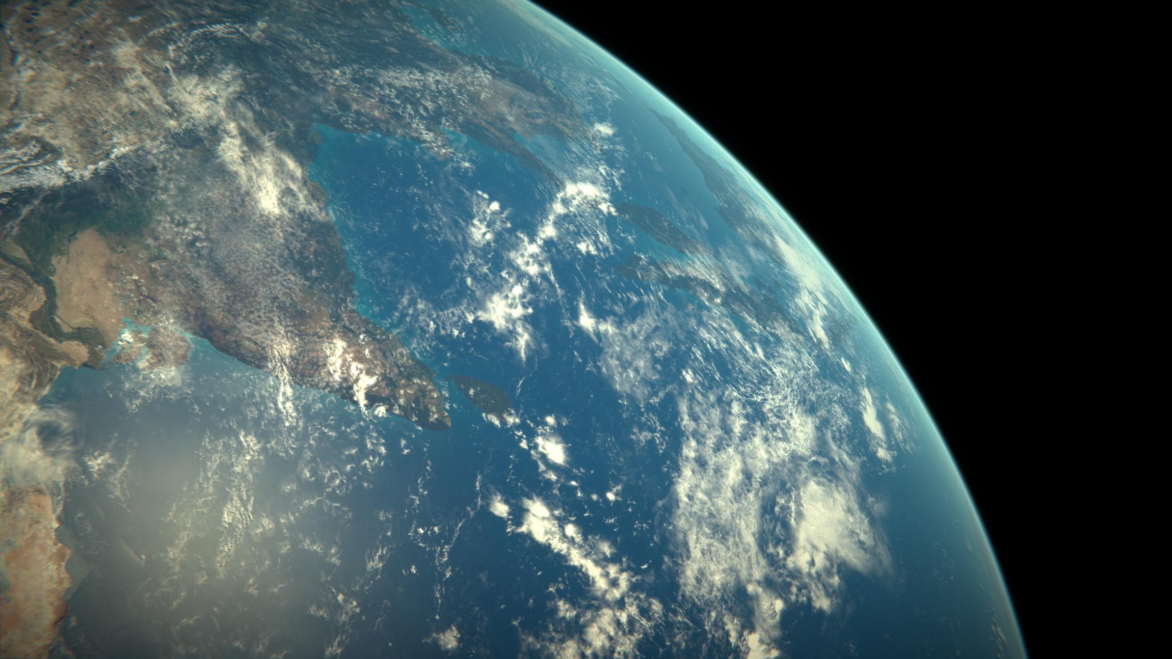
Yeah. If that atmosphere generally ends at 100km altitude (the Kármán line), that is about 1.5% of the entire Earth’s apparent size, in an orthogonal view. The edge in the Apollo XVII view should be near invisible, as in your high altitude image based on the same.
I personally think that your shot (the daylight one) looks really grand, as is. It does not need the stars as far as I am concerned; mostly those are only visible on the dark side of the planet.
I agree, the daylight side render looks fantastic! I have used the earth colour map to mix between blue and blue green close to land, not necessarily realistic but it would look nice.
You can see what I am referring to in this earth I am working on.
that’s indeed very nice blenderd. may i ask with what texture sizes you are working with? i just tried out a 54k one but blender couldnt handle that anymore :(. those above are 20k for the colour and 8k for the clouds.
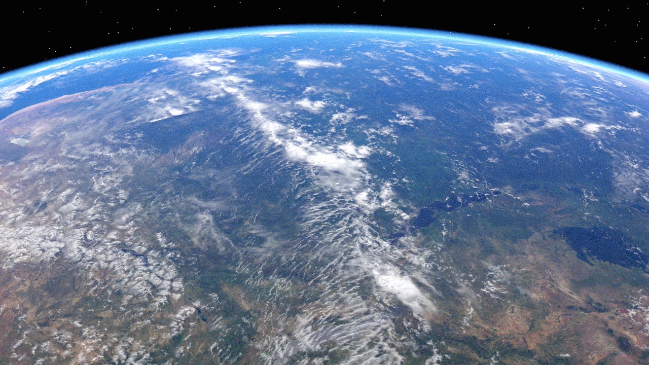
tried to bring in some kidn of gradient on the atmosphere. very tedious as i’m working with values like 0.008 or 0.011 for different positions on a colorramp node, and apparently more than 3 decimal places are not possible. i havent been using the compositor for the earth itself so far but i think i might on my next update. problem is: my tempering with the atmosphere messed it up when looked upon from other angles, so now the second picture (apollo 17 mockup) looks worse than before.
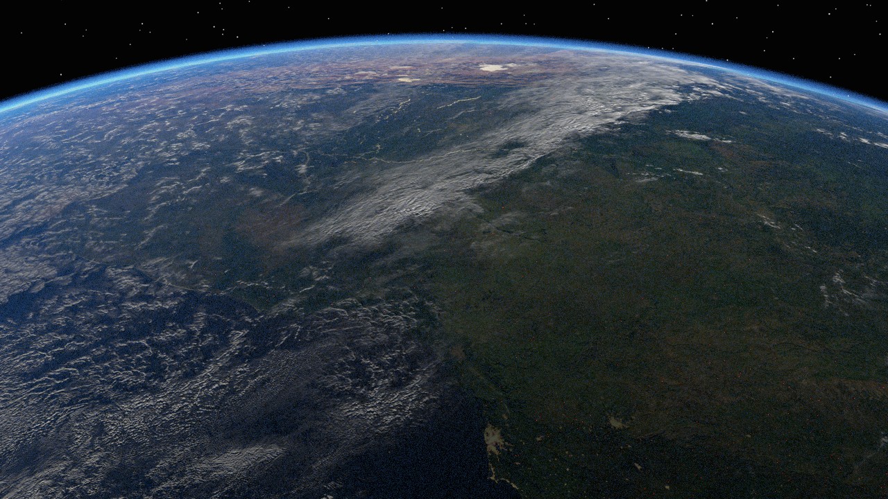
i also introduced 30k textures, which can be looked at in picture 3 and 4. the biggest textures from nasa come in 54k actually, but my computer cant handle that. I’m now using 5 textures, each 30k*15k. one for day-color, one for night-color, one for bump, one as specular mask for the water, one for the clouds. using all these my system spikes to 26gb ram usage upon rendering ;).
they allow to put the camera more close to earth though, which i tried in picture 3 and 4 (i worked on the atmospherical gradient using mostly that camera)
rendertimes are through the roof, iterating values takes ages :(.
I really like #4! I find the stars slightly distracting unrealistic though. I can’t tell what angle the sun is at, but do you have any specular on the ocean?
I agree that #4 is incredible looking, and share blenderd’s uncertainty about the stars. I think that your Sun could be fixed a great deal by adding some irregularity. Now it looks too symmetrical, and not like a real lens glare.
earth is AMAZING but i think the stars are too similar is size, brightness, and colour. Also there are no (apparent) interstellar dust clouds or galaxies. Also the milky way galaxy can sometimes be seen from space.