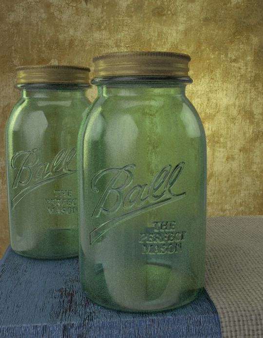
SO a while back I posted a scene with some mason jars. At the time I was really only working on getting the raised text on the glass. In this scene I purposly tried to make it look as PR as possible. THis was done in cycles @ 100 samples. Please let me know what you think.
This looks overall pretty good. I would suggest adding some wear to the lids, the bottles themselves look fairly used, but the lids not so much at present.
It looks good. I can’t tell if it’s just an illusion caused by the lighting or the environment reflection, but it looks as though you can see where the jar model goes from being cylindrical to spherical (or domed) just above the “Ball” label. Again, it might just be the way the lighting happens to hit it.
And the raised text looks cool.
Thanks for the input. @andvari I worked on the material on the lids for a long time to get the right overall look. I totally agree about the wear. I had originally started off with more of a rusty material, and that may be what I ultimately go with in the final render.
@Rajakabapockets I see what your looking at. Though there is a seam running down the back side of the jar and around the very top under the lid and bottom. what that may be is the “smudge” map I made. I had to uv the jar to get the raised text where I wanted it. However the smudge map was generated it didn’t look right when I tried to UV it. I think I am going to add a light at a distance over the camera. Thinking the front top edge of the lid needs a highlight. Hopefully that will help mask that area. Looking at it again I tend to think it’s the lighting.
Once again thanks for the input.
I love the scene. I feel like it’s a bit flat, lighting-wise. You need a bit more light on the jars and a bit more darkness behind them to make them stand out. otherwise, excellent work.
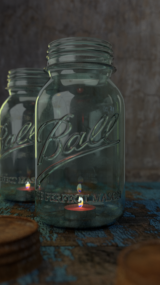
So here is an updated version of my first render. Tried to dress it up a bit. 500 samples no post Please any feed back would be greatly appreciated.
both look nice . the second image, the scale of the candle looks odd relative to the bottle, but overall its great
Thanks for the input, I tried several candle’s I originally had some tall stick like candles, but it just didnt look right, I went with the tea candles just cause they were easier to model and texture. I am not reall happ with the flame though, Id like to cast a little more light for the flame source, But I can’t seem to get it to be powerful enough without washing out the flame itself. I tried an area lamp behind the flame, but wasn’t happy with the result. Any suggestions would be great.
well for now i can only suggest that you add the extra glare through post comp.