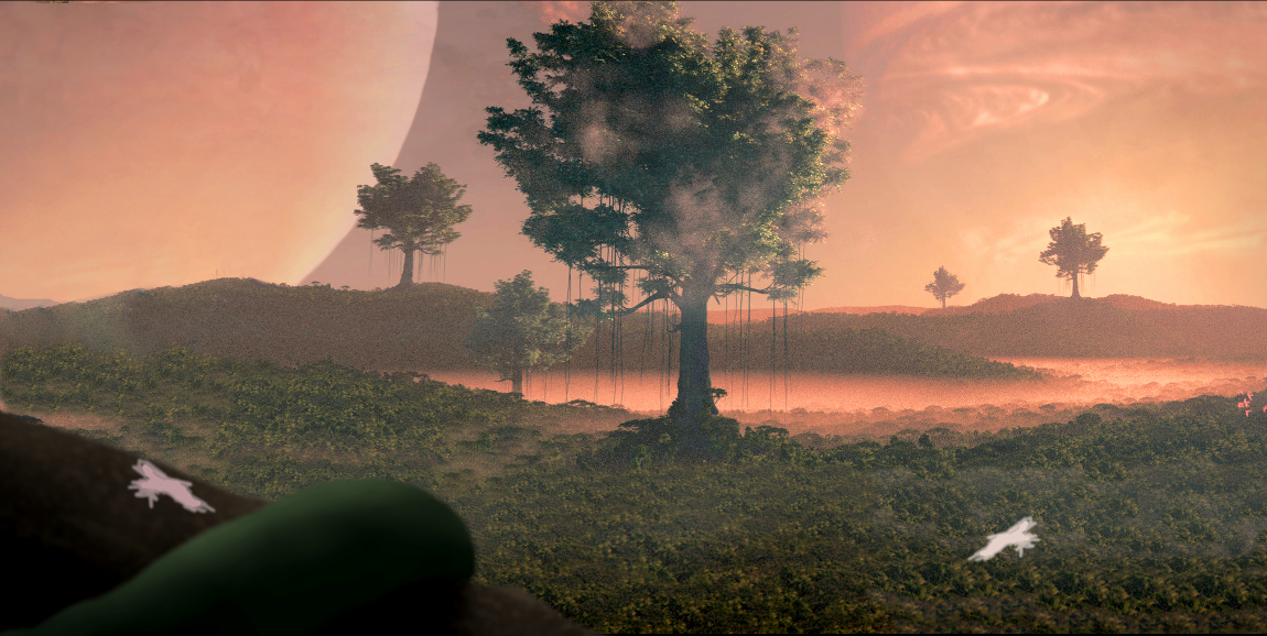
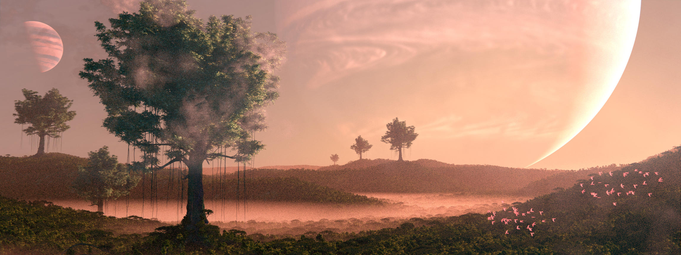
Hey people! This is my newest project, and since I owe much of the quality of my last image to the folks here in focused critique, I decided to do the same thing again. So, to keep it short, what would you change? Any feedback is greatly appreciated
Hi,
I’d say the atmosphere is good and feel of Sci-Fi, but I have two critics:
Or we are seeing giants trees that spawn out of the forest, or we see some trees on a grassy/mossy ground. Anyway I feel or these trees are out of scale compared to the others, or it looks more like savannah than forest. It looks a little odd to me (but it is your Sci-Fi/fantasy universe, then you decide).
The background give a nice “not on earth” look to the image. But the dark edge of your bigger planet is masked under your middle tree, and it feels like the small planet is in front of the big one. This look strange. Maybe you could put the big one on the left part and the little one at the right of your image to correct that ?
I got a problem with your birds too, but I cannot say what at the moment.
So I haven’t been able to work on this for a while but now I can. I changed the aspect ratio of the image, and the colors a bit. I think it looks a lot less cramped now. I’m still struggling with the planets, scale, and birds. The lianas and trunk also look pretty out of place.
EDIT: I feel like the scale is off. I need some element to give the viewer a reference point to understand the scale. At first I thought the birds would do this but it doesn’t really work the way I thought. It would be a bonus if was a sci-fi element as well. Any ideas?
Those trees are massive, if I understood correctly. Maybe the only way to show the scale with the birds is to bring foreground element back with some birds and show how massive the branches/lianas are in relation to them. Not highly detailed birds, just closer to some foreground element that shows the scale of a bird in relation to foreground detail. Could also help to sell birds as birds and not be mistaken for butterflies or insects.
(Foreground could be in focus, I put it off focus because it’s not really detailed, just some value.)
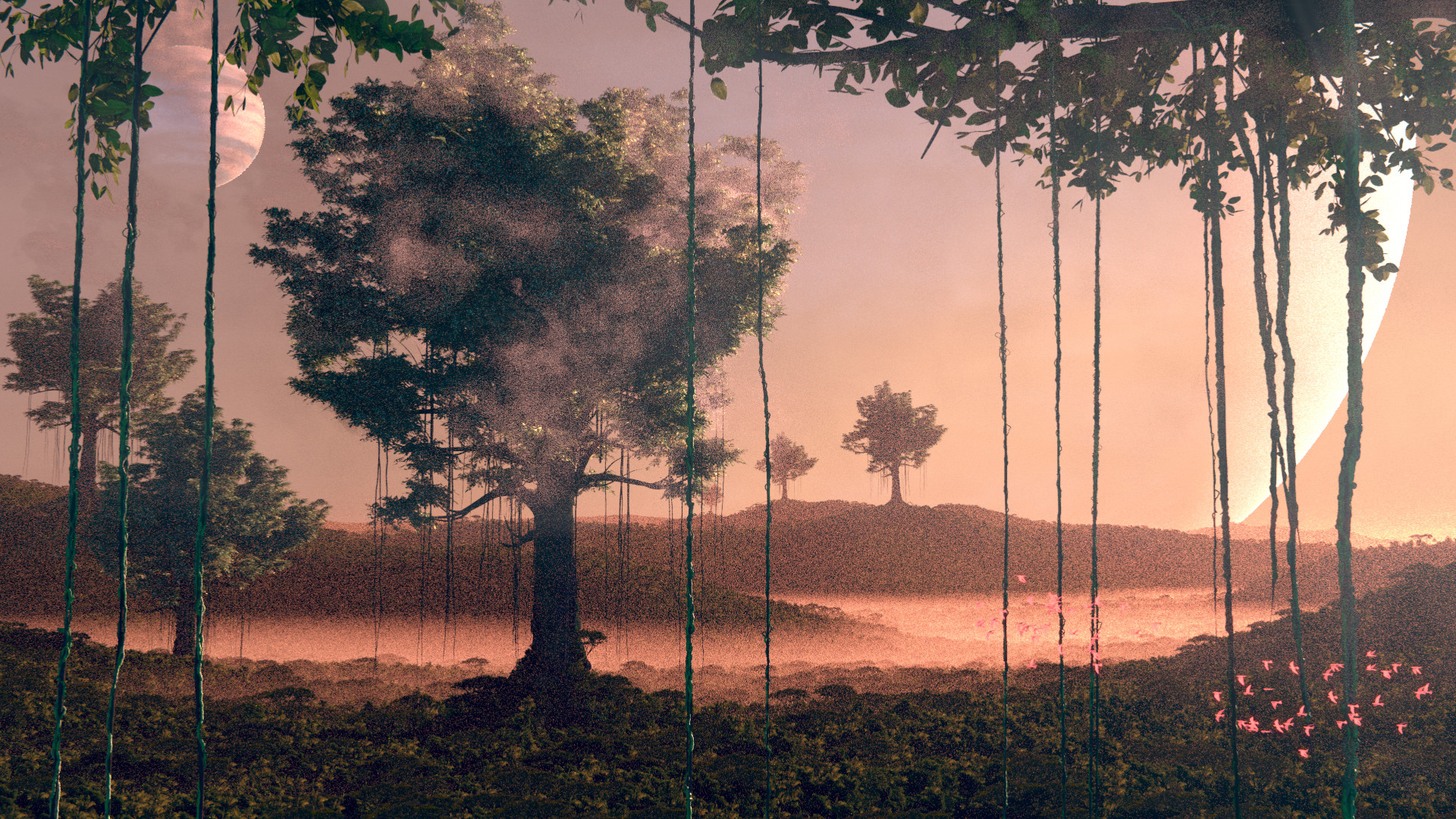
Showing more ground and adding more athmospheric effects might help to show that it’s a long way to the ground and especially to the next tree.
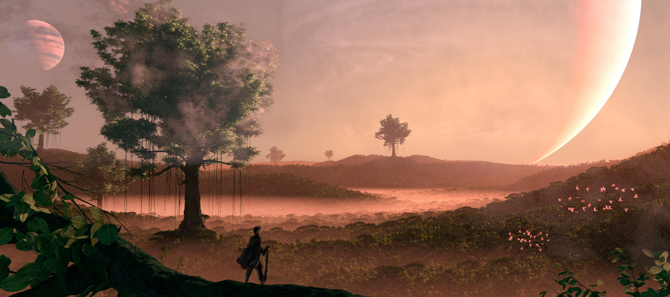
Not a big fan of those 3 perfectly aligned and scaled trees in the background. I took the last one out and moved the second a bit.
I think it would be cool if you added a whole flock of birds around the tree in the middle, it would really pull the massive scale in your scene together.
Its not really clear to me whats going on in the foreground right now, but it is still a WIP so i’m sure you will add more detail. Over all though i think its looking great! Keep it up.
The first “cardinal sin” in this shot is the murk in front of the tree. It can’t plausibly be “lens flare” … it honestly looks like you need to clean the lens.
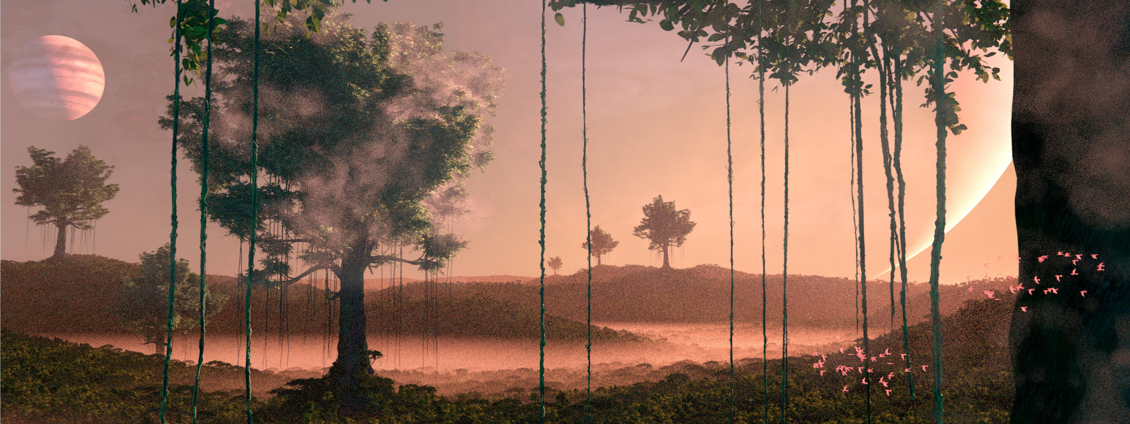
The various versions play with the background planets in various ways that don’t make visual sense. In post #5, for example, it seems that Jupiter occupies the same space as the gigantic planet.
If it were me, I think I’d take shot #4 and remove the large planet. Put an off-screen gentle sunrise at four o’clock and crop the shot on the right-hand side to remove the trees and the flying-things in front of it. Add visual highlights consistent with the sun coming in from that low angle. Keep the vines. Add some light reflecting off the hillsides, including the one beneath the tree at eleven o’clock as well as eight o’clock, so that we perceive the three-dimensional shape of the hills. Generally increase the tonal-range of the exposure so that it isn’t murky.
Big improvements this time around! I changed the aspect ratio a bit, added a foreground (which is still very much a WIP), and I made some smaller changes here and there
I suggest that you get a couple of pieces of cardboard and make two L-shaped pieces out of them. Hold them so that their corners point in diagonally opposing directions, making a variable-sized rectangular or square opening. Now, with these “cropping boards,” look for the tightest crop that you can make … the one that blocks-out as much stuff as possible to zero-in on what is the strongest possible “telling of your visual story.”
I think that this image will benefit from strong cropping. There are too-many things going on, too much distance, and thus, no real, clear point-of-focus, no path for your eye to trace through the scene, no clear story being told.
Also, feel free to experiment with different placements of the camera. Right now you’ve got a bulls-eye composition covering a vast expanse, with the suggestion of equally vast Z-depth. You just can’t do (IMHO …) all of that at once.
@BjarkeDuDe
There is something called the rule of third, where you should make sure to keep the focus of the image within a smaller area.
you have 1 focus spot within the suggested area, and the rest is spread all over the place.
this makes the image unplesent to look at, because my eyes are being drawn everywhere.
I am familiar with the rule of thirds and I do agree with you that there are too many points of focus. This image however is based on the Fibonacci Spiral, albeit not that well. I will have to make some changes
my suggestion would be, make the big planet darker and barely visable, move the big tree slightly to the bottom left corner, move the birds to the bottom right corner, make the leaves close to camera blury, (same with the bush on the right side) and no idea what to do with the guy tho…
Mentioned in my earlier post that the attached image is not a composition I’m suggesting. Not sure if this is either because I had an idea of a different direction one could take the image. I suck at drawing but luckily I don’t have to achieve a pretty image to convey the idea
I was thinking about those massive trees and the scale. The camera is high up and showing less ground level detail (because it’s far away) could make it a bit difficult for the viewer. The foreground elements you have already help that a lot but tried another camera position. I placed the camera on top of a hill that has regular size trees/plants and show that the big ones are really big.
Since it’s a fantasy/sci-fi theme, could make those big trees a bit strange looking, maybe make them flourish while the trees/plants around them are dying as if they were sucking the life out of them. Could maybe show it with dark color and put less plants around the big trees.
Just an idea. Maybe there is something you can use in your scene.


 Great job!