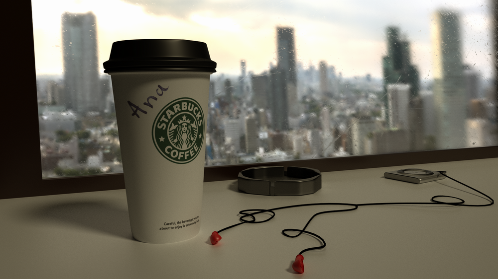
i was doing renders with tutorials about 1month, this is my First own render without helping tutorials ![]()
need your opinions and critics.
Your composition is good. It is a nicely balanced picture.
here are two things that jump out at me:
-
the window: Is it supposed to be wet? It looks more like it is scratched up. If you are going for a frost effect, it is a good start, but it doesn’t look quite right yet.
-
the table: The grain appears to be running the same direction as the middle section of table. Usually, when I see tables with that pattern of inset wood with edge pieces, the grain tends to run the direction of the edge. I did a table similar to this a few weeks ago so I have enclosed an image showing what I actually mean.

I made duplicates of my materials for the horizontal and vertical edges and I just rotated the z angle on my mapping node 90. I hope this makes some sense.
Anyway, you have a really good start! I need to get some coffee now.
you’re doing well. it’s good to break away from tutorial mode. it’s better to decide what you want to do, and then find out how to do it.
yeah, window is supposed to be just scratched, not wet or frost effect, but i know it looks like a wet or something.
thank you for good tip.
Blender internal renders really tend to bother me so I can try to help you without telling you to just convert into cycles. You should soften the lighting because it looks too sharp of a shadow on the table for what it should be in a setting with a sun. Also, add some translucency to the cup lid. And one major thing that really got me was the ipod and headphones. the ipod is too small let alone the headphones. On the scale, it looks like the headphones would fit a tinker bell sized thing. Also, the table, there is too much displacement than what a normal table at a restaurant would have. Plus, there is no “noticeable” texture. Since this is your first piece, I don’t think you’re aiming for a feature already, but in the future, make sure there is a clear focus with guiding, colors, and compositing (DOF/vignette/coloring).
Just to add - On the cup top - If you look at actual cups, they are molded and typically have a bit of texture just due to the process… you may want to add a displacement map just to give it a slight orange peel texture to up the realism a bit. It can vary part to part, but sometimes there are small inclusions in the mold as well, like air bubbles… (I work in the rubber industry and design extruded and molded parts… sorry for the OCD!)
Excellent as a first render!
the texture of the vessel is great, I think You should adjust the saturation of color because the vessel cover and the frame of the window are more saturated of color than everithing else, to have a better texture on the table You can select the table, chango to edit mode, select the top of the table, hit the button 7 on the numpad and the hit the letter “u” and select project from view. Then You can adjust the scale. Good luck.
This looks quite neat indeed. The writing on the cup especially looks really realistic, I think.
Regarding the proportions, the ends of the ear buds look, very tiny, at least compared to those that I have seen.