This is the first project that i’ve uploaded.
I’d appreciate feedback on anything, but mostly on lightning and details.
Thanks in advance.
(rendered with cycles)
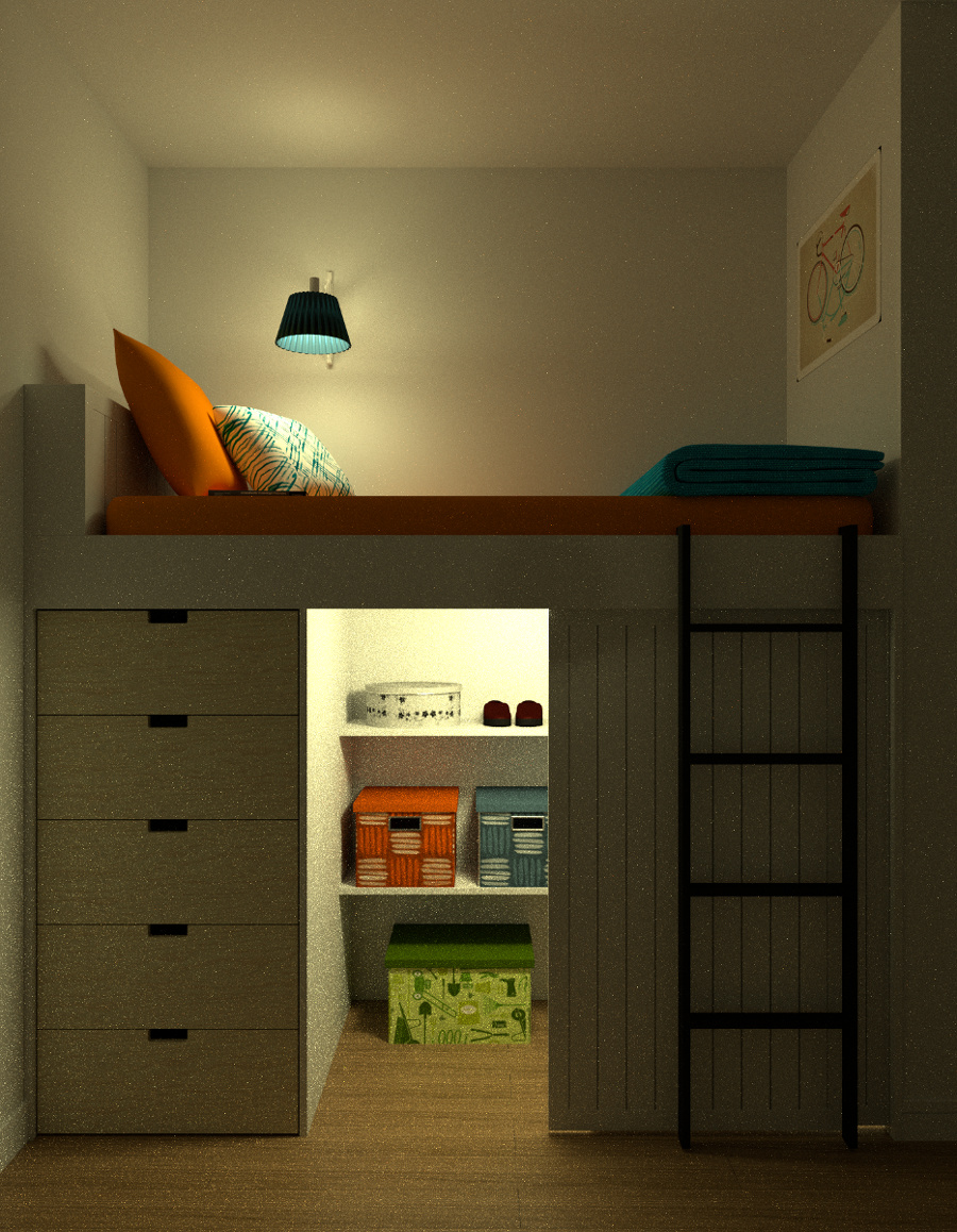
I like the modeling. I think that you have a really great start here. I might suggest a sample update. It would help the graininess. You might also want to scratch it up a bit. Right now, everything looks very clean and not very “lived in”, so to speak.
This is a great start. Keep it up!!
Thanks a lot.
I will try to add scratches and make it look more used.
it looks great to me,
but the orange pillow, i think it should have some folds, it looks very smoothie to me, and i don’t like the white dots on the image, try to turn on caustics
What you have looks good so far, but the scene still feels bare. It feels more like a “show room” than a lived in space. Other than the picture of the bicycle, There’s very little to tell us about the person who lives here.
Also, in addition to “scratching things up”, you might also consider the placement of stuff. Things look too perfectly aligned and neat. Unless the person is OCD (and even then, I’m sure there would be some slight variation).
You have a great start. Push it further!
Do some sculpting on the bed and pillows and a little on the blanket to make it more realistic. also the orange pillow corner is a lot too sharp, because pillows usually have a curved corner.
It is looking good!! and it look like if You had waited looooooot of time to render, the blue and the pink boxes on the closet have something weird, I don´t know what, You should check the boxes no direct and indirect caustics, change the clamp value to be more than cero and put a traslucent shader node to the screen of the lamp up the bed, I am agreed with the sculping coment and the stairs look good but them could be great if You change the material. The green box in the closet is like pasted to the floor.
Great modelling details - the others have hit the more technical items… but I’ll add that you may want to change the setup a bit as this is very square to the camera, remember the rule of thirds and come at this a bit from the side… what is the primary focus of the image? Kindof looks like a catalog shoot…
I’d say rotate it a bit so that the ladder is closest to the viewer , drawing the eye up into the bed area… I realize there are some modelling details you want to capture that would then be out of frame or obscured, but you may be capturing them at the cost of a better perspective.
Maybe set the camera from the viewpoint fo a child about to climb into bed… lower and to the right, and a bit darker may make it more dramatic.
Looking at this again - if you dolly the camera back away a bit and to the right, you could expose a adjacent wall with a window showing a moon and clouds through curtains, setting the scene (bedtime) a bit more.
Just some ideas…
Love the model it is a good idea. I agree with tc2466. What catches my eye is that the pillows, bed and blanket look too perfect. The orange pillow looks really stiff. Maybe some subtle folds or hints of folds would make them look more realistic.
edges are sharp, when i reality everything has at least a little of bevel.
drawers has exactly same texture placement, could mix that.
floor could have some reflection and fresnel.
I’ve never had drawers under my bed, but according to the bed size the person using this room might have problems reaching the contents in the top drawers. Maybe they would better be open shelves. But please check for yourself, it’s just an idea. Also the actual size of the room would be defined more clearly.
Awesome! There are a couple of things that I think could improve
- The scale of the scene is a bit off. From the size of the pillows and lamp, the bed doesn’t seem long enough. The ladder looks a bit to large on the x axis. And also the little space beneath the bed looks a bit too small, unless it is for a child. These are not very noticeable, but could make the image look better.
- The walls are perfectly straight and smooth. Try adding little imperfections, with a noise texture maybe. Also add color variation; everything is so clean! add some dark spots, dirt on the walls, specially near the ceiling maybe. Also, where the walls meet the ceiling, it is perfectly straight and sharp. Try adding a bevel or those details you see on some ceilings’ edges (don’t know the name)
- The floor could have a footer, and usually the footer has the same material as the floor itself. The floor is also too clean.
- The image doesn’t have a focal point, and the light inside the little room under the bed looks a bit too strong maybe. The other light is o.k., but you should maybe add a light source that is off screen, coming through the hall, and have a shadow casting, of a plant maybe, so that it adds to the realism, depth and the fact that someone lives in the house.
The details are good. Try sculpting some wrinkles and detail in the pillow and bed. For the mattress, you could even use a cloth simulator, so that it looks more realistic. It also look a bit too thick. - Increase the sample a little
The image looks great, these are just some more suitable things that add to the realism.
feels nice and cozy. one thing i noticed that doesn’t seem to have been brought up yet is how little light appears to be affecting the lampshade. the exterior is very dark, and you would expect a least some light to transmit through most type of fabrics. this is supported by the light hitting the wall, which would otherwise be shadowed by such an opaque lampshade.
also, the interior of the lampshade is less blown out than the pillow, despite being closer to the light source. not sure if this was intentional, but i think overall making the lampshade feel a little more luminous would make the lighting of the room feel more “real”