Hey guys, I have now been using Blender for just under six months. I am still definitely learning the ropes ! Composition and lighting is one of my biggest weaknesses currently, so I was wondering what you guys thought of this ?

It honestly looks fine if it is just meant to be a still portrait. Maybe if you want to convey some action you should switch it up, but I don’t know your intentions.  The lighting and model is great by the way!
Hey, two things that stick out to me are the hair looks like it was just washed and blowdried-you might want to go for a greasy, stringy look. Also, you might want to consider rotating the rings a bit in his ear, to break the uniformity. otherwise it looks fine to me.
I agree with Frobenius.Edge about the hair and earrings, but nice sculpting!
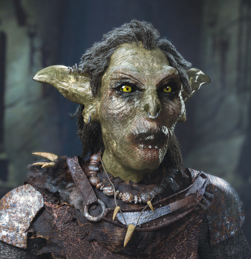
Hey guys, I have taken your comments on board and this is what I have now :
I have been struggling to make the hair look wet. Do you think I need to increase the root thickness ? The glossy shader I have used is at 0.50 roughness. Is this too much ?
There’s some great tension in this composition. His eye lines draw the viewer’s eye out of the scene, but not far because he’s so close to the edge. At the same time the lighting and sharp angles of the ear draw my eye back. My gaze bounces left and right. Is this what you want?
Sorry to come across naive but could you elaborate a bit more for me ? ![]()
The hair looks much better! My suggestions would be to lower the roughness to something like 0.2, and also comb the hair so it is in clumps (like large strands of multiple hairs). Just some thoughts. 
Cool ! I had a play around with some of the settings and I got this result :

I think this is more fitting but I will see what I can produce tomorrow ! Thank you for the advice Shadow Camero ! And thank you to everyone who commented and gave their input !
Correct me if I’m wrong, but I still feel like the right side of the model is a bit too ‘blended-in’ with the background, and the overall tones are just too ‘white’-ish.
In general, when you make a still portrait, you want to make your model really stand out (maybe add some lighting color variations?). I think that excessive glossiness is a problem as well - that shoulder pad and the overall face glossiness makes me feel like it’s wet. Is that your intention?
Regardless, I feel like you should play around with the overall tones and the roughness - maybe if you bumped up the Sharpness factor a tiny-teeny bit and darkened the glossy reflections (decrease gain a bit?) - you’d make it stand out better.
Also, the mouth feels a bit too shallow - you might want to add a bit of depth to that; and those earrings seem like they’ve been there a while, which means they should have made some dents in his ears (at least the ones on the earlobes).
Apart from that, awesome modeling and sculpting! I love your idea! What did you use before Blender?
Thank you for your input Kroopz ! I completely agree with all of your points and will definitely look to lower the level of the glossiness. I have not used any 3D programs prior to using Blender, this is the first 3D program I have ever used. I have started dabbling in Sculptris and used that to sculpt the head in. The armour was built in Blender and so was the rendering !
That is an outstanding job for someone who has only used Blender for half a year! (Not that it’s such a short term, and it in fact is just about enough time to get used to the workflow and get on a professional level, but seeing as you have no previous 3d edperience, I gotta say - that’s very impressive).
Thank you for the encouragement Kroopz ! It is greatly appreciated ! Here is my latest render, I will be looking to apply the things you have suggested in my next one !

Very good job for 6 months!
I’m not sure what range of comments you are looking for, or which parts of the model you are considering complete, but just a couple of things I would think about. I think the mouth is a missed opportunity. It is so often one of the most expressive parts of model, and in this case it has the opportunity to be one of the most grotesque too. I would definitely model it so that some (very bad) teeth were visible. Next thing I would look at is the ears, there doesn’t appear to be any ear hole or definition to the various parts of the ear. A little SSS (or thinner ears if you already have SSS) might help to make it look a little more natural.
As for composition, I guess it depends on how you want to present him. He looks a little bit like he’s studio lit right now, and a bit superimposed on a background (the value range in the FG and BG don’t match, i.e. your shadows in the FG are darker than the BG). If you’re interested in composition, rather than just modelling (good thing IMO!) then it is often better to plan of as much of the composition and design as possible before commencing with the real modelling. Of course you should revisit the composition and tweak/change it as necessary, but it actually informs so much of the modelling process too, so it helps to do sketches first.
If this were my project I would have started by coming up with a reason for the image (what’s he doing, why, where, etc). Right now he could be asking himself, “Did I turn the stove off?”, for all I know! The context that having a concrete idea brings actually makes it easier to embellish the image in a meaningful way - it will guide you in terms of what kind of lighting would be believable, what kind of background would work, how to pose the character and give them appropriate expressions etc. I would then sketch a way to construct a scene that compliments the character. After that I would start to block out basic shapes (if I were modelling the BG too), and once I am happy that the composition will work I will then begin modelling.
Thank you Blender Matt for the insightful tips. I have to be honest the mouth has been bugging me for a while and I am glad others such as yourself have picked up on it as well. It gives me a reason to go back and give it some more detail. I like the tips you have on creating the scene. This is my biggest problem unfortunately as I have never done free hand drawing for things like this ever ! 3D art has always interested me and so I have decided to give it a go. I find it easier to do than drawing. Would you suggest to start practicing my drawing or are there other ways to concept a scene ?
making mouths and ears is a super pain, but if you are going to spend a lot of time texturing a model, it makes sense to spend some time on these areas beforehand. also, I would suggest using a bump map to make the upper ears less smooth. because mouths and ears are so weirdly shaped, it is good to have a reference pic or two, or it can be confusing.
Glad it was of some help to you. ![]()
Don’t worry about having any 2D skills, the sketches are just really general scribbles that help to create a framework of what you are visualizing the scene to look like. My sketches are really quick, just a couple of mins or so, and I would do several in order to assess and compare different ideas. All it is is sketching in general shapes, locations of objects and figuring out how the interact with each other to create a cohesive design that serves to actually support whatever you goal is. The point isn’t to create a 2D sketch that looks as good as your final render, it’s merely a tool to help organize thoughts and to create some direction for your art to take…which can of course be altered as and when necessary.
Thank you for the insight Modron ! I will definitely check out references and hopefully will be able to come up with something !
Thank you again for the input, it is greatly appreciated. May I ask ? If you were to light this scene what kind of lighting setup would you use ? I currently have a three point lighting set up that gives that studio effect. What kind of lighting would you use to make things a bit more natural looking ?
No problem. The lighting would depend on the scene I was trying to portray. If you take a look at my Laocoon sculpture (“latest project” link is signature), I can say that I chose my lighting based on what the scene was supposed to mean. In my case it was the discovery of the statue, so I wanted the lighting to support that. The light from above indicates that the statue is in some kind of chamber, but I do not make it explicitly clear whether the discovery is happening from above looking down, or from the perspective of the actual image. The extra hint is the warm light source to the left, which contrasts with the cool light source from above (and ambient bounced cool light), which might imply that it is a light from a flaming torch in an explorer’s hand somewhere off the image to the left.
However, I took several liberties with the realism of the lighting in order to get the image to look the way I wanted. There are a few mistakes too; one I forgot to fix (up lighting on the left should have been removed to prevent the highlight beneath the arm), and two that I changed settings for prior to rendering and didn’t notice until it was too late (the volumetric lighting is missing the shadow plane, and I accidentally changed a setting that meant that I could not properly composite the image without it looking a little more fake than I wanted).
Anyway, the point is really that you might find it easy to come up with an idea for the scene, and make the lighting work for that, rather then try and come up with the lighting with no reference for why you might present it a particular way. Right now I have no context for where he is, or what he is doing. Is it night time? Is he outside? What is the bright white light that is illuminating him (from the top left and right)? The background looks hazy, but he looks studio sharp. There are several inconsistencies that actual break my immersion with the image, rather than enhance the image in a way that does not break the immersion.