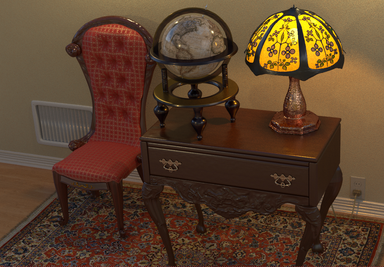
This piece has been on the slow burner. I’ll add an object here and there, and then it just sits around for awhile. I wanted to show a few renders and get some feedback. I am going to push it in a more dramatic direction, I’m just not sure exactly what. One idea is a peacock feather pen that stands out right on the desk. There is no compositing yet, and I’m still experimenting with lighting. Each render has a slightly different lighting setup.
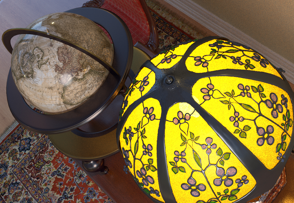
well, the models are super. you could add add a texture to the roughness to gain even more realism. (wood of the globe). only thing to improve is the lightning. A strong sun light for example.
@juanrev, thanks, I am going to mess around with the wood shaders, they look too plastic
@SirNik, how are you man? Thanks. I plan on going over all the materials again, and adding roughness grunge maps. I still can’t decide what kind of lighting I want I’ll need to do some more experiments.
I’m fine. currently working on my last project till I have a 5 month blender break
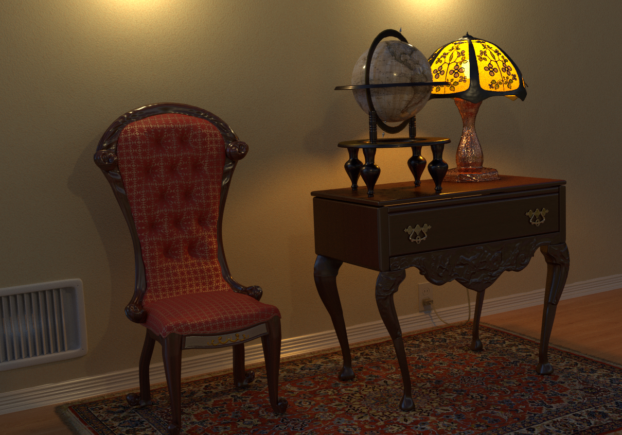
I usually light my interior scenes only with a hdr map. A night scene would also be interesting. like on the second shot, but with more contrast and shadows.
How did I miss this? Well done. I love how you did the carpet, looks top notch. Can I ask how you did the tiffany style lamp…curious from both a modeling and texturing standpoint?
In shot #1 it seems the chair may have a little too much gloss, but then on other renders it doesn’t seem that way.
@SirNik, we all wish you the best, and will look forward to your return in a few months.
@Harleynut, Thanks.
The carpet I wish I could say is complex bump and particles, but , er, it’s pretty much just an image texture from cgtextures. I took it into photoshop and added some noise. Now the edges that is a hair system, and I think that helps sell it a lot.
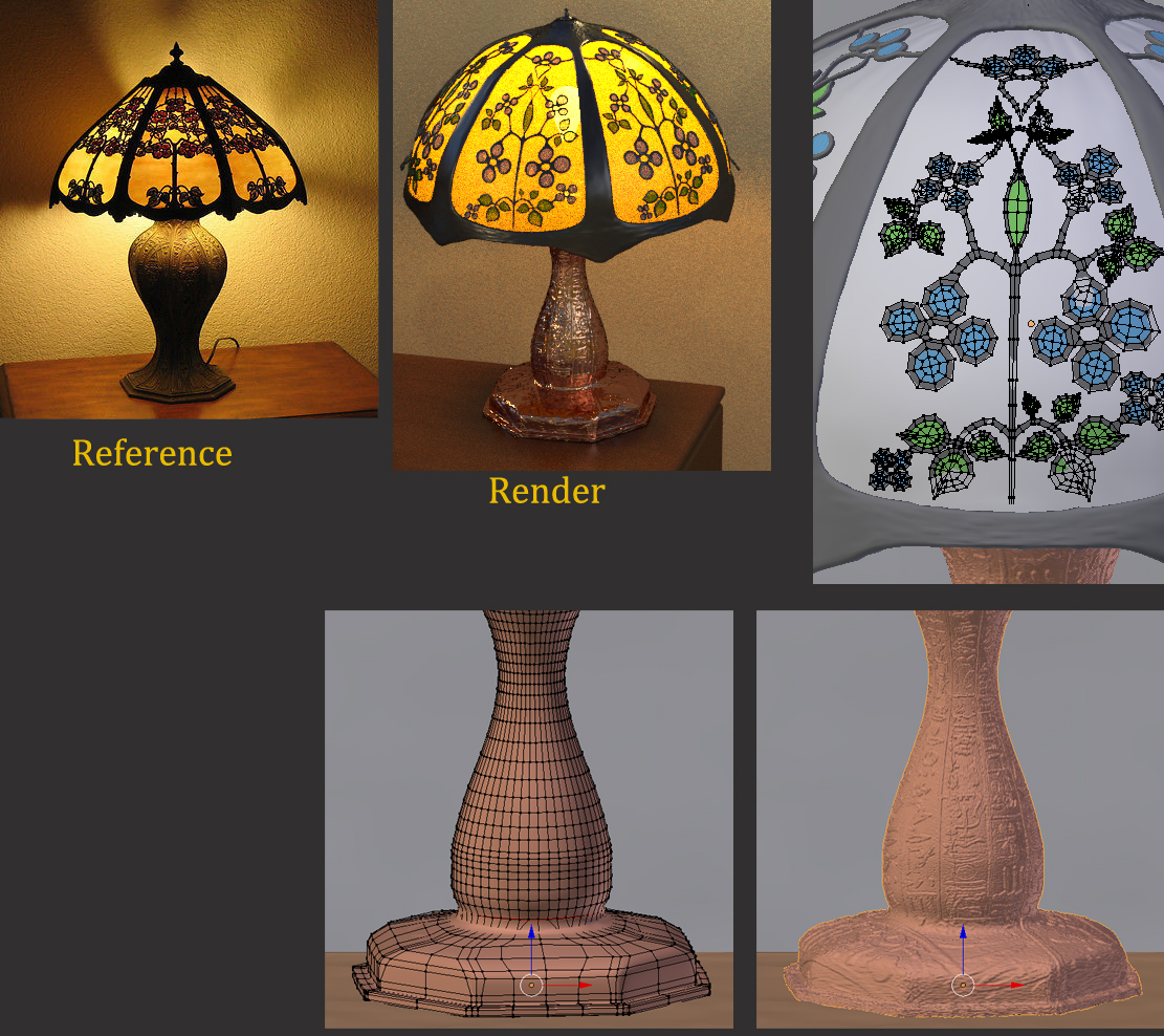
The lamp is all modeled, I topo’ed the floral design onto the “shell” I need to work on thenodes the the lamp to get it looking really nice. Right now there is a copper shader, the yellow/orange lampshade which is mixed with tranparency using a textured mask. And then the dark metal lines surrounding the floral patter, and then the floral glass shader.
I made each piece using a single reference image, and just used it as a baseline, not wanting to reproduce it exactly but simply as a guide.
I can decide whether to do a whole room, or just focus on what I have here.
It seems that the globe is exceptionally mirror-like. Most globes seem to be made of paper or card on the exterior…Yours seems to be made of glass. I would agree with an earlier comment about playing with the roughness setting on it. As it is it looks neat, but strange.