It sounds like you’re pretty comfortable in Photoshop. That’s good, because most texturing isn’t even done in Blender. It’s taken me a while to learn about texturing, but there are some great references and resources online.
I don’t know how much you know, so I’m going to write about everything, starting with adding layers on top of existing materials. Go ahead and skip the parts you already know.
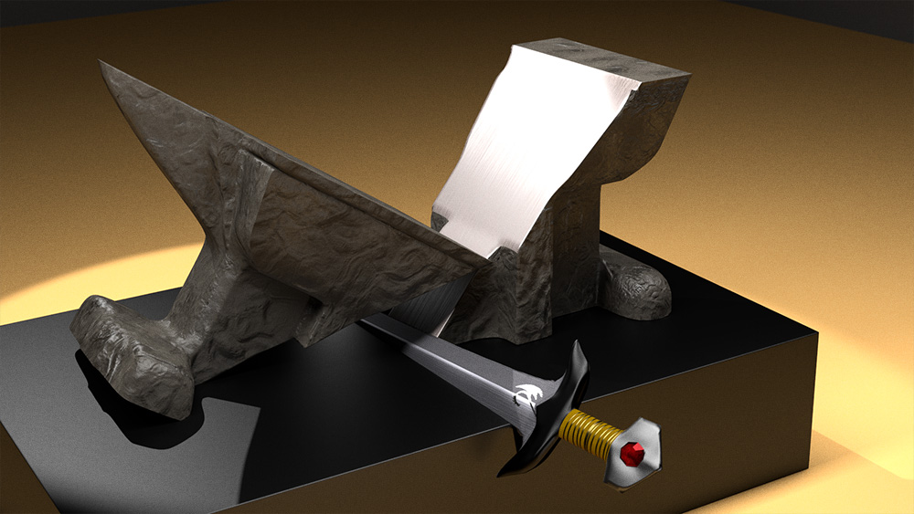
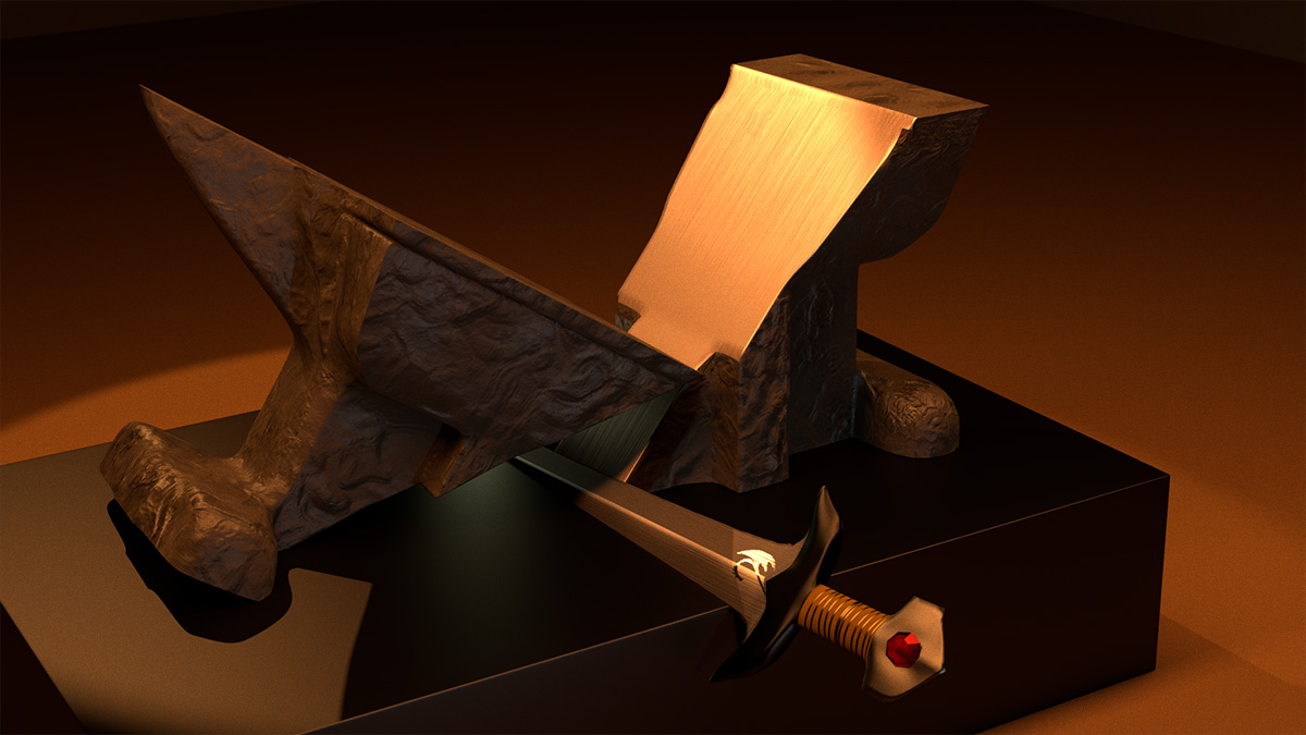
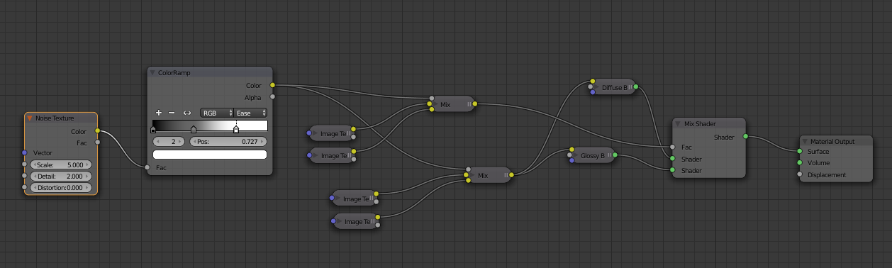
First, hook up the texture you are trying to layer into an emission shader so that you can look at just the texture. Then, mix the textures-I always use an alpha map of some sort, or plug a noise texture node into a colorramp and use that as a factor to mix textures with a Mix RGB.
Once you are satisfied with the layering, use that same colorramp as a factor to mix the other textures (as I have done in the example) and plug’em into the shader just like normal. You’ve made two specmaps into one, and two colormaps into one. You can do this with normal maps, too. And you can use any kind of texture instead of the noise at the beginning- marble, musgrave, voronoi, you can even use image textures if you set them to non-color-data.
Some nodes to know and use often are: colorramp, color curves, mixRGB, invert, math (this one is so important). It’s all about tweaking the values till everything looks right.
Getting the Textures:
CGtextures.com has great high-resolution textures, 10MB a month for free, with a few limitations. It’s really awesome, even if you can’t afford any more than a free subscription.
3Dtotal has some nice free textures, too. Make sure to read the license information for both sites.
Making the Maps:
http://www.blenderguru.com/tutorials/the-secrets-of-realistic-texturing/#.VDnamvldV8E this tutorial is awesome because it goes over the 5 basic texture types and then gives you a good solid node setup. BUT: Don’t worry about the program. You don’t need Crazybump or Knald or anything like that (But they are awesome, I wish I had one).
So if you find a nice woodgrain texture for the floor or something, then open it up in Photoshop, and then make several copies of that layer (I use GIMP so some of the steps may not follow). To tile the image if you want to do that, offset it by 50% on the x and y axis (in GIMP this is ctrl-shift-O, took me FOREVER to find that), then basically just use the clone tool intelligently. Here are a couple of videos of a pro doing it in PS: (and a video of him alpha-masking a texture that I haven’t seen yet. Awesome!) https://www.youtube.com/channel/UCjT4kEPRJvt8AnxtC8ejfCg/videos.
I make spec maps by playing with color curves, brightness/contrast, and merging several layers together using darken/lighten only, multiply/divide, and overlay. I often make changes color-by color (for example, an image may be of painted metal, the metal part will be more reflective than the green paint, so darken the green channel and lift the other channels) and I always desaturate it, usually before most of the other steps. Specmaps should be black and white. Just look at the picture, think “what part is shiny” and find a way to isolate that part as white and darken the other parts. Of course, the contrast shouldn’t be too high, you should never have areas of full black or white in any image, but should make good use of every value range. So instead of pushing the contrast with the brightness/contrast, sometimes it’s best to use curves. Also, when you save the map, it’s usually best to use a lossless file-type that can hold an alpha channel (like png), and you should save spec maps and occlusion maps in grayscale mode to save on filesize (hi-res textures in color can be 25MB each).
Occlusion maps are made the same way as spec maps but they have more white, basically. I usually make the occlusion map first, copy it, and use it as a multiply over my specmap.
Displacement maps, are hard, I still haven’t figured those out.
Normals maps are easy. For you, there should be an Nvidia Normal Map plugin in PS, but I had to search for a copycat plugin in GIMP.
So anyways, I hope this isn’t too much, I hope it helps. There are a lot of tutorials out there about node setups, and this is stuff I’ve learned from watching a lot of them.
Anyways, I love the idea of doing an Opera piece. Opera doesn’t get nearly enough recognition. It’s awesome, I too wish i knew more about it. I only know a few of the names, like Wagner, and Barber of Seville. I should watch one of those one of these days. Good luck!