One of my tests evolved into an environmental scene of relatively abstract (painterly?) nature and I wondered if, keeping in mind that simplicity while keeping the composition expressive was the point, it could be improved without excessively extensive changes.
I posted this in the WIP section as it isn’t either really finished or a complex work.
EDIT: added some post processing
EDIT: slight tweaks
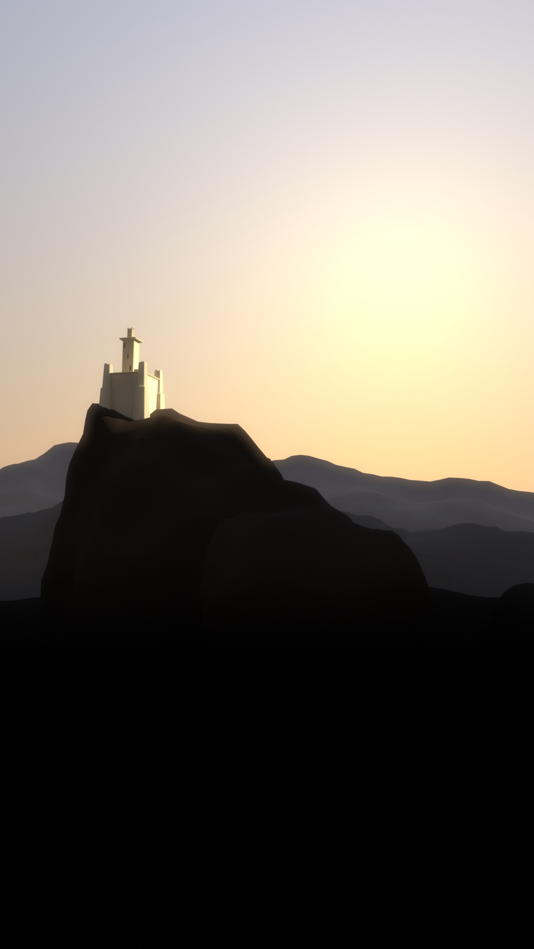
EDIT: more tweaks, final version?
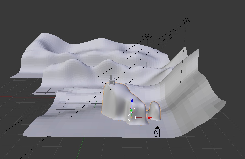
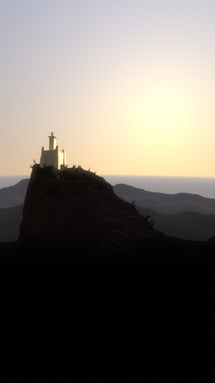
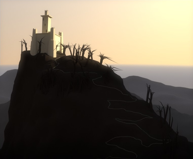
EDIT: added displacement
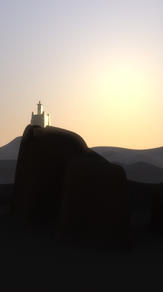
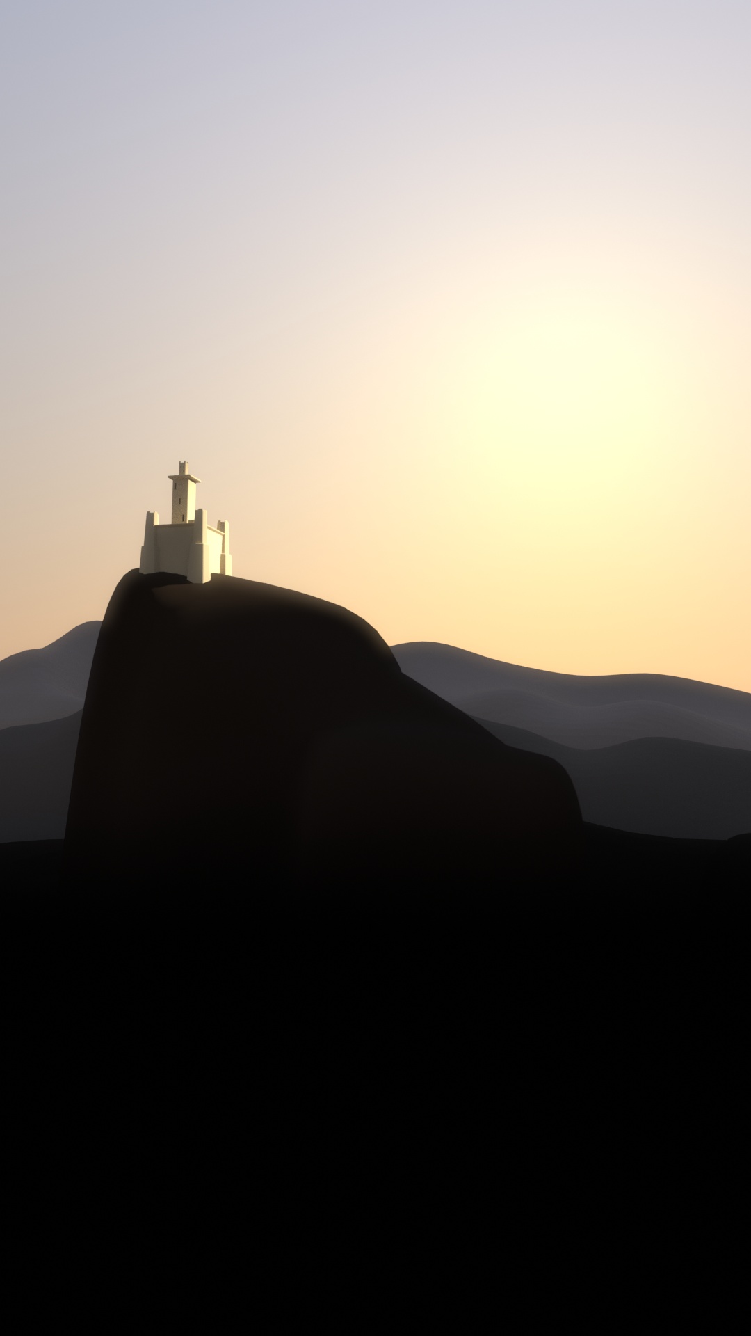
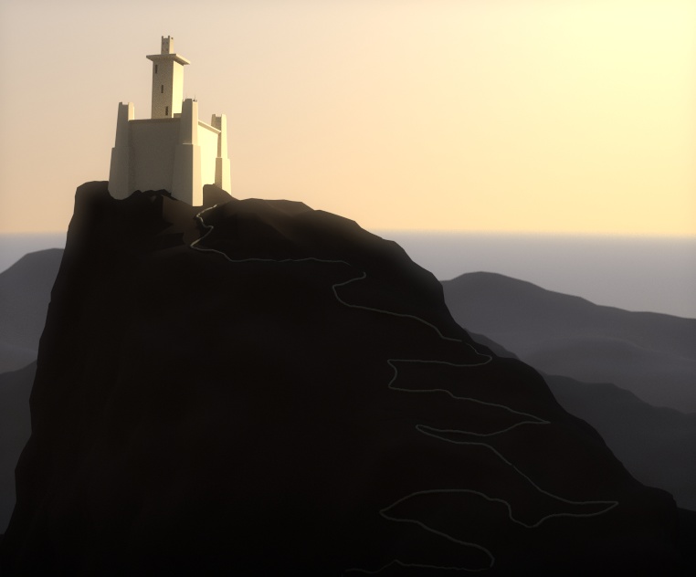
EDIT: added ocean-like horizon
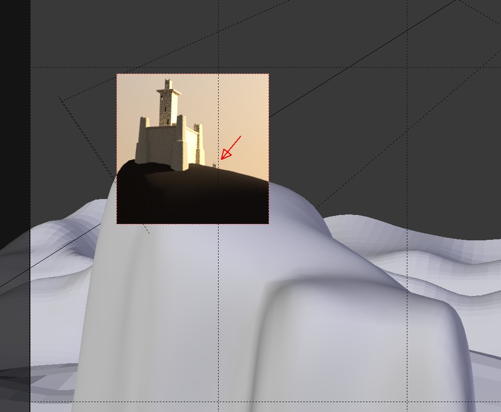
EDIT: slight tweaks to the ocean, slight depth of field adjusted (focus on the top of the front most caste tower)
Following some suggestions around I tried tweaking the original composition further in a slightly different way. Somehow I think the composition turned out looking differently than what I originally intended creating. What do you think about that?
I think I’m pretty much done with this scene and am relatively satisfied with the end results.
This is the entire scene, pretty simple and “cheaty”. I deliberately chose flat shading for the background hills as it cheaply gives some sort of texture to them:
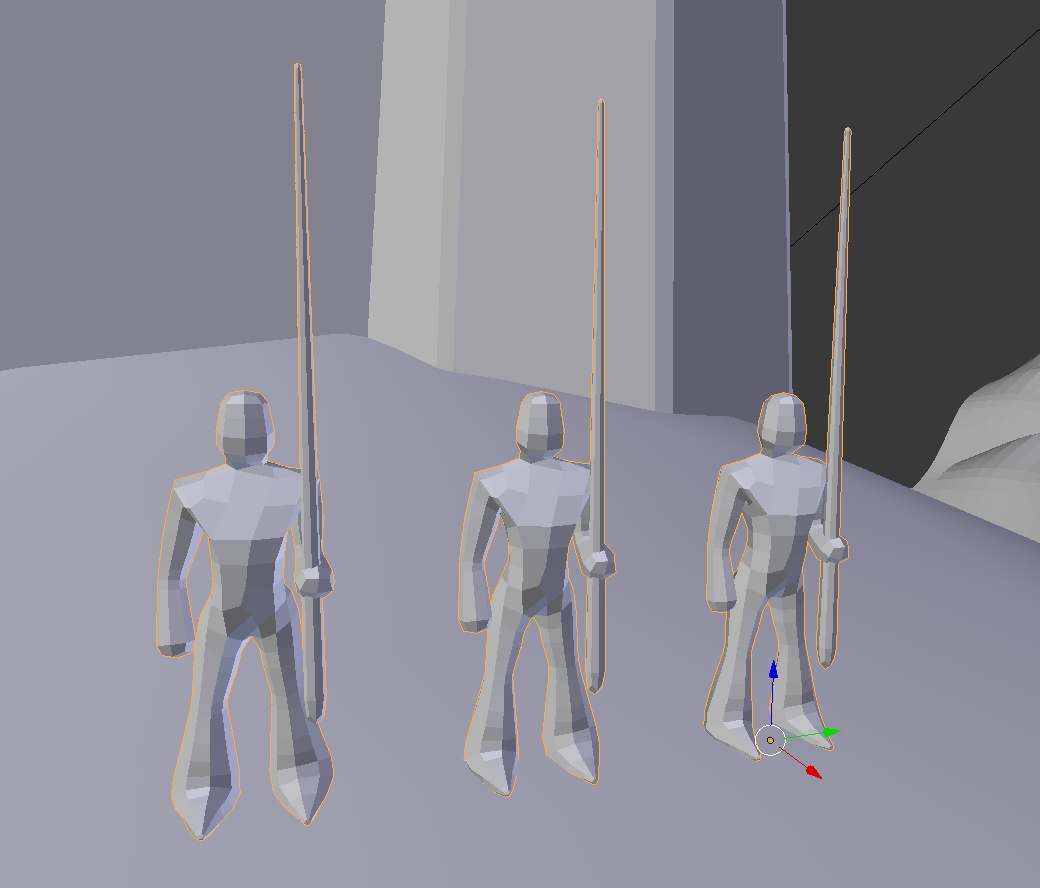
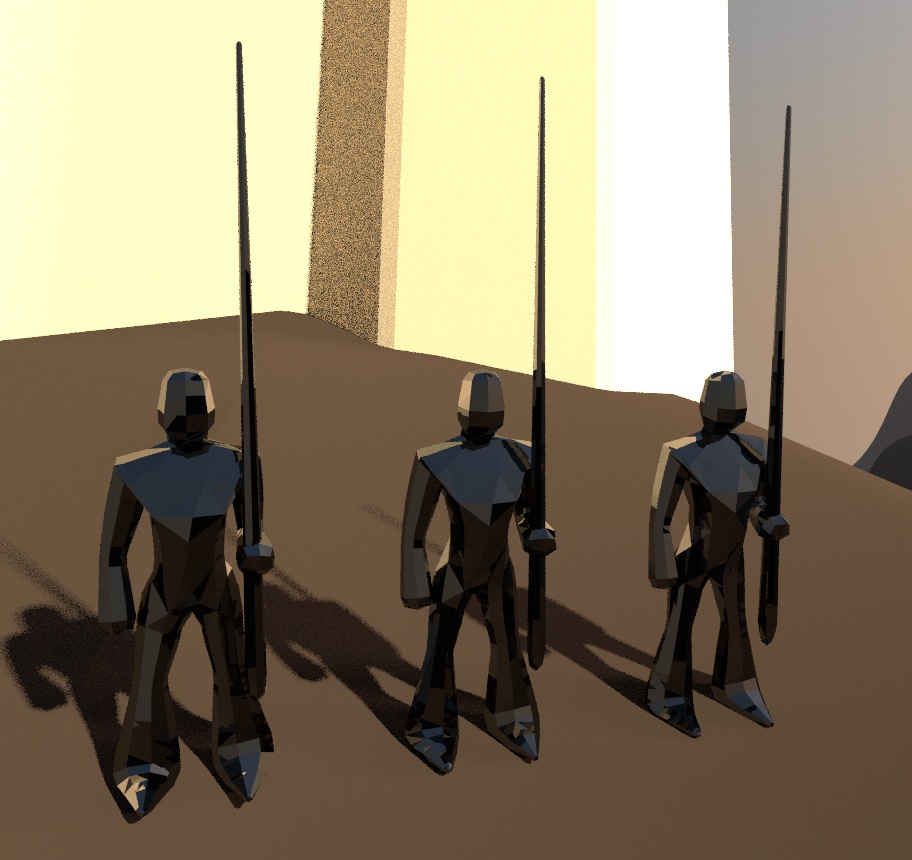
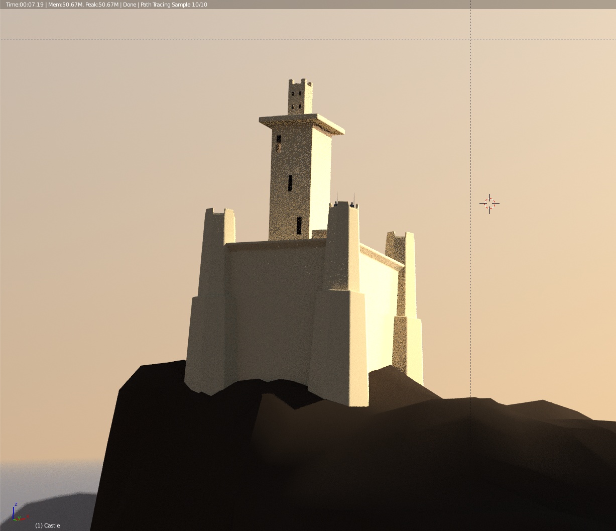
I tried experimenting including some low-poly knights, but quickly realized they would have looked rather small in the scene, so they are not featured in the final render.
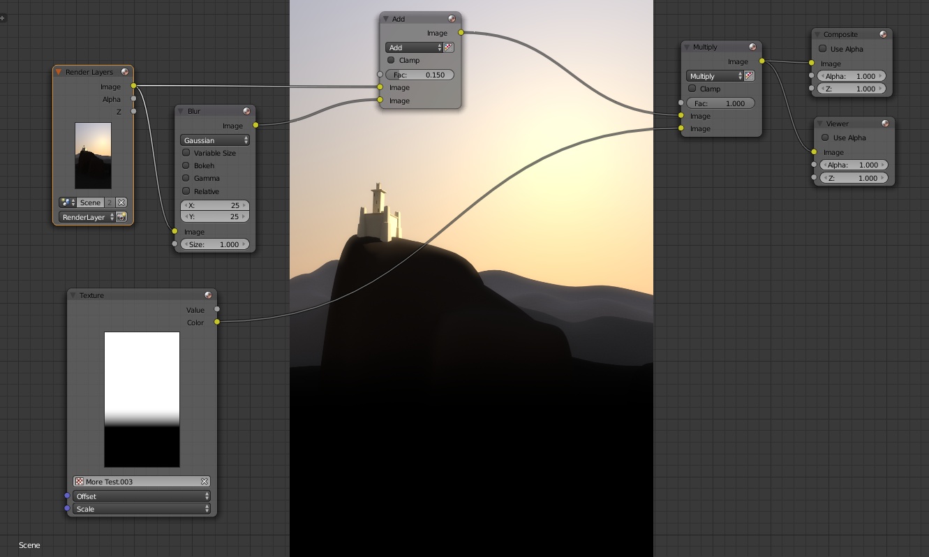
This is the compositor node setup. I added some bloom by mixing together the final render and a blurred version of it.
Also, I mixed in a special gradient in order to darken (hide) the bottom half of the image, since it’s supposed to be completely under shadow, not visible and I found it easier to cheat it this way rather than by tweaking the lighting setup.
A few minutes I found out about a cool use of the displacement modifier and made further tweaks. I think this looks better and more natural, although less simple/essential in principle. What do you think?
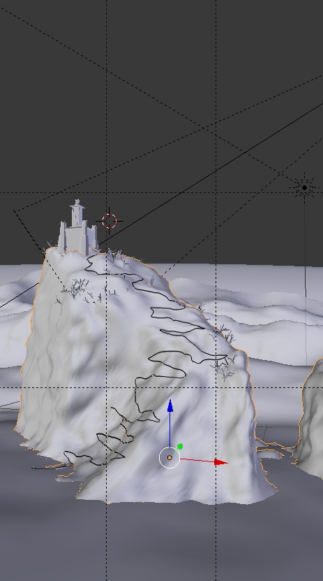
Here’s a comparison, without and with displacement:
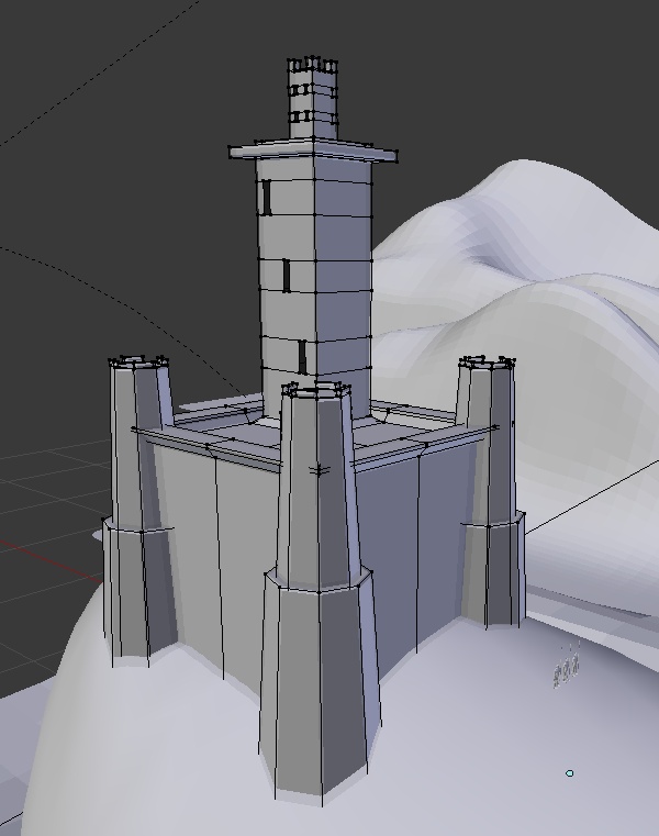
I tried adding two guards on the front most castle tower. As I expected, in the full scene you wouldn’t know they’re there unless somebody told you so.
I don’t know how much value there would be in adding more polygonal detail - the scene is more about the whole environment and the way it’s presented (artistic composition) rather than the tiny details.
I like the method you used for distant hills but I do think some detail wouldn’t be a deal breaker. The dramatic sun angle glinting off the walls of the keep or off long, bent strands of wild grass outside might add one more visual detail to keep the viewer daydreaming.
Maybe even a few backlit stairs heading up to the keep to break the negative space and reveal just how the beck we can get there! I like it.
“beck” was a cellphone keyboard typo, btw!
I like the path but not so much the grass. It throws the scale off. Just the opinion overall of a casual observer.
To tell the truth, to me the scene is pretty much done (either with or without “trees”); the general concept I originally had in mind has been more or less accomplished in 3D and I didn’t really expect to invest so much time tweaking it afterwards, even though all suggestions have been helpful in a way or another.