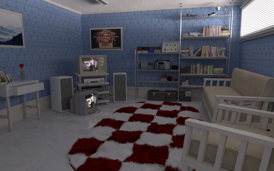
Hi, this is my first “serious” interior render.
I am attempting a realistic look.
I will be adding more stuffs on the shelf, however is “more props” a good thing to do?
The things on the top second shelf are models that I made for practicing Blender and thought it could be as displaying toys.
Any criticism is welcome (even the harsh ones) as I am thinking serious about career in CG.
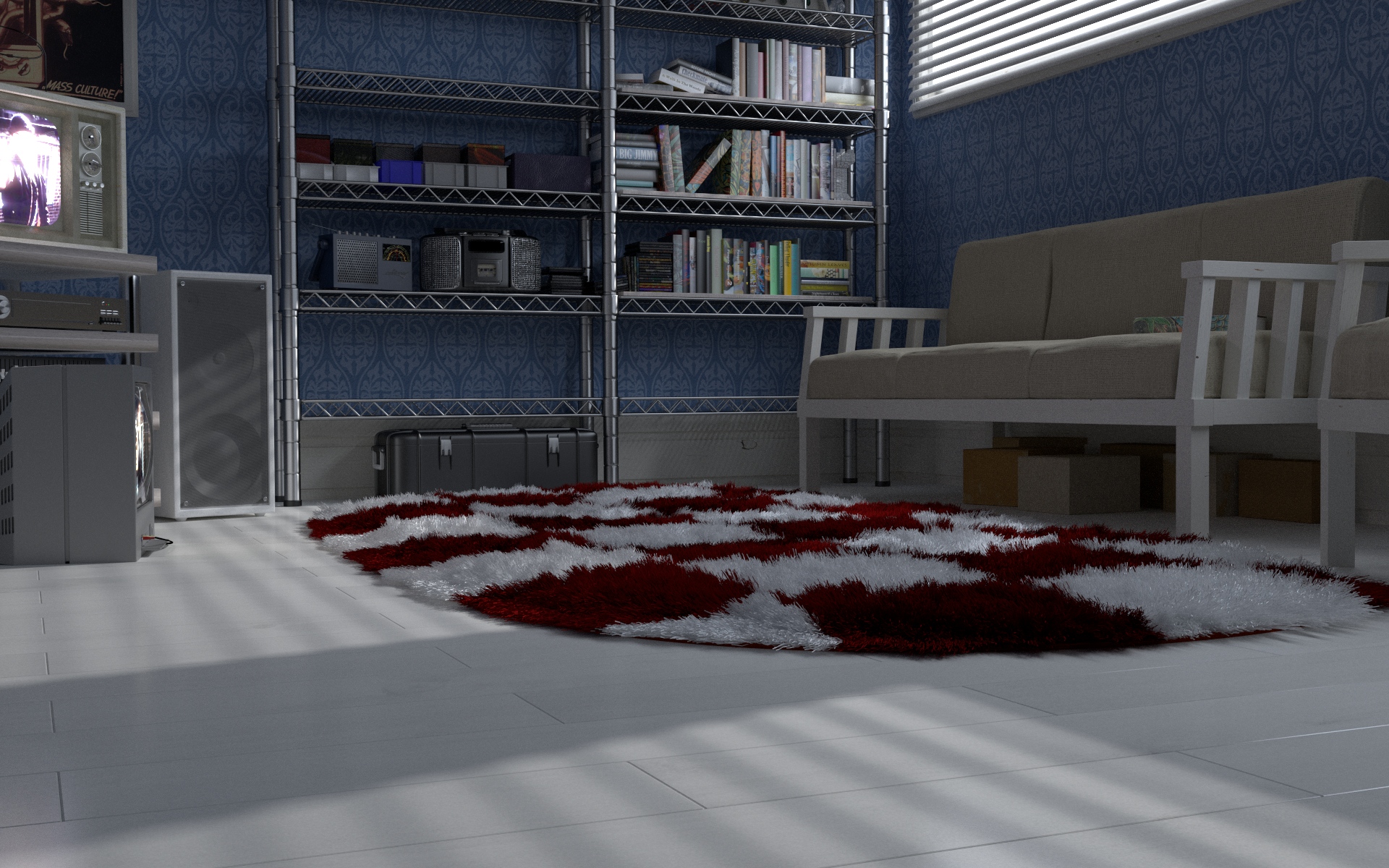
You may have noticed this yourself, but IMO the renders from an angle look much better than the first one that’s just straight on. Also you’ve done this for some of the objects but rotating them a bit to make the room look “lived in” would also heigten the realism. Finally, less ambient light and more of the directional coming from the window could make it look less flat/pop more.
You can check the scale of the ceiling lamps
The ratio of the lighting is a big part of realism.
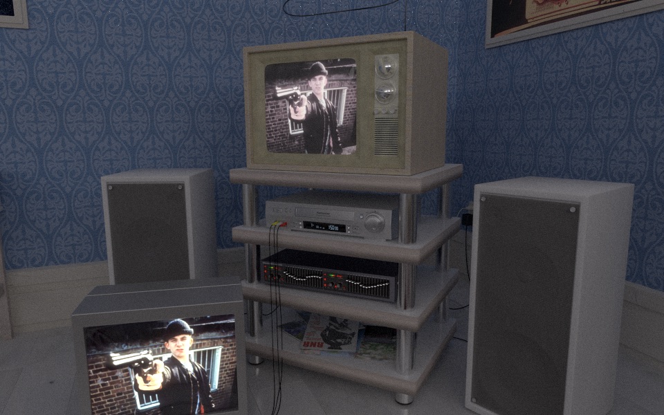
There is no real-world lighting situation in which the TV screen would retain as much detail while also being the brightest part of the scene.
It appears that the only direct light source is the light streaming through the blinds, but the light that it’s casting on the floor would be insufficient to indirectly light the rest of the room in the manner in which it currently is rendered.
are you putting light sources into the render which aren’t visible in the scene?
Thanks guys.
juanrav
< You’re right. The ceiling lamp was kind of big, so I scaled it down a bit.
Spekular, nvrmt
< Actually there are four major light source in the scene, the classic TV video, modern TV video, spot lamp, and window glass panel.
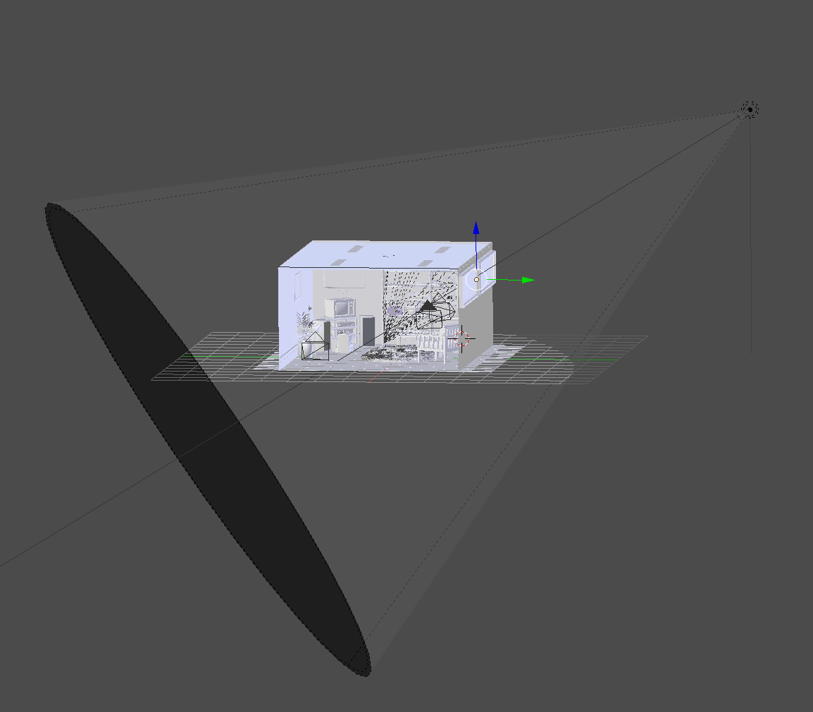
I don’t know if this will be helpful but this is the scene from the distance.
And these are the materials that emits light. The spot lamp’s size is 0.1 and strength is 10000
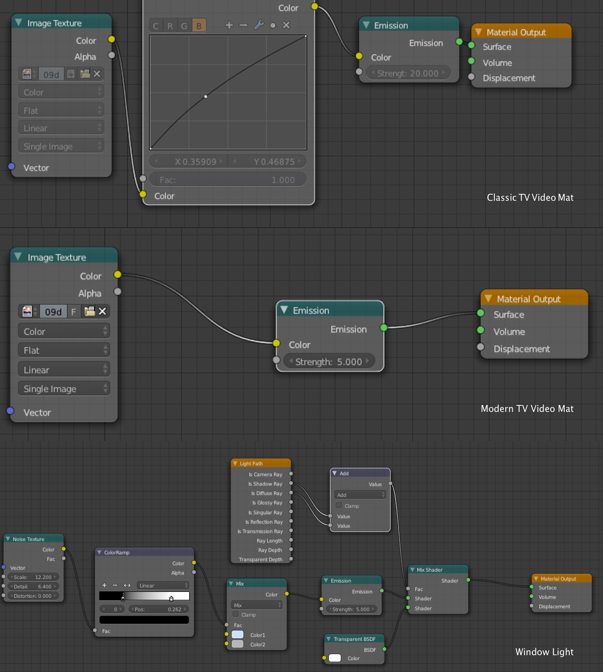
Instead of Glass, Window Light Material is the material for the window glass panel because without it the spot lamp will cast shadow of the window shades but not enough to light the room which makes the scene really dark.
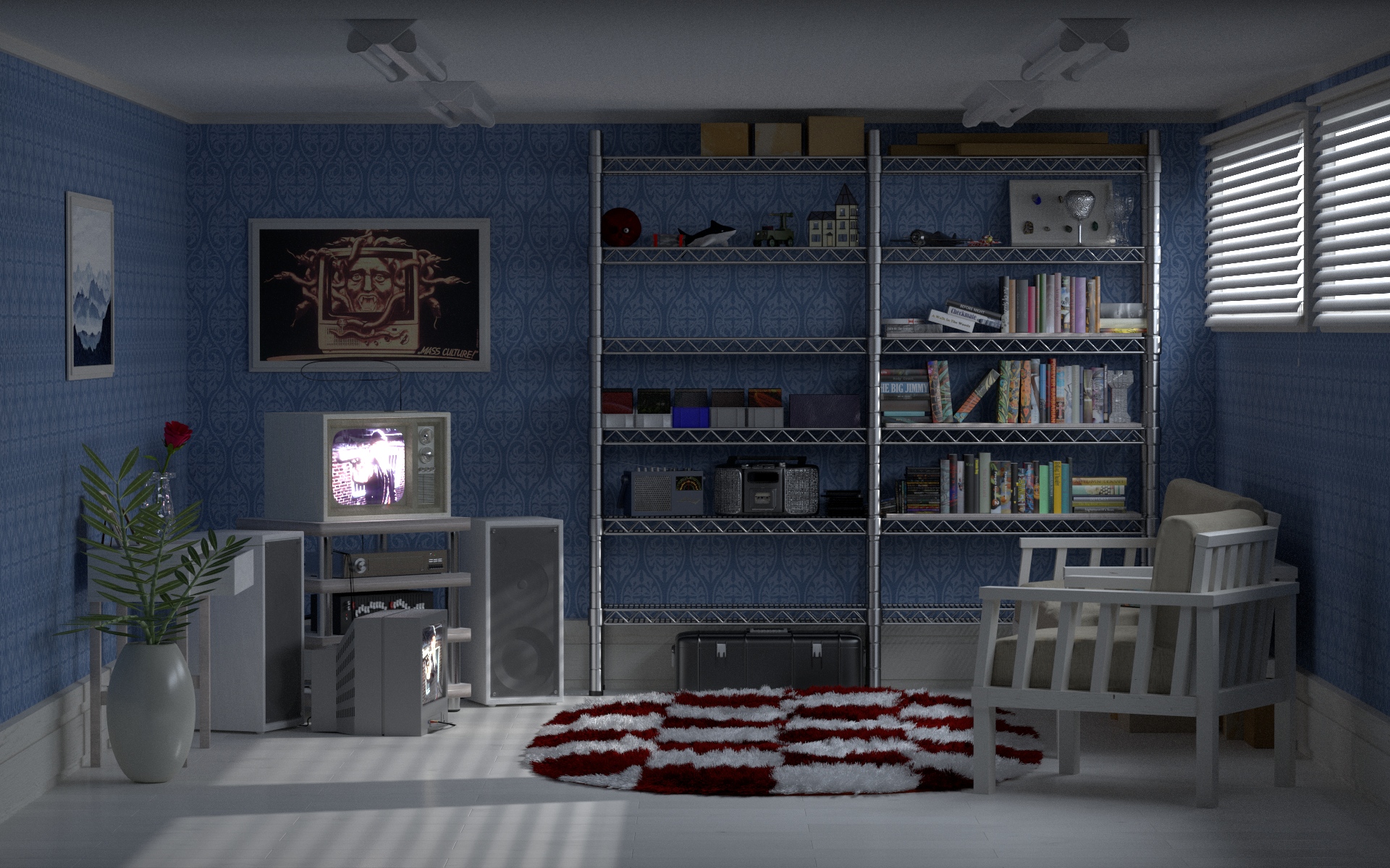
However, I may have set the Emission too bright and because of setting the Light Paths to Full Global Illumination caused the above result.
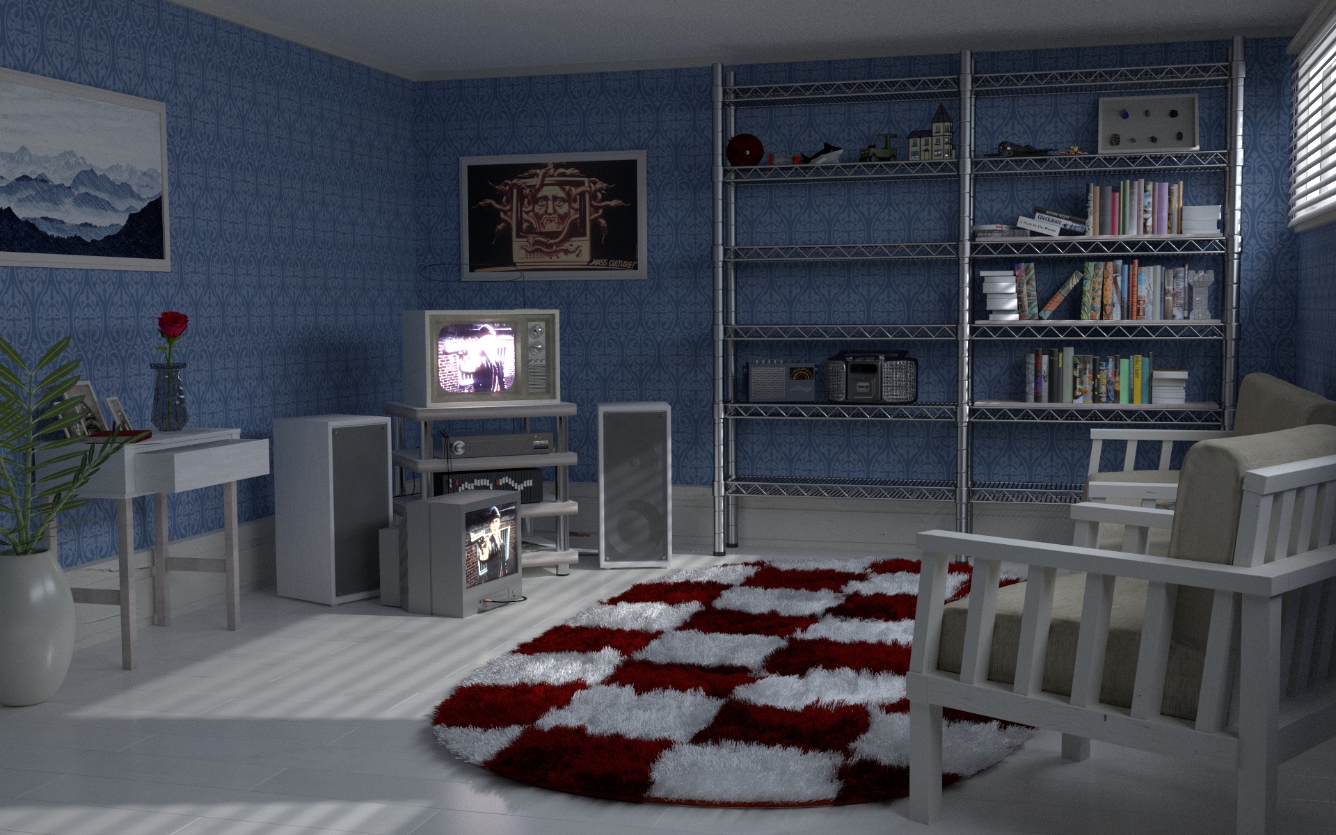
So I toned down the Emission of the Window Light and Rendered with Light Path set to Limited Global Light and achieved this
With this result, I don’t like the look of the carpet so I guess toning down the Emission and render it with Full Global Light is the answer.
What do you think?
Pretty sure sunlight is much brighter than TVs, so I’d suggest increasing the strength of that spotlight by at least 3x, maybe even 5x.
If you have an actual pane of glass in your window, disable everything except camera ray visibility. This’ll save you render time and prevent things from looking dark.
But of course the first thing I notice is that everything is exactly the same shade of grey. Have you not finished texturing or was that on purpose for some reason?
Thanks for the advise Gregzaal.
I’d suggest increasing the strength of that spotlight by at least 3x, maybe even 5x.
Did that. Although too bright for full global illumination, I did like the look of the light around the window. Maybe adding some yellow will be nice.
I guess I need to fine tune the amount of light bounces without making the carpet looking ugly.
If you have an actual pane of glass in your window, disable everything except camera ray visibility. This’ll save you render time and prevent things from looking dark.
No, the window panel is an emission shader not a glass (however I disabled it since I found the brightness of the spot lamp was enough), but I will take that advice on other projects.
everything is exactly the same shade of grey. Have you not finished texturing or was that on purpose for some reason?
The gray you are seeing is actually an image texture of wood planks painted white and the shadows made it look gray, however you can still say that it all looks the same since there are only two variations of white wood material.
But I have to admit that you have to get close to actually see the "wood"ness.
Some nitpicks:
The scaling on the wire rack is off: the posts are too thick, the notches on the posts are too far away from each other, the shelves seem too tall, and there should be black spacers where the shelves attach to the uprights. Also, the two sets of shelves cannot be at the same height, they would collide with each other. (I have both modeled this type of shelf and assembled them IRL as well, so i’ve got an eye for them.)
Also, I know it’s a cool way to show off the fibers in the rug, but everytime I see people use these giant fluffy rugs in architectural renders it makes me cringe a little. I’ve never seen a rug with 3 inches of loft like that. If it were a shaggy rug, the fibers would lay flat, or be a lot denser. Maybe if you combed the rug and used half a can of hairspray you might be able to make it look like that, but the minute someone steps on it, it will be flattened out.
Other than those things, it’s looking pretty good!
Not only nice, but necisary. I’d be very suprised if I found a room that was lit by the sun, but had no yellow tinge to it. You may want to conside getting an HDR for the lighting also. You can get some of those nice, sharp, and blue shadows (assuming you get a good HDR).
Some of the other problems I have with this scene are, the wall is too saturated and grabs your attention too much. There is no clear subject.
This is coming along nicely. Adding more props is certainly an option, but be aware it will affect your composition. As long as the props you add contribute to the story you want the scene to tell without interfering with the other props, by all means, add them.
I would suggest you maybe add some more shape (curve?) to the leaves in the foreground vase: they’re looking a little flat as-is. Maybe double-check the materials on them too.
I like that you didn’t forget the cords and cables to each of the devices. A power outlet or two near your baseboard at one or two points around the room would help sell the authenticity too.
Such old-school TVs and I’m surprised there’s not a Nintendo Entertainment System nearby!
That’s all I can think of for now. It’s looking really nice.
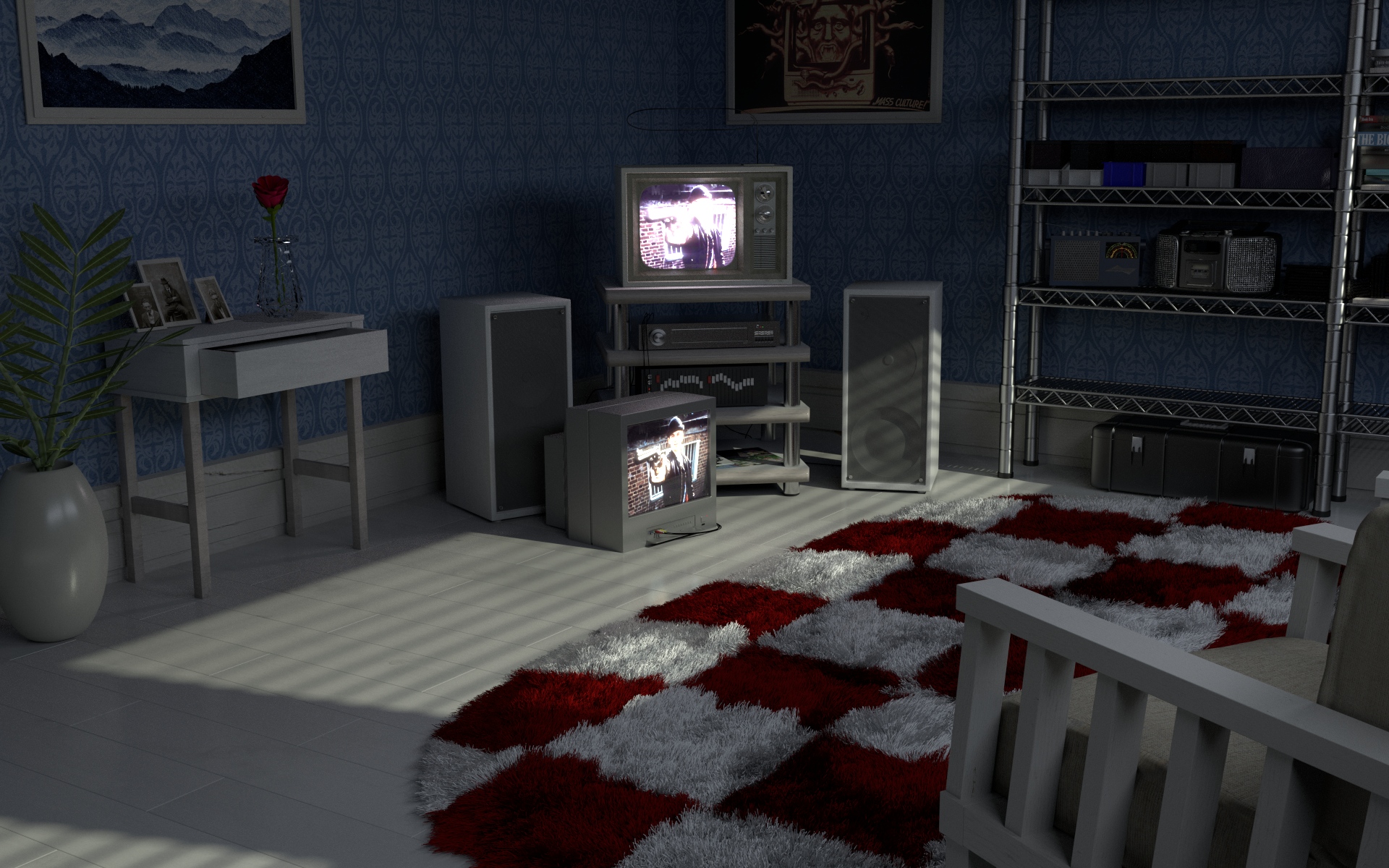
It’s been a while but here’s an update.
I changed the lighting to HDR. I don’t think the scene is benefiting from HDR since the window blinds are shut, and it is supposed to be shut because whoever in the room is watching the TV. I might switch back to spot light since it can create a strong shadow. I think the scene looks nice if I had the shadow of the window blind.