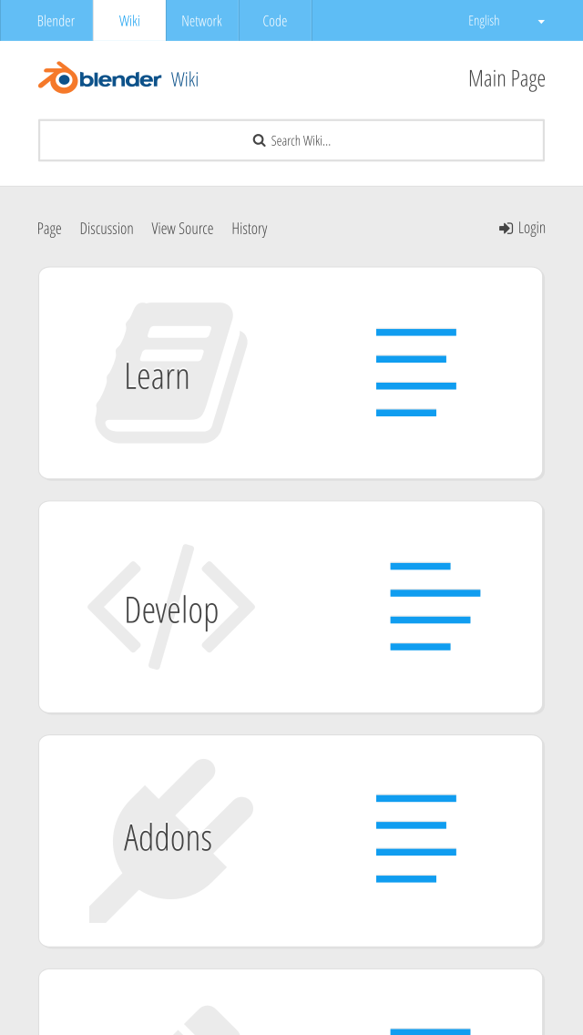
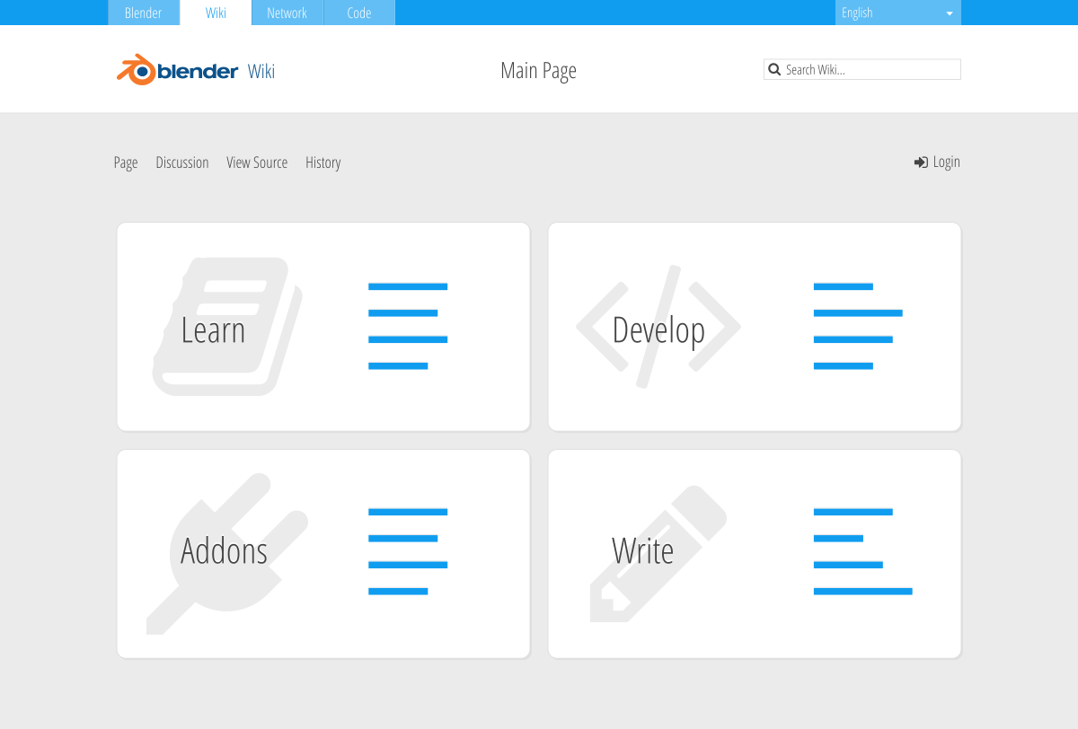
I do Design and Frontend Development and I’ve made a mockup for a possible new Blender Wiki. I tried to match the look from http://blender.org. My goal is to create a much simpler Wiki and a more intuitive way to interacting with it. For now I have only created a design for the landing page.
You can give me feedback and if you like it, I would be glad to work further and bring this idea to life. It will be responsive, mobile first (will look great on any screen size) and I will use SVG and font graphics to support high resolution devices (retina displays).
Do you like this design and have you any further ideas? @niklasravnsborg
The linked new versions in that post are great examples of why someone with design experience should be leading the effort to build a better documentation resource for Blender. Sphinx makes it really easy to autogenerate horrible, practically unusable, documentation.
Personally, I find it better to keep the documentation separate from the code for various reasons. It’s hard to read code when there are too many unecessary/inappropriate comments in the way. I believe Python also keeps the code and documentation seperate.