Hey all,
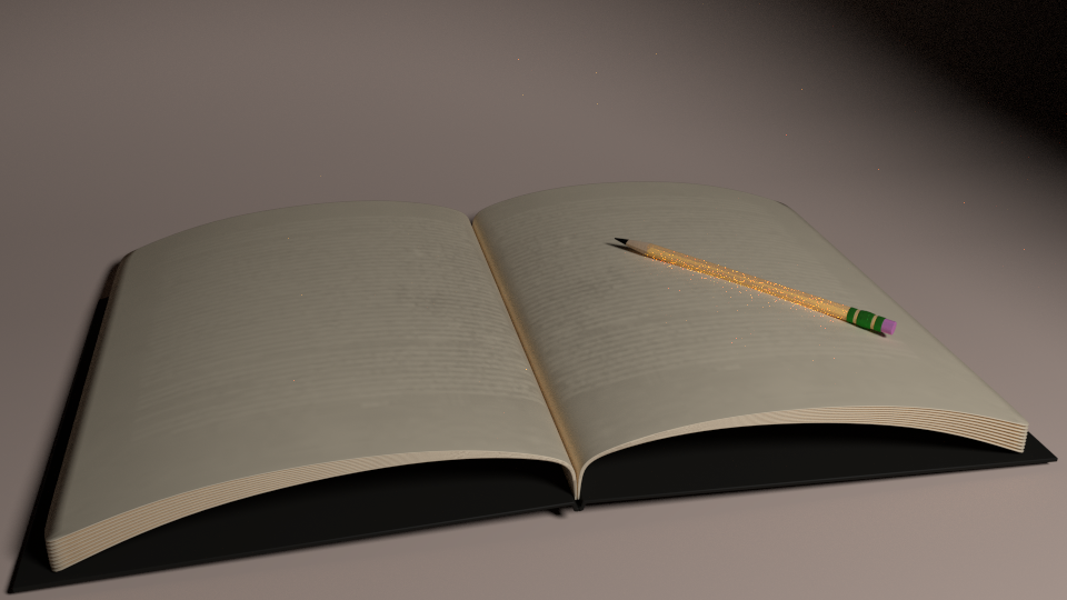
I’ve made this book scene and I wanted to know why it wasn’t realistic. I don’t necessarily want photorealism, just to make it look realistic…if that makes any sense
make your pages thinner and add more of them, also your words need to be in a colour that can be seen, lower the reflectivity of the pencil, it shouldnt be bouncing such light to make so many fireflies. and light it better or soften the black covers as they are making the shadows merge with the book
oh haha lol. ok not laughing. ok i lied
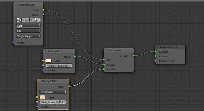
you are currently using your text image as a factor to seperate the two different pale colours. what you need to do is connect the texture into the colour socket of the diffuse shader. that way the image texture becomes your diffuse colour. as you are mixing it also with the glossy shader, your text will be half pale gloss, so this is where you would use the image texture as a fac, so basically keep your nodes as they are, but connect the texture into the diffuse as well.
you should also set a better lighting. The only light from right makes it flat. The wood material of the desk is poor. Add more details to the book and the pages and also more contrast between the lines and the paper
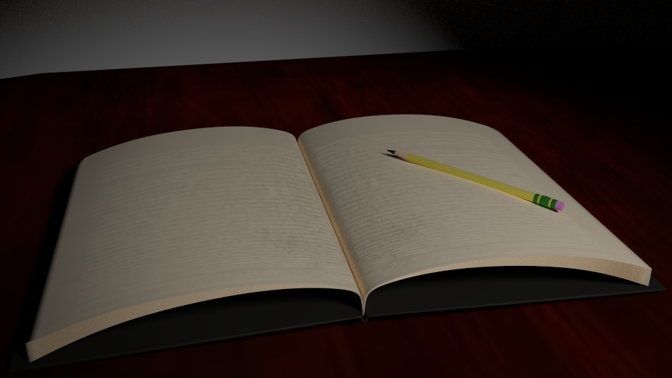
Updated one, added a top lighting also
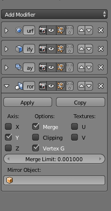
I don’t have spec or bump maps, and even if I did I don’t know how to add them This is why I can’t use the Boolean modifier, because of all these ones I already have that for some reason is messing with it