Hi. This is the second project I’ve posted on the forum. I’ve been using Blender for nearly a year and have been continually amazed about what all the talented people on this forum can make it do. It’s really inspired me to learn new things and improve my work.
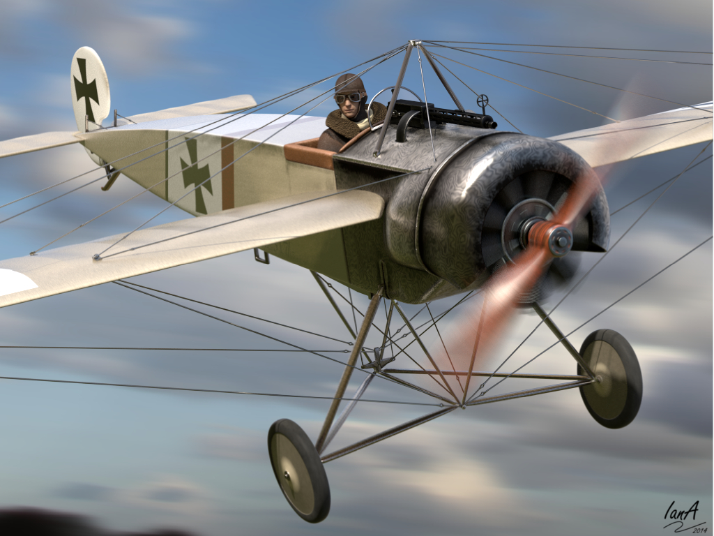
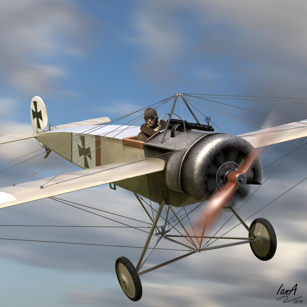
To that end, it would be really helpful to have some thoughts and feedback on my latest project. It’s for a card game my brother is developing about the early days of aerial combat in the First World War. I’ve modelled a Fokker Eindecker which is one of the aircraft in the game.
Any tips for how to improve it (especially scene design and post-processing, which I’m a complete beginner at)?
Many thanks for any advice.
(I should add, I cheated a bit with the pilot model - it’s from Makehuman)
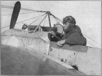
Thanks for your comment. Yes, it is a bit weird. The real thing did have a strange swirl pattern in the metal - some sort of a result of the manufacturing process (see picture below). If anything, now that I look at it again, I think mine isn’t quite swirly enough so I should adjust the scale a bit (so thanks for prompting me to think more about it!).
Great job, I won’t mention the obvious metal surface issue ;). What I would mention is that just to get pick the best image possible for the use it’s going to have, is to make a few renders with not too much motion blur of the props…I would bring them down in 5% increments and from the resulting renders, pick the best IMHO.
Mind you if you brother manages to get the cards done and I had the money I wouldn’t think twice in getting them if the rest of the planes would look as nicely done as this one, well done!
Hi, Nice model you made. One thing you could improve still, is adding rivets, nails, that kind of thing. the body is looking a bit too clean now.
And another point: the name is Fokker (double K).
Thanks for the comments. As suggested, I’ve adjusted the amount of blur on the prop to slow it down a bit. It catches the light much better now. I also added a few rivets on the engine cowling, though could probably do a bit more on that front, changed the scale of the patterning on the metal and added some general dirt to make it look a bit more used.
Niiiice!!! I don’t know if it’s my eyes that are getting old and tired but I don’t seem to see the rivets and the cowling seems to shiny and new compared to the rest of the plane.
Without giving out too much, what other planes would there be??? because of what I’m picturing in my head the game is going to be amazing…keep on the good work!
Tommy1441 - yes the rivets are pretty small. They go along some of the joins on the cowling and over the strip that runs round the nose. They don’t show up much with the slightly low resolution image admittedly.
I’ll have a look at the shininess of the metal as you suggest.
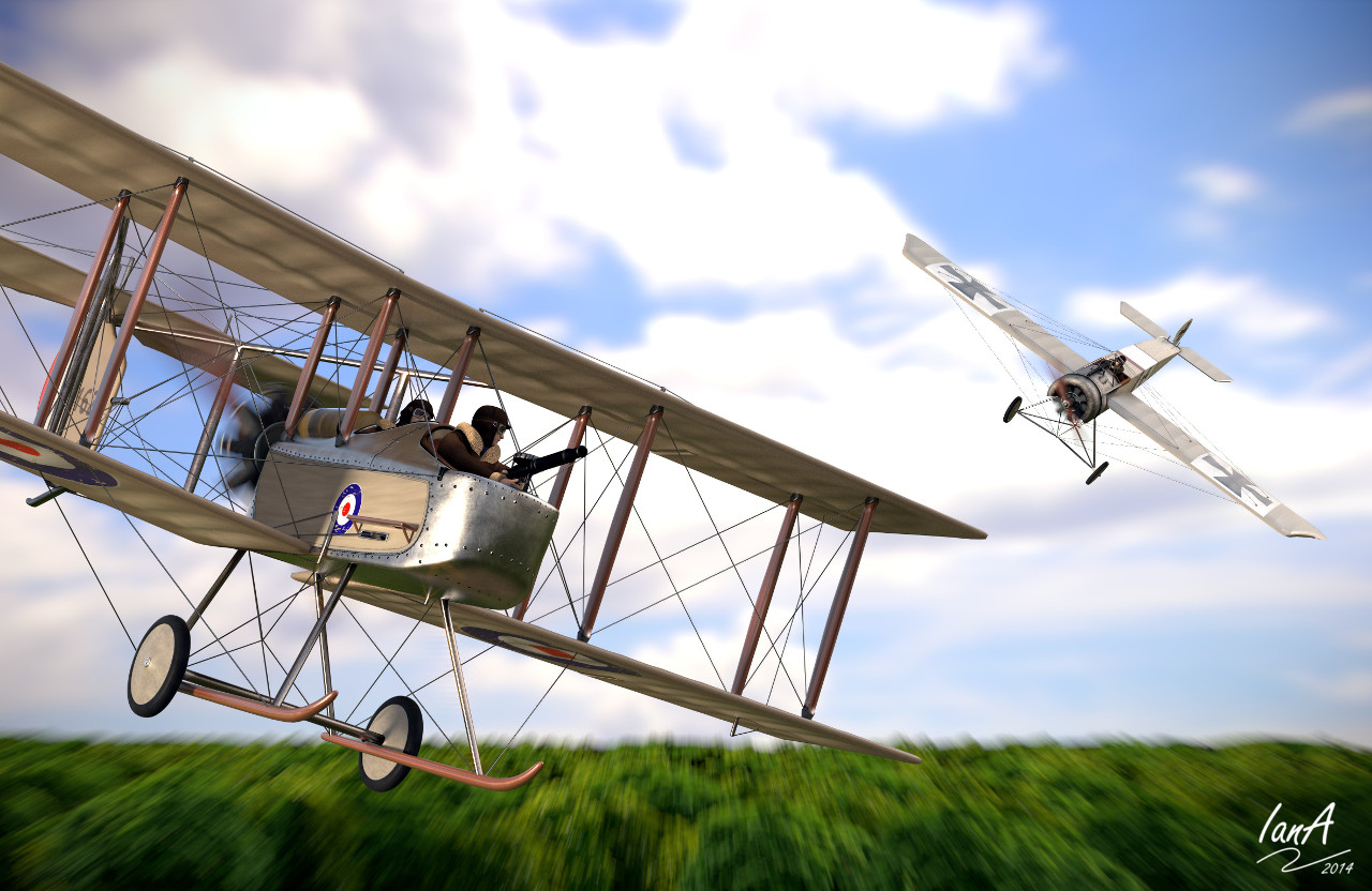
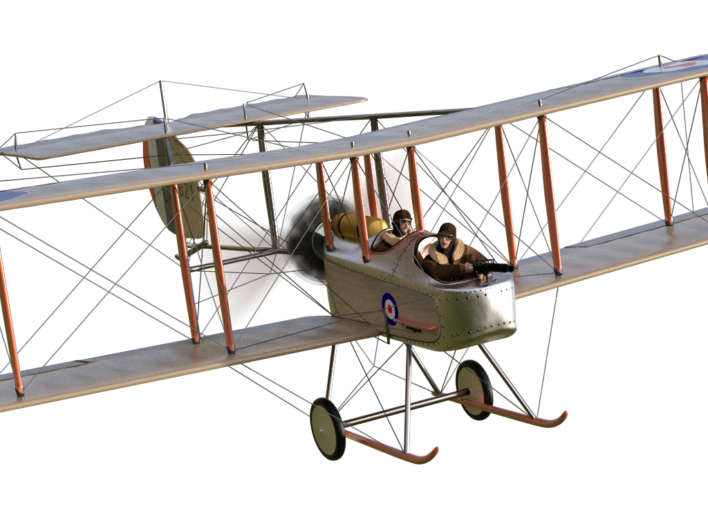
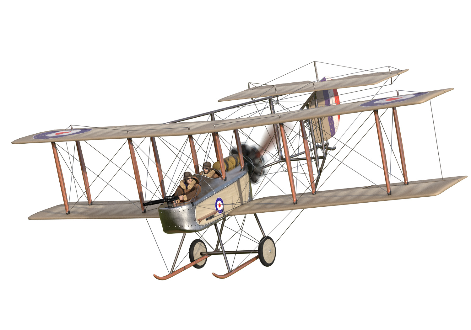
Funny you should mention other planes. I’ve separately modelled a Vickers FB5 Gunbus but am having trouble putting the two into a convincing scene. I was going to ask you actually, given your excellent F-16, whether you’d thought yet about your final composition. I’ve struggled to find any combinations of horizon, sky and clouds which look like anything other than images badly stuck together. Any top tips would be greatly appreciated.
For the game, I’m really focusing on cover art at the moment. My brother’s updating the other graphics and his 2d art eclipses my 3d skills…
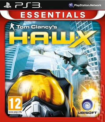
I’m no Tommy, but you could one where the plane is flying low over some trees? Or for the one where you combine the Eindecker with the Gunbus you could do something sort of like the H.A.W.X cover art? Obviously without the giant helmet in the middle of everything, and perhaps not in such a modern setting, but at least have the planes in a similar position. Excellent modelling
Sweet!!! the Vickers FB5 is a beauty of a plane, I see you are into vintage planes!!! cool
Thanks trust me for me the F16 has been very labour intensive and time consuming…LOL. I keep changing my mind as to the final composition, I believe this thing has got a life of it’s own. I don’t want to let my imagination run wild, also have to control my obsesive need for details and “real life accuracy” as well, otherwise I wouldn’t get things done.:o
Don’t let your brother’s 2D art put you off, can he do things in 3D as well as what you have shown us so far???I bet he can’t
Maaan you are making me blush here :o…thanks for the pressure!!! ROFL
Great picture!
The only detail I would suggest to improve: this metal seems too polished (I have impression that it was painted using a transparent varnish). Maybe you could increase its roughness a little, to obtain a less “polished” sheet metal?
As the dogs say: Wow, good job, I think You can add something dinamic to the challacter like a scarf and the wheels look so perfet, You can put an older wheels, thats just an opinion.
It’s been quite a long time but this is how this one ended up, partly inspired by sdighe’s post above in terms of the composition. As I mentioned, the intention is for it to be the front cover for a card game so there’s some empty space at the top for the name and logo.
I’ve pretty much moved on to some other projects (including a video for the game, also all done in Blender) but any feedback would still be much appreciated to help me learn how to improve.
Nice work!
I would like to suggest some minor improvements (based on a comparison (to this photo of a rebuilt plane):
modify the wing airfoil shape: the leading edge had smaller rounding radius and the airfoil had greater maximum chamber;
the rivets on the metal panels were smaller;
the cross-section of the upper part of the fuselage seems to have a “bulge” in the center, while on your model it has just a uniform radius;
I think that in the flight conditions the airflow pressure makes the depressions of the fabric between subsequent wing ribs deeper - I suppose that you have modeled them as they look like on a airplane standing on the ground.
 but I don’t seem to see the rivets and the cowling seems to shiny and new compared to the rest of the plane.