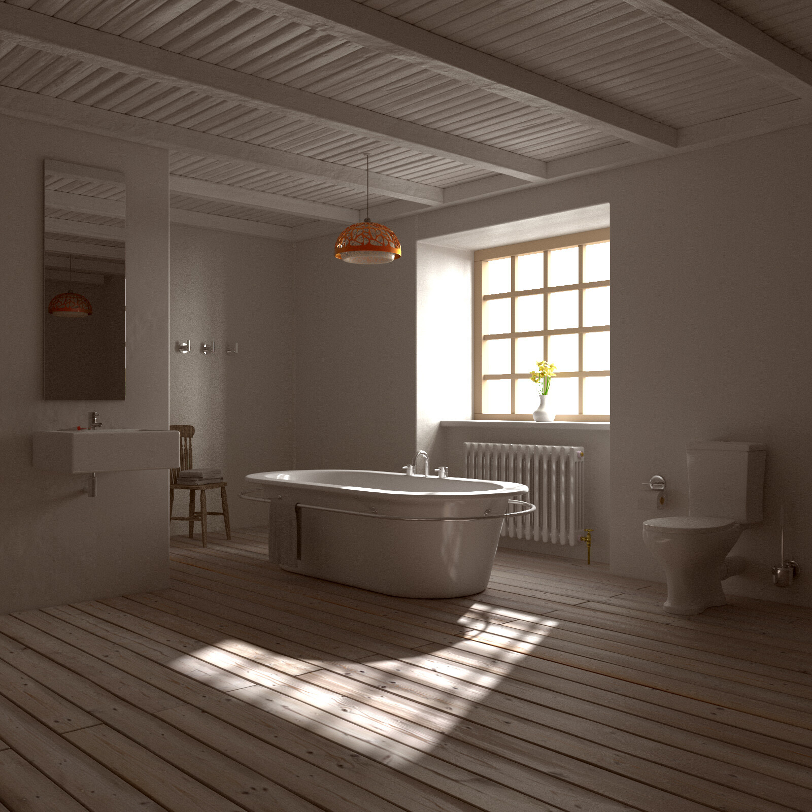
I’ve been following posts on this forum for a while now, but only recently have a felt confident enough to publish any of my work, so will be interested to hear your feedback as to how I can improve. This is my first attempt at creating a rustic bathroom based on a photo I found online, although I’ve made a few changes based on what I thought worked. I was having a lot of trouble with the floor and wooden beam textures, so any advice on how to improve these would be great. I’m happy with how the bath I created came out and think the lighting is working well, but will be happy to accept any comments
Thanks, I agree with the glare around the window and will tone that down a bit. I actually quite like the reflections off the porcelain, and going to try to improve the textures of the wood. Also thinking of adding in a skirting board, but not sure how that will look, and think it needs humanising (if that’s a word), so bottles of shampoo, candles, etc.
Here’s a closeup around the radiator and bath area. I actually put quite a bit of detailing into the pipework on the radiator, although probably not that noticeable. Will leave my PC to re-render the main scene with some changes made overnight and see how it looks tomorrow.
Really nice work, this is gorgeous. The things I note are really pretty trivial to fix.
yup, porcelin is too glossy. Either up the roughness, or decrease the mix factor. I think the latter.
The edges seem sharp on a lot of the objects. The edge of the tub feels like it want a smoother edge, sink too, and sides of toilet.
The overblown lighting a neat effect, but I might dial it down just a little bit.
The tub as as whole seems rotated about 10 degrees, which seems odd. I would either rotate it 45 degrees or keep it parallel to the floor boards.
The desaturated colors really work, but it’s also an opportunity to add draw the eye somewhere with an object with a little more saturation. Where, what, who knows?
Thanks for the comments. I will turn down the glossiness a little then. I forgot on the original render I’d turned off the displacement and bevel modifiers for the wooden flooring, so you can see in the closeup render they are softened a lot more. Have toned down the lighting around the window, and I like the idea of something with a lot more saturation. I could try making the towels a rich orange colour, have some other ideas, so will see what I can do and upload the updated render tomorrow. To get it looking half decent without much noise though i’m looking at about 10’000 samples, and think once I’m finally happy with it, it will need around 30’000. Does this seem way too many?
I know what you mean. I do a lot of pencil sketches of cats and dogs in my spare time (what little I have lol) and is the same with them. Haven’t done any for a while now as I’m in the middle of renovating my house before I either sell it or rent it out and move from England to Poland, so lots of big things going on. Meant to be doing a sketch of a Giraffe for a friends daughter so will be nice to do something different
The orange ceiling lamp above the tub already sort of has the effect of drawing the eye. The colors could pop more, but I think it works well as a focal point. You may want to change it if you’d like to draw attention elsewhere, but I think that the composition is good. The different elements draw the eye all around the image and especially on the tub and orange lamp.
I changed the glass from having some thickness to just being a plane, and also adjusted the filter glossy down, but is a big improvement as before I was having to render at least 5000 samples for this, but this was only 2000 samples, so if I left it longer at a higher sample count it would take the noise out of the equation. I just wanted to get an image up before I went to bed lol. I’m away at the weekend, so going to leave my PC running while I’m gone to see how it looks if it’s set much higher.
Ok, that makes sense. The other thing I might mention is that I have no idea how the scene is set up, but it will probably help if the off camera portions of the room are closed in at least by planes or a giant cube to get more secondary bounces. I kind of think they are already though. It’s a really classic and classy look. Well done.
It is closed in, although I did think of putting a door in that you could see in the reflection of the mirror and also get some more light into the scene
If you want more correct light to make real eye catching image, never use “emission plane behind window” trick, it hilight close objects too strong (remember 1/(distance*distance) light decay rule? ) and really looks artifical, as like 1000 kg pro cinema projector next behind window, not shiny day. Only sun light and/or HDRI background texture. And never change “clamp filter” or “filter glossy” from default 0.0. Some may tell you they clean noise - it lie, it make your image dull. If you have no remder farm, go compositor + BI way, or other biased renderers , but NOT clamp.
I’ve used a HDRi image and sun light. Will upload the new render on Monday once i’m back from the music festival i’m going to, and think it will be looking a lot better then
You just have to be careful with those values, clamp will reduce fireflies if used properly, but it should be used as a last resort, If you can’t use other tricks to take care of them.
The latest render looks much better that you first one. Next thing might be to add some foreground. also the room looks way too big for a bathroom.
I absolutely like your image and architectural style.
But I would change the lighting:
-Change the light source to a HDRI and a sun, as this gives your light some colors as in real life. Because the light that is coming into an interior is partial blue (from the sky) and partial slightly yellow/orange (from the sun).
-Add a window from behind because your scene needs more light.
The room:
I would partial agree with you TARDIS but it really depends on the owner of this house/room. If the owner loves to have big bathrooms than the architect would design a big bathroom for him/her. But you right the room is a little bit to big, as the foreground or the stuff that is behind the camera is filled with nothing. But this can be changed with some decorations or cupboards. Those can be placed you can see it in the mirror or in the foreground of the camera.
From a more architectural (not archviz) point of view the bath is really really spacious and nice, but the sink is not it’s just that little space, also I would move the toilette to a seperate room^^
The sink and everything else should be as spacious and nice.