I’m trying to set the material on a tank track link using Cycles and I’d need a cast iron look. However, no matter what I try I just can’t get it to look as it should.
Could any of you pros pretty-pretty please a node setup for this?
Generally, a nearly-black (very slightly reddish-brown) color with nearly zero specularity will be a good basis for dirty, sooty, industrial cast iron. On top of this, modulate the specularity – more of a bluish color, usually – with a fine-grained Voroni texture or something like that. You really don’t want sharpness at all in your specular highlights: if it does, it was painted. (And of course, sometimes they were.) The texture scatters all light-bounces this way and that.
Thank you so far! What I mean is something like shown in this image:
I tend to use Cycles and prefer procedural whenever possible. But I’m really crappy at it So if you could please explain it as if I am an bloody beginner (which I secretly am), that’d be great.
You didn’t specify if it’s the color process you need help with (explained somewhat below) or the setup for the surface structure (bump mapping, which I ignored because I’m never happy with my own procedural bumpmaps anyway).
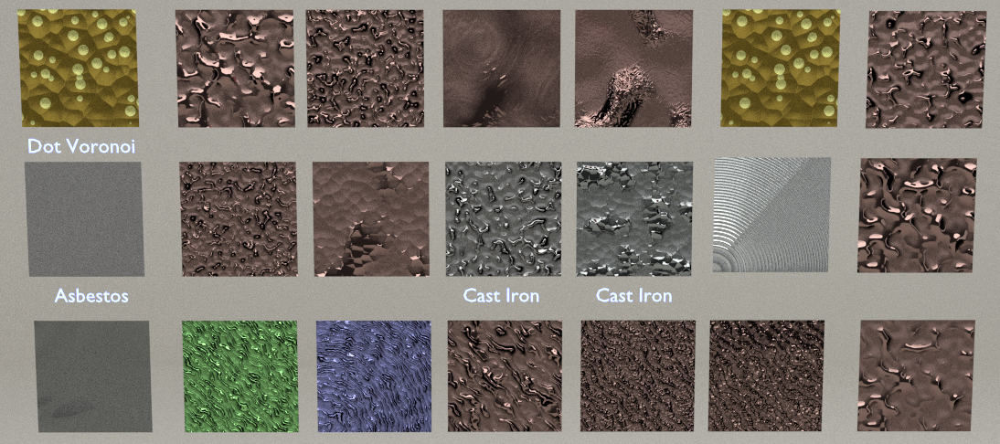
My observations based on the image:
It’s metal, so diffuse contribution should be low or darker in value. Hard to judge lighting, but sometimes it’s useful to link specular and diffuse roughness to be equal value. Although I don’t typically use diffuse roughness (Oren Nayar diffuse shading model) for metals. Also it’s safe to ignore any facing/fresnel factors. This is true for most metals (exceptions exist) whose fresnel is too high to notice anyway, and in image I can’t see any such effects also.
It’s somewhat specular (all metals are), but the surface roughness is very very high. Maybe combine a couple of speculars with >0.5 roughness. That typically requires longer rendertimes (a lot more samples) in order to look good.
Modulate with noise/voronoi maps the speckles of brown and white. Notice that the white speckles seem to correspond somewhat to some of the “tops” of the bumpmap. The brown speckels seem to have at least two levels of details.
It has extensive bump mapping at multiple levels of detail. Dense high bump mapping doesn’t work well with specular surfaces, so it can be wise to channel some of its effect into diffuse instead, and have more bumps in the diffuse channel compared to the specular channel. This will allow bumps to be visible without ruining the glossy shader, which could be the case if driving bumps directly to materials “displacement output” rather than individual “shader normals”.
Roughness lay is irregular (non machined/polished, directly from the cast), so choose normal glossy shader over anisotropic glossy shader.
Polished (roughness closer 0) cast iron will still be a gray shiny surface, so if a textured roughness map is used (still high in values though), you could probably also modulate the reflection color towards this color.
(Modelling): At least for preview matching, keep a bevel modifier in there to get rid of any hard edges. Higher radius in the “deep pockets” caused by the cast should be completely modeled. Ideally kept as we have no way to round edges using shading techniques yet, but I guess this depends on how much detail is visible in the final shot.
The last part of the last sentence is important. If it’s a major player in the scene, then put effort into it. I often do the mistake of twiddling forever with something that renders out only a few visible pixels that is not focus of attention.
Or machined or polished. Also painted would typically produce dielectric (white) highlights, whereas a metals highlights would be colored mostly by its base color (tinted only slightly towards white based on amount of impurities and visible detail of those). I forgot to mention that about metallic specularity.

 So if you could please explain it as if I am an bloody beginner (which I secretly am), that’d be great.