I’m not sure if this is the right forum for this so feel free to move it to it’s proper place.
I haven’t started on it yet but I was wondering about Blender’s capabilities to render out a print ready image for use as a book cover. I do plan on taking it into Illustrator for the layout but I’m wanting to know if there’s any special set up within the Blender interface or is it just not possible?
The printer said I could use jpg but I’m not sure if cmyk would be the better choice. If anyone of you have used Blender for that purpose I would love to know how you did it.
CMYK is only a color model like RGB, nothing to do with image format like .jpg, png.
I would export from Illustrator several formats, png, eps and if possible .pdf.
Printer can collect what is best for print quality.
Blender is not suitable for work like this.
Sorry, but I’m not sure if I understand your problem…
You want to make a layout for a book cover in Illustrator and need image material for that?
Can you render out such an image in Blender? Of course you can.
Can Blender output a render directly to CMYK? No, it can’t. There is (to my knowledge) no render engine in existence that can. And, while we’re at it, there also is no digital camera that can output CMYK images. You will always have to convert image material from RGB to CMYK when getting into print. And nothing else would make sense, as CMYK profiles always have to be adjusted to the media you want to print on.
So, render that image in Blender, make sure you have a sufficient resolution for 300 dpi, ask the printing agency what color profile they use for their machines/paper and convert that image to CMYK, e. g. in Photoshop. Or let Illustrator do this automatically on exporting to PDF/X. If you’re not sure what color profiles are or how to set up your layout software to use color management, maybe you should rather refrain from doing this yourself.
Again: This is no Blender issue. This will always be required in any 3D software, render engine or with photographic material.
I want to make the initial image in blender then place it in illustrator and work the layout part then (and I forgot this part) export it as a pdf. I’m also pretty sure that placed images can’t change color profiles regardless of how I set the other programs color space so I’m back to the drawing board.
I also didn’t know that no render engine can do CMYK so I learned something.
I do that quite regularly: When exporting to PDF/X (a variant of PDF optimized for print) image material in that document gets converted to CMYK automatically based on the defined color profile.
I’m sure the publishing company can tell you what color profile they need for that export.
Just have an eye on the export settings from Illustrator and check back if “color conversion” (or so… my InDesign has a German user interface) is selected. I just had another look: For some PDF/X formats that is the default setting in the Adobe CS products, for others it’s not.
To be honest: My customers are not that demanding, therefore I normally just rely on InDesign doing the automatic color conversion for me with my custom export profiles - that’s why I hardly think about these things any more…
Oh, and another thing: If you set up color management for the Creative Suite, do that from within Photoshop. The settings apply to all CS products, but only Photoshop has the full set of options exposed to the user.
Yeah, I was wondering why someone would tell another person that they can’t use blender for an image on a book cover? That would mean just about every tutorial book on blender nation and every dvd on blender foundation would not have turned out so well.
Use any tool you like. Just be aware of how RGB converts to CMYK when you do the conversion. RGB was made for TV so I personally think it comes out a bit darker and more contrasting than CMYK. So just be aware of the when you export.
If there are any colors you want to match, just convert the CMYK layout with the colors you like to RGB. Then get the HEX number for the colors and you can pipe those into the color attributes of your material nodes.
Reading through their guidelines saying that images can be either rgb or cmyk. It also says print ready pdf. And looking into it on their site it does state either “PDF/X-1a”. “High-Quality Print” or “Press Quality” in the pdf export settings. So I’ve been doing it all wrong on my last 3 which I never knew because the system wouldn’t throw an error or an editor would come back and say it’s not correct. So this is a knew one on me. Makes me wonder about why it would think I had transparencies in the file when I never used one. Might have to do another kids book to test out this theory.
I’ve got InDesign CS2 but have only used it for interior layouts and not for covers. I’ve always used illustrator for that.
The cover I want to make for this book would be easier to do in Blender than it would be for me to make in Illustrator or Photoshop which is why I was leaning towards Blender in the first place.
It seems they still did not answer your question. It’s clear that you need to convert to CMYK, but to what profile? They should tell you something like “Coated GRACOL 2006”, “Web Coated SWOP 2006 Grade 3 Paper” or something similarly cryptical. As I said, CMYK profiles differ for the printing machine and the printing media used.
Adobe CS comes with a bandwidth of CMYK profiles, the ICC profiles of the ECI can be downloaded here (although most likely not used in your case - they’re more of a European thing) or maybe the printing department can send you a profile file. All this will guarantee that you get a conversion to CMYK with the most color fidelity.
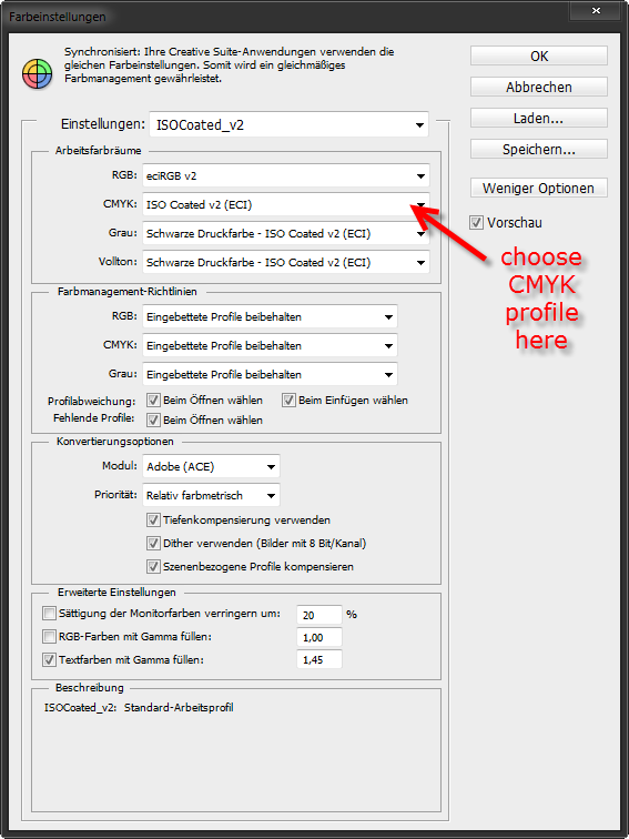
These are the color management settings I regularly use for my CS. Unfortunately my user interface is in German language, but maybe you can guess what the English language counterparts are. As already stated, this is the color management panel from Photoshop, as neither InDesign, nor Illustrator expose all settings to the user:
The red arrow indicates where to select the CMYK profile your printing agency needs (in my case: ISO Coated V2). Under guidelines it is set to keep embedded profiles whenever possible. For color conversion it uses the Adobe (ACE) module with priority set to relative colorimetric.
In Illustrator you just have to check that it converts colors to the correct profile. The Illustrator document should already use the correct CMYK profile (so it doesn’t also have to convert the parts done in Illustrator itself).
Thanks for the screen shot it’s very helpful. I’ve rarely used CMYK color profiles since most of the work I do is digital so this is going to be a new experience/learning curve for me. I’ll start working on it once I can get my editing finished. Thanks again!
If you are strictly speaking of rendering out an image to use for your book cover that is a typical raster style render, of course you can[1].
Any information to the contrary is entirely false.
The key is to know what color space your RGB image is in when taking it to another piece of software for final mastering.
In this case, Blender natively assumes sRGB primaries by default. You could either tag the image as such in the other software, assign a reliable sRGB profile to the image outside of the software and have it recognize it, or some other technique that identifies the RGB image as sRGB.
In doing so, the chromaticities of the relative RGB values can be correctly transformed to the unique printing color space needed for offset printing.
[1] Offset style versus spot. Rendering to a spot format would involve a pipeline to achieve print-ready results.
Great info Ikari,
I have the suite so I have opened Idesign for the first time. I will use this on the other post that you added this thread to. For CMYK. Is there a syntax or search I could use to speed up the learning curve here? I am bringing in that model after you let me know the formula to cipher my DPI on an export. Send it over to P.S for a stroke and then into Id for a CMYK export to the packaging company.
Appreciate your brain man, it is a wonderful thing.
NC
p.s Not to jack the O.P’s thread it looks like you were done with it…August last post. Along the same line of thought.
If you’re familiar with Illustrator by any means use that for you pre-press work. No need to get into the ring with InDesign…
InDesign has it’s merits when your print products increase in complexity and you have to deal with significant quantities of text.
No not done with it I’ve just been too busy with kids and work to get back to it. This is a ton of information to go through just not enough brain power to absorb it all Now that I know what the print company wants I need to carve out some time to actually work on it. I just have to get the render size correct as I really don’t want to resize a raster image when I go into Illustrator unless it’s to scale it down and not up.
Generally raster images headed to an offset printer should be a minimum of 300 pixels per inch in North American terms. Your text elements will be handled by the Raster Image Processor (RIP) and will be resolved to approximately 1200 as a standard.
So, in order:
Work backwards. Find your destination target dimensions for your image. This is probably in a PDF blueprint somewhere with exact dimensions listed. Make sure you account for bleeds and such, and calculate your final image dimension in real world units.
Track down what the printer wants for a raster DPI setting. Generally, this will be 300DPI for raster images, with text elements stored in spline / vector format for rasterizing by the RIP.
Render the final image in Blender and save it as a TIFF. Load the image into your publishing software and assign it as an sRGB image. This will assert that your color transform will be accurate when the software transforms from the RGB color model to the CMYK color model. Note that at 300DPI, your render may take a long time due to the larger pixel dimensions that result. Make sure you account for bleeds!
Identify what your printer seeks in terms of destination profiles. There will be a standard such as US Web Coated V2 or one of the Fogras if you are in Europe. Keen offset printers will provide a monthly calibrated ICC / ICM file that accurately represents the medium and ink combination of the printer you will be printing on. This is your CMYK color space output and should be set accordingly in your software. General settings are as IkariShinji suggested above with Relative Colorimetric. Generally Black Point Compensation (BPC) is also required.
Note if your printer requires bleed, crop, registration, or other marks and flag those as registration in your software. This is a special flag on a spot ink in the application.
Note that there are some strange edge cases with the RIP that can lead to unwanted results. Transparent text elements can
Generate a PDF. Many decent applications will provide a pre-flight check to make sure all of your assets are in order and such. Your PDF should aim for a 1.4 compatibility as a general rule, as it asserts that any printer can handle it easily. Make sure you embed any and all typefaces you are using into the PDF, or make certain that all text is converted to curves before exporting.
Once you generate that PDF, your sRGB TIFF data will be converted to a CMYK set of values based on that output profile. Nothing magical nor complex, and your printer will be able to tell you immediately if something went wrong. The above outline should suffice to keep you from stressing out too much.
A highly encouraged resource for printing is The Print Handbook, which is an excellent resource that will calm even the most stressed of individuals. It is filled chock-full with wonderful advice, examples, and tips such as this sort, while being software independent so the advice works for Illustrator to Scribus.


 I’ve just been too busy with kids and work to get back to it. This is a ton of information to go through just not enough brain power to absorb it all