This is my first attempt at a photo-realistic render and I am completely new to 3D modeling for that matter. I spent about 3 months from first downloading Blender and watched a lot of youtube videos. I feel like I got the hang of modeling and texturing and what not (don’t let that stop you from critiquing those aspects) but I don’t have a clue when it comes to the photo in photorealism.
I messed with compositing to achieve the reflections in the lightbulb but I don’t know where to go from here. It feels a little too HDR - maybe there should be some washing-out of the whites in the bulb? Maybe it needs some sort of glare effects?
Please let me know what you thing is unrealistic - specifically about the render but if you see something wrong with the model then please share.
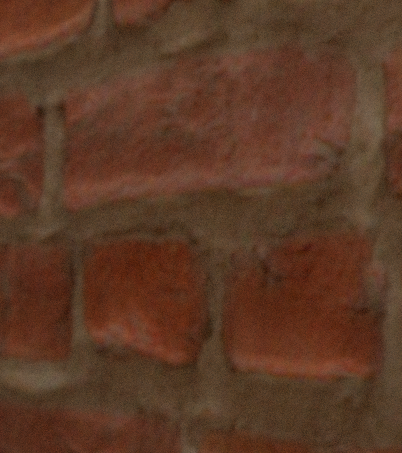
Thank you. The brick wall actually has a lot of detail to it and it was originally a lot more 3D but I reigned it in because a) the actual scene this is rendered on has a pretty flat brick wall (the face of the brick is nearly flush with the mortar) and b) when the displacement was scaled higher, the brick got a weird glossy look (perhaps due to the lighting setup).
i prefers the close view i dont find it so weird
maybe if you reduce the glossines of the material a little bit it can solve your issue, or (and) add a smooth modifier to the displacement
to add more realism, or I say it in another way: to make your image more interesting, you should work on the lightning and color scheme. The lightning works here, but its boring.You could maybe darken the room and get most of the light from the lamp, or vice versa; light the room up. Maybe a morning sun with sharp shadows. (for sharp shadow: turn down the sun size). And add a point of interest, try experimenting with colors.