I think the biggest fault is that the lighting and environment do not compliment the forms of the car. After looking at your original thread, I can see this is a high-quality model, but all the work you’ve put into perfecting the shapes is really not shining through here. Especially given your car design aspirations, and the modifications you’ve made to this one, you really want the finer details to stand out and do your work justice.
I was going to suggest some environment ideas that could help, but it looks like you’re going for a darkened studio photoshoot style. In that vein, this is one of the better examples I could find on Google (of this car anyway): http://www.fewmo.com/wp-content/uploads/2014/03/nissan-gtr-r34-skyline-modified-wallpaper-w8ftekwz.jpg I’m not a fan of the overblown highlights, but it’s a good example of giving the details the love they deserve.
I have no experience with creating such renders, so I can’t give technical advice, but I’ve scribbled all over your hard work to highlight what I can. (I only noted the tires, by the way, because I find that the size and design of a tire and hubcaps compared to the body can pretty strongly affect the impression a car has on me.)
Also, the focal length in the previously linked render is narrower, so there’s more perspective distortion, which helps bring out the larger gesture lines in the car body.
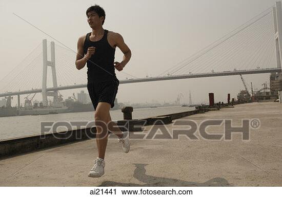
It’s like the difference between these photos of men jogging:
http://www.adpic-images.com/data/picture/detail/man_jogging_through_the_fields_254123.jpg
http://www.delveintohealth.com/wp-content/uploads/2012/12/Intervals-e1356111857420.jpg
They’re in almost identical poses, both have impressive bodies, their clothing and even the scenery and lighting is similar. However, one jogger is a much more interesting and impressive sight. It’s all because of the camera angle, positioning, and focal length.
The second man’s bent right knee does affect the viewer’s impression a little (similarly to a more dynamic car design), so here’s one more example, whose pose is closer to the first jogger: http://fscomps.fotosearch.com/bigcomps/ASI/ASI009/ai21441.jpg Even with the less exciting pose and drab lighting, the camera’s configuration has a great effect.
I think your best render from your original thread is this one. Many of the changes I’ve suggested are already present to some degree. It’s much easier to see what’s going on with the hubcaps, and the contour lines on the hood are pretty clearly visible. It could use some fine-tuning (for example, your great work on the tire treads is hidden from view), but if you really want to make your work shine, I’d suggest moving back toward this setup and going from there.


 Try again?
 … Sorry for egoist bump
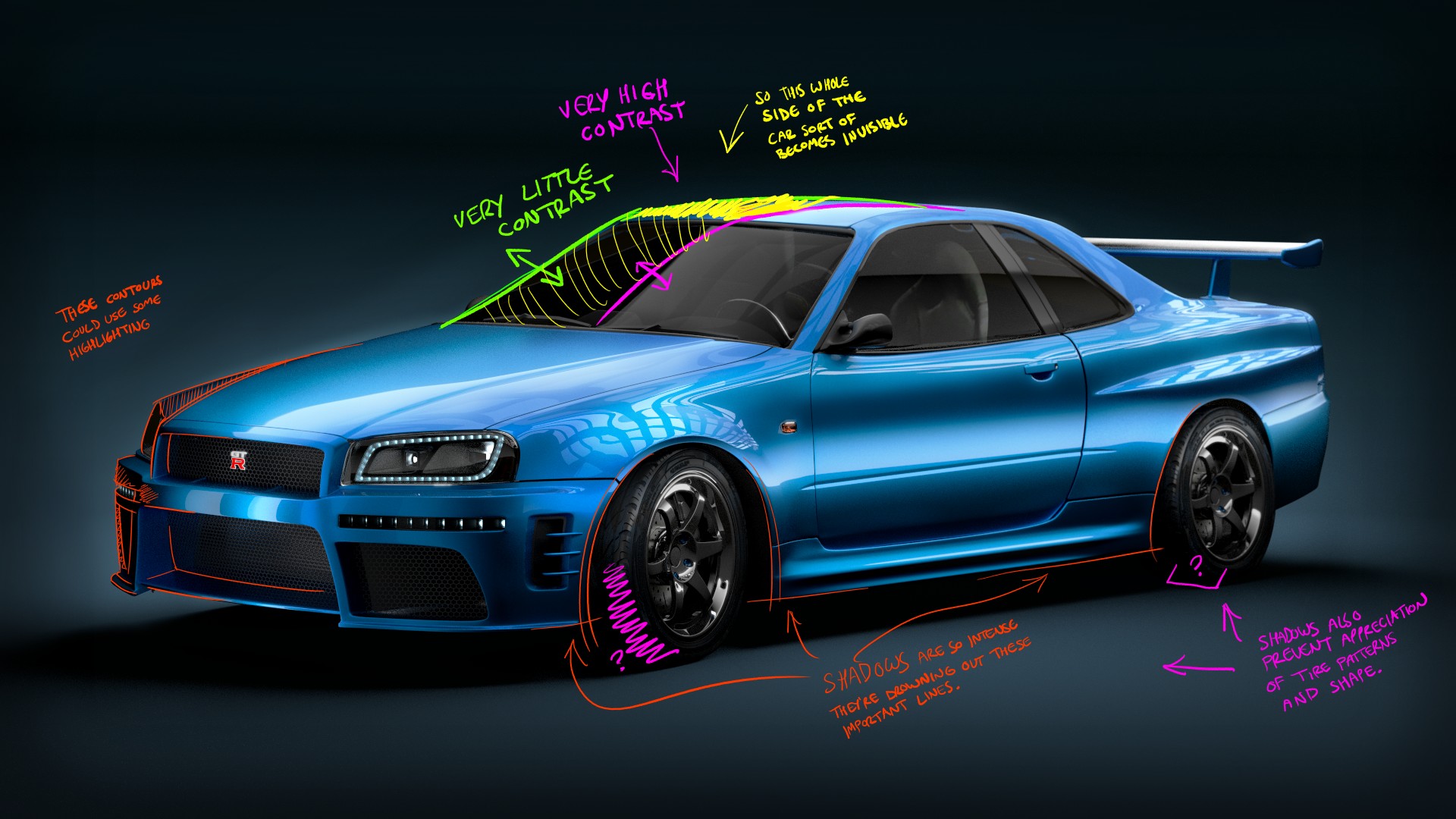
