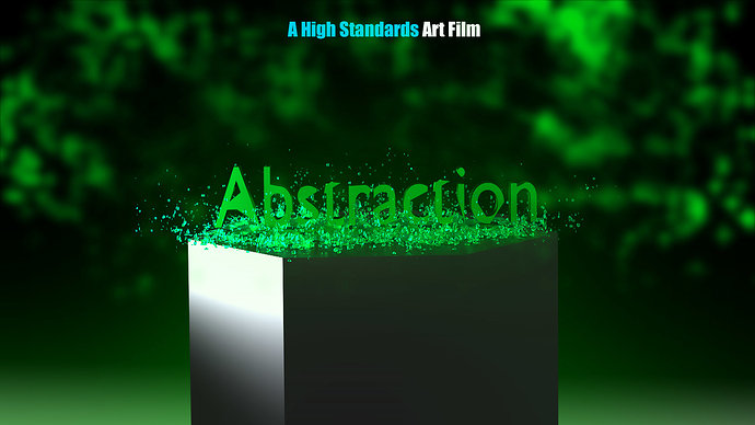
Hi. I’ve read these forms for a while and finally made an account! I made an image for a short film called Abstraction that’s being made. I would love some good constructive criticism before I move on to making a poster. I used Cycles and then finished it up in Photoshop. Thanks!
Everything looks good, but I don’t like the cube. It looks a little out of place in a green poster…
Use something else then a cube, like a glass bowl or something
I really like the green background and overall design. I don’t mind the cube, but then it doesn’t look quite like a cube to me, it does look like the text object is sitting on the back edge though, so I’d consider trying to give it more depth. But what I think would give this image more impact is a more glossy surface to the text, possibly use “fake reflections” to make it look like polished green metal. I might also consider moving the camera up a bit, so you get a “rule of thirds” where the bottom of the A is at the bottom “third” and the bright highlight in the background starts the top third.
