Hey kids! 
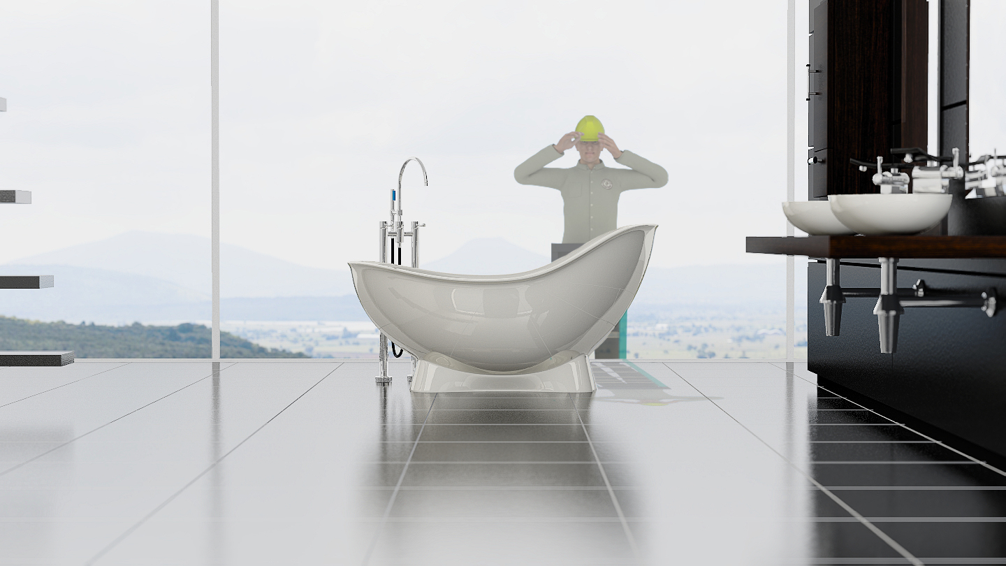
Just something I started working on yesterday, I had been inspired by a bunch of photographs of contemporary rooms, especially ones with the bathtub as some sort of peaceful retreat. Going to try and emulate those shots as best I can, using my own ideas in the design. It’s rendered in BI, and will be for the finished pic. Right now it only has two area lights(no shadows, specular = off) coming through the back windows, and Environment lighting on 1.00, but I might add a sun later. I have the samples for the blurred gloss on the floor set at 48 right now, but it will probably need a few more, and I also have the threshold set at .02 so it’s rendering pretty quickly with some nice results. I just installed the plumbing this morning, and I still have to install the hose and sprayer  And yes, Anthony, I do wish I had a bigger bathroom!


Despite it’s simplicity I think the lighting is great! This is a really nice render and a cool result for one achieved with BI.
I’m not sure if what the sinks are resting on is meant to be wood, but if so I think it’s probably a touch too glossy.
So cool man, I wish I could create images as striking as this.
Thanks Words!  I actually just fixed the wood, hoping to get another render up here in a minute. Thanks a lot for stopping by!

As always, a beautiful BI render, Vicky!
Not that yours needs it, but I used this tutorial for a tile floor I did some time ago.
http://www.neilblevins.com/cg_education/tiled_floor/tiled_floor.htm
It may be helpful to someone checking in on this thread. I know it helped me tremendously.
Again, great render! Keep going!
Looking amazing, Hon. Hey, take your time my 18 x 50 IS binoculars don’t arrive until next Tuesday.
@Longaly: Thanks a lot!  Thanks for the tutorial as well, looks like it will come in handy!
@theoldghost: Hahaha! Thank you!
You’re welcome. As I said, it wasn’t intended for you, just wanted to share for others.
Ahahahahaha!!!
Bwahahahahahahahahahahahahaha
Looking great already, Vicky. Also, hahahaha, what in the world is happening here?
Very lovely so far, and that is one funny addition to the render
@Frobenius.Edge: Thank you very much! I think harleynut97 sent his Inspector over to install a camera outside of my bathroom 
@Craig Jones: Thank you Sir! Yeah, I’m actually still laughing from that one!
I have an update coming up as soon as I shovel more coal into Ol’ Betsy
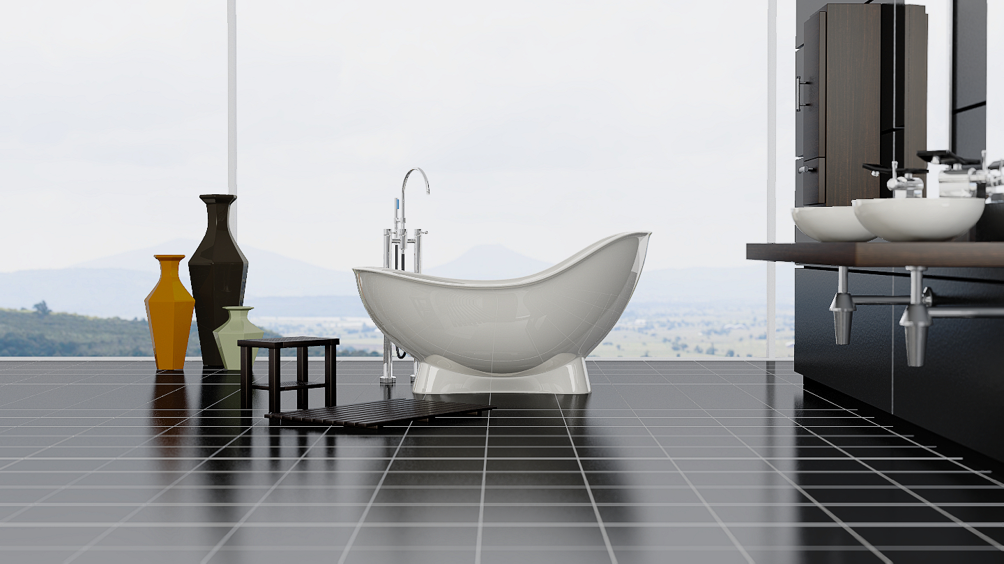
The oblong structures to the left, are they the beginning of stairs? If so I think the spacing is a bit wrong. Stairs or not, I’m not sure they’re necessary at all in my opinion, they seem a little confusing. Also, the piping under the sinks seems to be perhaps a bit too rough, I’m not sure, is that how the look normally? Still crazy good, even better with the updated image, keep going!
–edit from seeing updated image–
So much better!! I think everything I mentioned is fixed other than the pipes under the sinks but they still look better!. Nice cabinet and vases! Again very glossy with the wooden(?) furniture, deliberate? I think I preferred the tiles that you had before, these look a little flat and small, and I think a line might be missing near the bath
–My browser messed up and I posted the same thing twice–
An ode to an old Chicago boy … I don’t think he will be bothering you anymore Vicky
@Words: Thanks again! The stairs were just an idea, probably not going to use them, I was playing with having something in the foreground over there. I might turn them the other way too, we shall see As for the glossy wood(mainly on the stool and mat I am assuming you are talking about?), I was looking at the gloss on this picture: http://ecx.images-amazon.com/images/I/91dl0iBVlHL.SL1500.jpg I’ll probably tone it down and flatten it, I think it just needs some really low/flat specular is all. I wanted to separate those items from the shelf and cabinet, so I might have overdone the gloss and sharpened the spec too much. I might even use a lighter bamboo-ish color for the stool and mat, but the room seems to have a darker feel to it, so not sure how it will look.
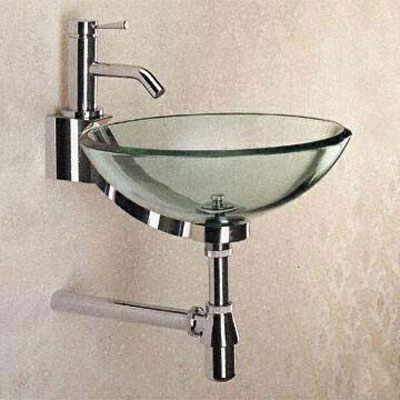
I think the pipes may have too much blur on them, I plan on sharpening it up a bit. This is the style of pipes I was going for: http://www.moderncontext.com/store/images/large/MCBF-17-SOLO-GLS-CL-CR.jpg Looks more glossy than mine, and maybe a bit anisotropic as well, so I might have to add that. I’m freaking hating this floor, so it’s going to change today Thanks again, it’s nice to be motivated
EDIT: Whoops, just reread your post, about the line on the floor. Yeah, I couldn’t figure out what was happening there to tell the truth. Normals are correct, and the materials are correctly separated(I initially though I had mistakenly left the black on that particular of the grout). Still scratching my head on that one
@harleynut97: Ahahaha! Brilliant!! Do I detect a little John Belushi from Animal House there? LOL