When trying to create something photorealistic, I always get stuck at the lighting and materials.
I did follow Andrew Price’s (Blender Guru) tutorial on creating realistic textures/materials, but it somewhat won’t work for me.
The problem is that my materials, ALL of them, gets too… flat or faint/weak/matt/dull (I don’t know the correct word for it).
While everybody else seems to create lighting and reflections that reflect reality, mine ALWAYS gets this cartoonish look to it. Even though I follow Blender the guides of creating realistic looking materials. They look better, but it still has this cartoonish look to it.
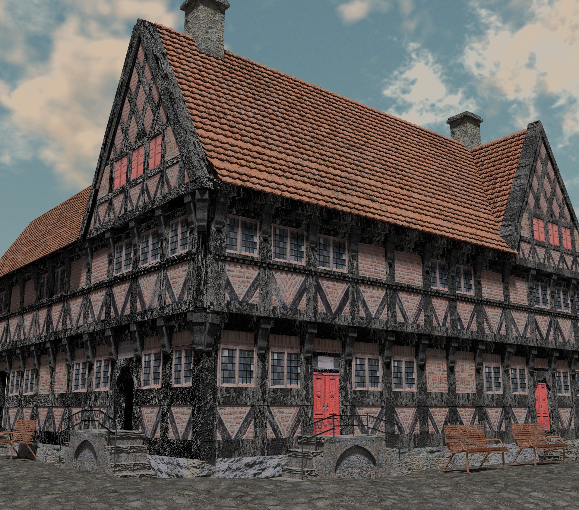
Below is my attempt to create something photorealistic. All I end up with in the final render (Cycles), is this cartoonish image:
I’d say the main problem with your scene is lighting. The main light seems to be directly overhead and is giving a very flat look to all of your materials.
Download some decent HDRI environments and give them a try - see if they improve things (make sure your turn multiple importance sampling on in the world tab). Try ones that have the sun low in the sky (what photographers call “the golden hour”)
Well, ugly is a rather strong term for the image you posted…
The textures contribute largely to the cartoonish feel imho, because…
a) …the bump/normal maps are waaaaaay too strong (= out of scale) and
b) …some of the textures tile very obviously.
There also is something with the lighting I can’t quite put my finger on. Could be the light colour? It’s just that the harsh shadows seem to shout “bright sunny day”, but the overall lighting seems to say “overcast afternoon”. Dunno…
EDIT
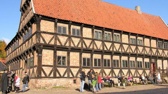
Is this the building from your image?
8 out of 10 times when an image looks cartoonish the proportions are to blame. The human eye can catch very subtle nuances in that regard. Please compare your image with the image above: The height of the steps towards the entrance, the width of the beams, the size and position of the windows in relation to the doors. They’re all that tiny bit off in your model, which takes away from the realism.
-you are not daring to play with things and see how far it would go.
-the sun is very dim, make it very shiny, light makes shadow which removes the flat look.
-put some objects in front of the house -search for what you should put-, real objects make the eye measure things and figure out the scale and the believability.
-introduce your self to composition, most camera effects gets added in composition, vignette, dispersion, flares, tonemapping etc…
People don’t just render things and have them look great! It takes a great deal of time researching, refining, rendering, researching, refining and rendering again!
It looks like there isn’t a fair bit of modesty to your renderings.
Questions to think about:
Why are your textures so dull?
Why are your bump maps so extreme? Everything you have on that building screams "I have bump maps, jack them up to 10000!
Why do you light everything so every side of the building is consistently lit? Shouldn’t there be a darker side with a brighter side given that the sun only lights from one direction?
To me, the main points out of those are that your bump mapping is out of control and it produces super harsh lighting with extremes of super bright to extremely dark. The other is the dullness of your maps.
Keep at it! Things are not so quick and easy and I assume this is more of a frustration post than anything else. Don’t get frustrated! Keep posting as well with updates and people on here will steer you in the right direction.
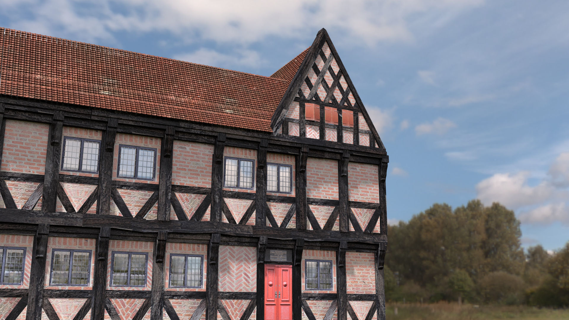
I think it looks pretty good. Choose a better time of day, however. The way the shadows are falling is not that interesting. They just kind of head off to the right at a 90 degree angle. Try rotating the angle of the Sun so the shadow from that farthest roof peak cast on to the main roof.
Compositionally you are missing what photographers call “arbitrary foreground”. It is really important for helping the eye determine scale. Place something in the foreground to block part of the image. Concealing to reveal. There is no challenge for the eye, we can basically see all of the building. Hide some of it.
Another thing that may add some realism…depth of field.
All of your image is perfectly in focus - however if this were a photograph - it’s likely at least part of it would be slightly out of focus due to the depth of field in the lens. Don’t overdo it as architectural photographs tend to be taken with a high F ratio minimising depth of field - but it is always present to some degree.
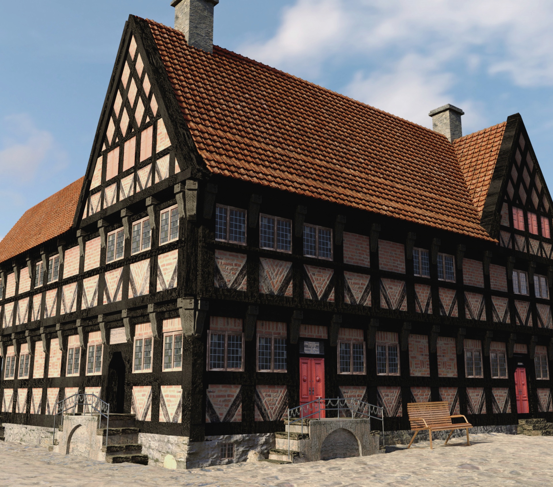
Hey! It looks a lot better! I still think some of the bump can be turned down. I know how you feel though because I do the same thing. “But I worked so hard on the bump I just want people to notice it!” For me, the black wood needs not to have very much bump/reflection at all if any. People are just too far away for it to play a huge factor.
Are you using Blender Internal or cycles? If you are using cycles, I’m just having a hard time understanding why you are getting such harsh shadows in areas like underneath the chimney and underneath the roofing tiles.
If you are using Blender Internal, set a light that points a bit upward to catch the underside of the building OR turn your shadows to a non black value. I still like fill lighting in any scenario.
If you are using cycles, up your HDRI map to 1024 or 2048 after clicking the “multiple importance samples” in the radio button OR use a fill light from the bottom pointing somewhat up to catch the underneath of the shingles, building and chimney.
I like the brick and the doors. They are the strongest so far. But seriously, pump up the value and make some contrast! Your color palet is chalk full of colors with the same values except for the red doors. The brick has the same value as the ground which as the same value as the steps which has the same value as the bench which has the same value as the roof which have the same values as the windows. It’s all one big blur. Set some contrast and get rid of those harsh shadows/direct lighting artifacts and I think you’ll have something really nice.
The windows should be a glossy material and reflecting the environment.
Your second render was a huge improvement, philosopher, but you’ve taken a big step backwards in this last one.
You’ve been lazy with your texture mapping; obvious tiling in the roof, brickwork and the timbering.
The background image does not match at all. The colour temperature is off, the sun is coming from a different direction. And above all, the framing of this picture is as dull as it can get.
Forget for a moment about ‘photorealism’, concentrate on creating a beautiful image. It can’t be stated often enough: learn from the masters, Vermeer, Rembrandt, Renoir.
I appreciate the effort and the questions, particularly your request for feedback. Artistic results, whether it be “photo-realistic” or otherwise, are crafted, there is no “make pretty” button. In most of your examples, the diffuse settings on materials are too high for the lighting and the specular is also too high, particularly on the roof. Seriously, look at the reference and figure out where your image is different. I had a class in my MFA program in which there was ONE still life in the middle of the room and an entire semester to learn how to represent it. My teacher at the time, would shout, “Look, look” and eventually most of us got it, the ones who didn’t dropped out of the MFA program. I remember his teaching to this day, in gratitude. Computers came along after I left grad school, but the art lessons remain valuable regardless of the media/medium.
Example, your black wood has way too much gloss, which is the bump and spec and diffuse settings. The roof would never look like that, it is clay tiles, and they are not glazed. Go outside, take reference photos, including the time of day, atmosphere, different materials and LOOK at them, then try to recreate one of them, or an object or two, … great practice, and ultimately that is what all of this discussion is about, practice. Be patient with yourself, and keep at it.
as the others said, you made a huge improvement between the first and the second image. So don’t give up!
If I were you, I would first delete all the materials, just use clay renders and work on 3 things:
scale of the objects. Do you work in metric system (or imperial). I mean for example, you can search for real bench dimensions and check if yours has realistic ones. Because the proportions between the bench, the gard rail and the stairs look wrong for example.
composition. what is your focus point? What do you want to show? Your building is cut on both side, it looks very flat
lighting
And only after that, you can work on materials and textures. Because you will have a good “ground” to notice all the details (normal, spec maps etc) you will put in it.
You have improved a lot between your first & last renders. I think, the wood still looks bit too cartoonish. Maybe try reducing the bumps on the wood even further. The wall and the roof could perhaps have more color. It still looks little bit grayscale image than color image. Overall, the colors look very dull.
why dont you start with the most simplistic settings such as a coffee cup on a table and sunlight comming through the window. Learn the art of fine tweeking just one or 2 textures, as knowledge grows increase the complexity of your scene. Just a suggestion!
Photorealism is not only about turning on a certain setting or two. Firstly, your image is totally out of proportion (the stairs, the bench, the doors).
Secondly, I’d say you aren’t putting in enough time to really achieve that great look and to understand concepts behind it (test rendering, experimenting, trying out different lighting conditions etc, going with what looks best not what others say). There are no shortcuts. To answer your questions on how to get closer to photorealism: make better textures (normal, specular, occlusion maps), make better models (details), make better lighting (hdri light sources, tweaking tweaking tweaking…).