Space scene

Hi,

Working on a spacescene. Started out with trying to make a city with the displace modifier and a grid particlesystem. Amazing how many polygons you can get with that (I guess something like 200 million in this scene).
Second i added character from makehuman and a weapon from Blendswap, together with a planet i’ve made earlier. I also stole the nodesetup from the arnold-thread, and some textures from cgtextures. =)

Making a new render now, trying to change the characters expression a little bit. She looks very much like a doll now.

Any suggestions?


Very well done! I like ! :slight_smile:

Any suggestions?

I see a few things I could suggest. just a few ideas for you
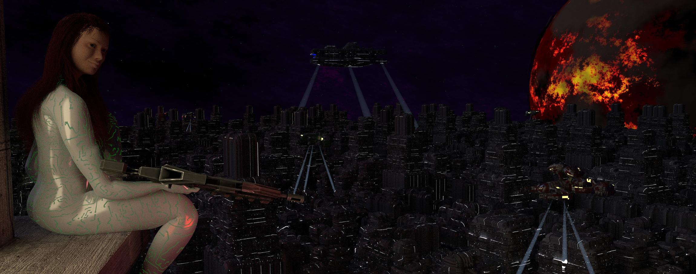
 :slight_smile:

The background Sky
…seems a bit too bright…those ships are lost in it. and it takes away my eye…its distracting me from seeing what is far more interesting. It makes it hard for me to know where to look.

The city…
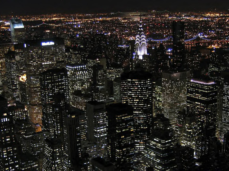
The city building lights don’t fade with the distance…that would really help give more depth to the scene. Overall it looks a bit flat with your current lighting levels.

Background moon?

The lighting for it is hard to get. So If you could tell us what is going on with that moon / planet. Typical it would be lit up from the sun.

Her
…Nice work on her face…

She looks very cool…I don’t think she is too doll like at all.

The suit looks too shinny…you might tone done the specular.

Her Lighting.

the overall lighting right now isn’t allowing her face to stand out…with a toned down sky and city I think your girl will read a lot better.

You could think about ways to get light on her face in ways that make us go wow, yeah, cool.

Its a bit washed out flat at the moment. If her gun had some lights on it you could use that light source to give her face some sparkle. Find some ways to give her more drama in how she gets hit by light…perhaps there is a light on the building she is sitting on…show a hint of that…make us believe your lighting. That will go a long way toward making your great scene be drop dead amazing.

Her pool of light…the Disney guys did this all the time…the main character got a ‘pool’ of light centered on them. All other lights were judged against the main pool.

Good Lighting tips…

http://home.elka.pw.edu.pl/~mskrajno/tutorials/lighting/general/General.html

Her story.

Her story is unclear from her body and face expressions. So changing that will depend on what you want her to be in this scene. Tell us about why she is there and what is going on.

The large ship in the air…

ships in the night sky will have little detail seen…what we see is small lights and a silhouette …I would take out most of those lights on the ship…make a few lights do more…highlight the cool design details. A search light from the big ship toward the ground? that would give a quick story right away…she is being hunted. Only if that is what you intend though.

The composition…
…could use more of a triangle setup. Standard triangle: she is the bottom left, the ship is the top tip, your moon is the bottom right. Bring those elements in tighter to each other. Its a very wide screen format, did you have a reason for that?

GOOD STUFF!

I think you have an awesome scene going on, I love scenes like these. I just think you need to give it some tweaks…You have fantastic building details…make some of the most interesting details show off…then, lose details when they are not as interesting.

Keep posting please. I can’t wait to see where you go from here.

Nicely done. Here’s a couple pointers to add to the above post:

Firstly, her hair throws me off. It really does seem like a doll to me, more specifically a troll doll if you know what I mean :slight_smile: 
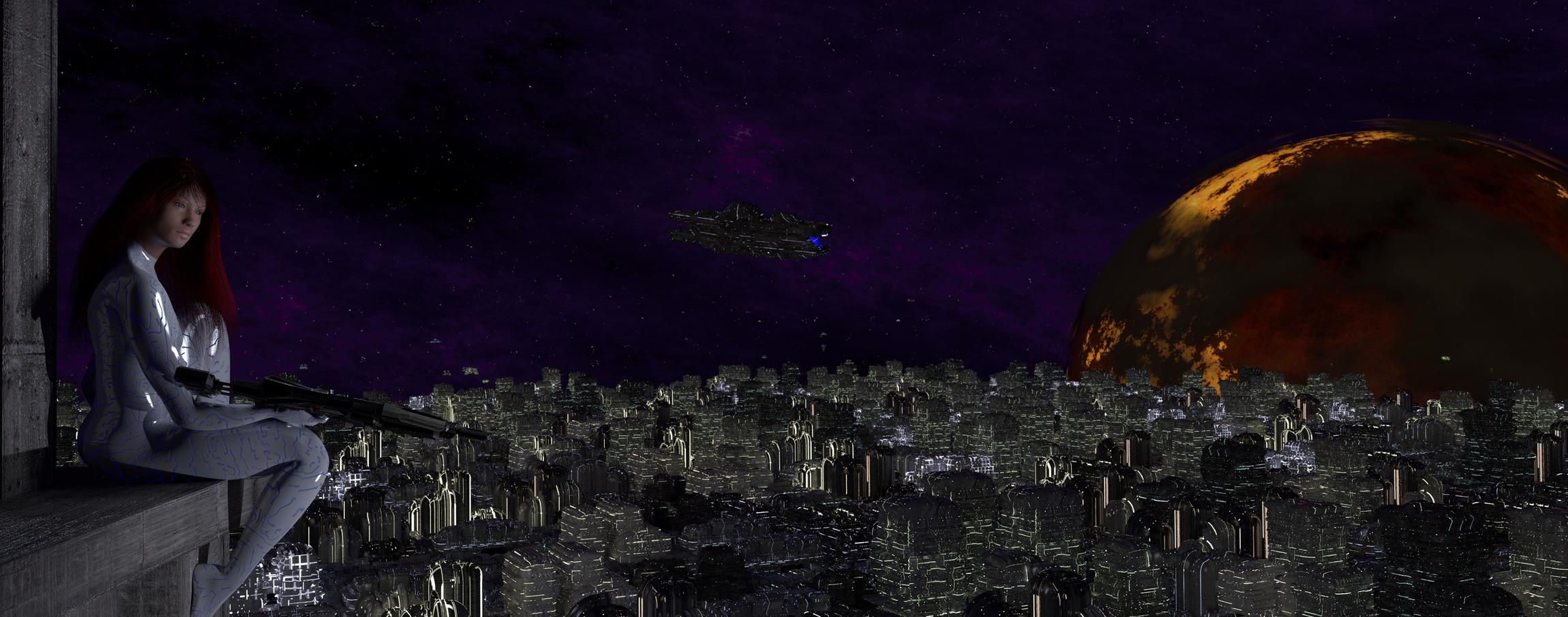
Try giving her hair more flow. Brush it back just a bit or add in a wind force. I would imagine it would be quite windy that high up.
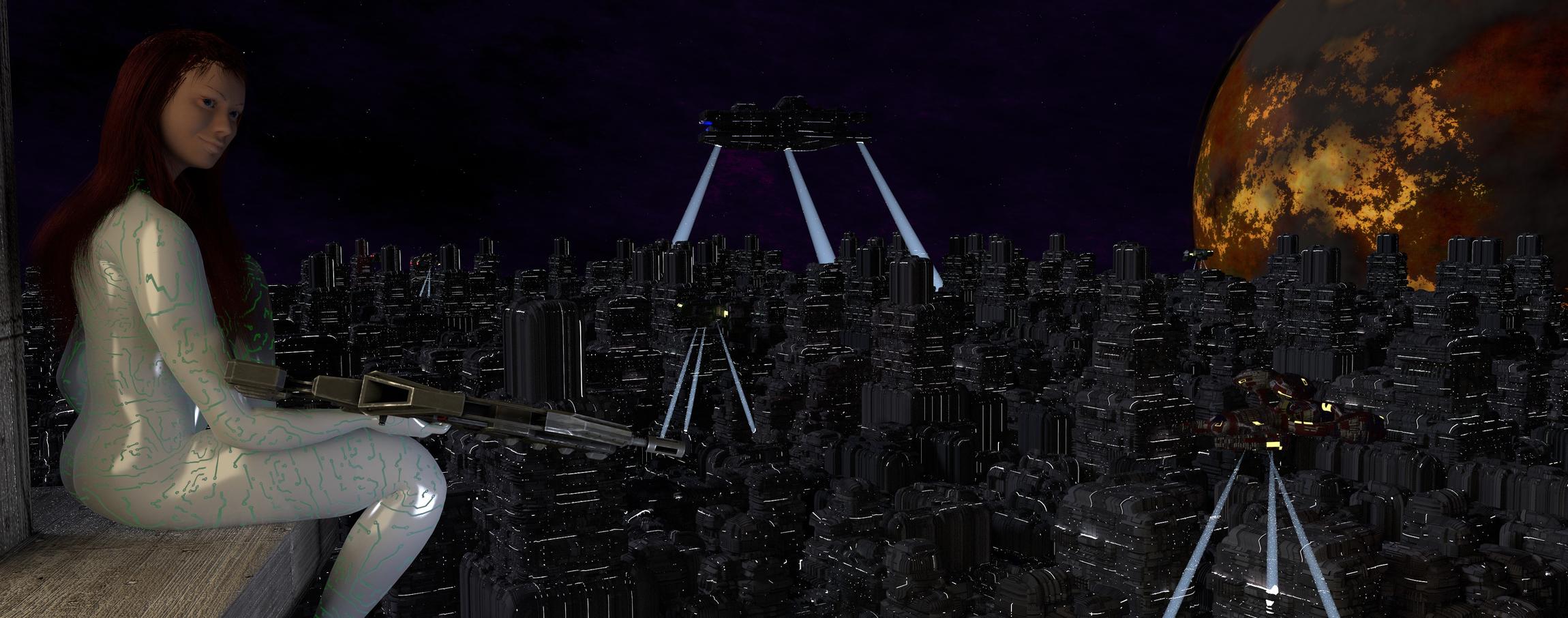
To add to the above poster’s comment on building lighting, maybe try adding in a fog? David Ward has an island tutorial on Blender Cookie that covers fog. I think it might give you a nice effect without having to adjust each individual lighting.

To draw more attention to the character, lighting the face would definitely help, but I think bringing her closer to the camera might help quite a bit as well. She kind of just blends in with the background. And now I think of it, instead of the fog I mentioned, maybe blur the background to make her pop a bit more. I feel like most of the focus is just drawn to the city below.

Hope this helps a bit.

Thanks alot for the very detailed replies!!! It helps a lot. I’ve made a new render, and i think i’ve made some improvements, and adjusted some things according to both of your advice.
The background Sky: I dimmed it a bit, should be better now.
The city: The reason for the screen format was because i wanted to give the impression of a vast city, a panorama. I also wanted to actually show off details of buildning, instead of just having some blurred background image. I wanted there to be details as far as you could see. I changed the lightning and the materials, i think the city melds better now, and show off more details, even though its darker.
Background moon: The lightning was really bad. I hope its more visible now, the clouds are more distinct. Its supposed to be some sort of molten/volcanic planet. I hope it comes off that way.
Her: I fixed her hair, made her expression a bit more interesting, changed the color of her suit, and also toned down the glossiness.
Her Lighting: I changed the lightning, and took your idea about some lightning from the building, put a mesh light at her right side. Should feel more natural. Also have a fill point light from her left side.
Her story: Didn’t really have a story in mind, but i really like the idea with the searchlights! So i added them to the ships, and also changed the ships materials.
The composition: Im completely clueless about these things. I zoomed in a bit, to make the character a bit more prominent, tried to get some sort of triangle. But its a mess to try and move the camera because of her pose right now, so i might have to stick with this =)

I also have a weird problem. The Z-Depth is messed up for some reason. If i add defocus, and use the Z-Buffer, the foreground is blurred, instead of the background. And inverting it doesn’t work. The only way i can get depth of field, is with the camerasetting, or if i use a 100x multiplier into a inverter, and then defocus with a very low fstop value.

Im not good enough with volumetrics in cycles to do a fog, any good tutorials yet?

Oh well, here is the new render. If i want to show a full resolution render, where do i upload that?


You have a great sense of imagination and no sense of reflective color. I see four pics here and I should only see one. That planet reflects color, but I dont see it in the buildings. The black sky should also reflect the scene. The lights, whatever they are, are to strict. The woman is nice, but it sticks out instead of blending. Put some color into the suit. Work on the buildings. Use some nodes to add color, If you dont know how to use nodes, its well worth the effort to learn. You cannot do anything, picture or animation without nodes in blender. I know its a lot of work…I used to hate nodes… This scene needs it…Keep up the good work!!!

With nodes i assume you mean composition? Because i already use plenty of nodes as it is, but you’re right. I dont really know how to make a picture “work”. I guess i could increase the light from the planet, so that affects the scene more. But im not sure what you mean by “The black sky should also reflect the scene”?

Also, i kinda wanted the woman to stick out a bit, so there’s some focal point of the scene, but maybe its a bit much. I do like the material in her suit though, i liked that plastic/latex feel, but maybe it looks unrealistic?

The plastic on the girl is fine. What im telling you is I know what you are doing. You have placed the girl, and you have placed the planet, and you have placed the buildings, but you have not placed the scene itself. Nothing is reflecting anything. I know its hard to comprehend. Maybe if you researched Andrew Price colors would help. I dont want to know what your doing. Nor does anyone else. Dont get me wrong, I cannot do what you do. But color MUST carry over. You have no color. O.K. Let me help. Bleed the color of the moon onto the suit. Just a little. Do it in the material tab. Do the same thing with your buildings. They are black and white. Look out your window…Nothing is black and white. If you posted this pic with a color reflecting off her suit I would be thrilled…But I dont have boobs…

Nice changes, your new render is much much better. :slight_smile: Well done!

her suit…yeah…it just isn’t right somehow. That suit would make her a target as opposed to being able to hide…since it’s night. Maybe it’s a high tech sniper / armor?

The texture of the building she sits on, seems a bit like wood vs it being concrete or some high tech stuff.

The molten planet is not working for me. Texture wise. The sunlight should either hit it or it should be dark…like a new moon. Then the molten stuff could just glow softly on it’s surface…but just a bit…not too overwhelming.


Your cityscape Needs some attention. It takes up 80 % and it’s lighting looks pretty consistent…too consistent. It needs some variations.

Here is a real city at night…look at that horizon…your horizon is too clear…we just won’t see that much that far away.


The building she is on…must be very high and far away from the city. Or is it a central tall tower? It’s scale is gigantic yes?

I hope i dont sound defensive, i just feel pretty lost when it comes to composition, post pro, etc. Why can’t just colors get along with eachother?!? =)

About her suit, i figured it would be some sort of Mass Effect/hi-teck suit. Even made a quick render with the wireframe node to get a cloaking effect. Didn’t think it would fit this image though. So i kinda like it, is what im trying to say. =)

Anyways, i changed some materials around, and did a quick render, is this in the right direction? It was just a quick fix, so i know there’s lots more things to tweak and adjust. Or did i totally misunderstand what you guys said? Regardless, thanks for all the advice and suggestions!