Feedback please!
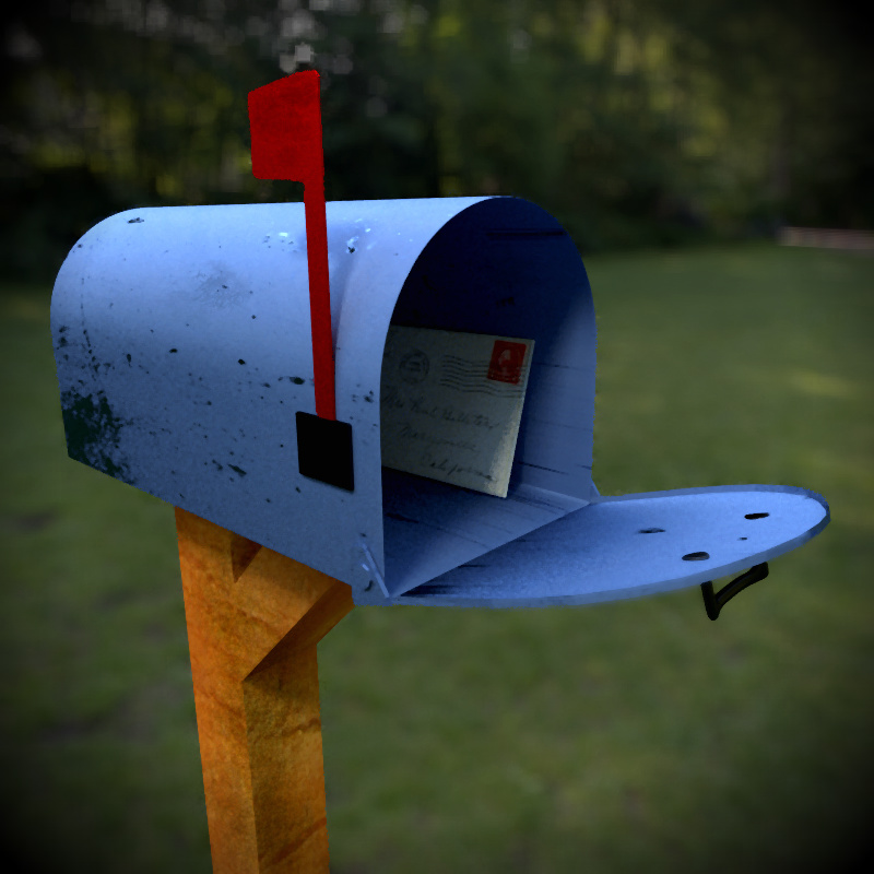
Edit: Scroll down to see a newer, nicer version
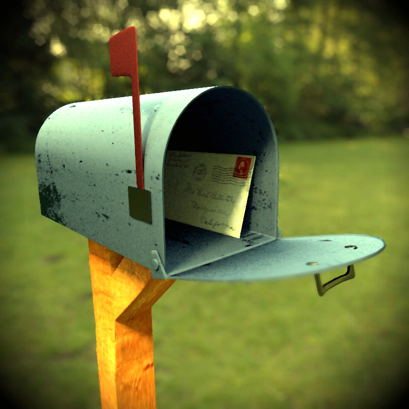
That’s a mighty thin metal on that mailbox you might want to add a solidify modifier. The pole seems really unrealistic.
Well I did add a solidify modifier, but I agree, it does look still too thin. I will make it thicker.
What do you mean that the pole looks unrealistic? Do the edges seem too sharp?
i think the pole looks unrealistic because it splits without any visible seam and stays the same thickness.
nice textures though 
Thanks, I photographed the texture myself. ![]() It’s actually not the same thickness, there are some subtle bends and bumps. However I think most mailbox posts in real life have a pretty same thickness, because they are manufactured to be that way.
It’s actually not the same thickness, there are some subtle bends and bumps. However I think most mailbox posts in real life have a pretty same thickness, because they are manufactured to be that way.
Depending on how far you want to take it
-maybe some bolts joining the angle wood to the vertical piece of wood would help see that it is two pieces.
-perhaps change the design of that metal plate that goes over the bottom of the flag. You would have to have someway
to lower that flag and the design does not seem to allow for that.
You did a nice job grunging the mailbox up, maybe you could also age the wood a little.
If you take the time to do any of the above, than on your final render I would use more samples.
Makes you wonder if this letter coming in or going out… nice idea.
Hi,
-Your textures are low res, you should definitely use some larger textures and try to keep the UV distortion as low as possible on the camera side.
-The metal shader has no reflection, it looks more like a plastic shader. use more reflection + a specular map for it so you can keep the oldish style.
-There are some really sharp edges, bevel them.
-Wood shader needs a better normal/bump map.(if it already has one)
-Try not to rotate the camera in the local z axis so you can keep those vertical lines for a better composition.(Unless you don’t like it that way )
Keep up the good work