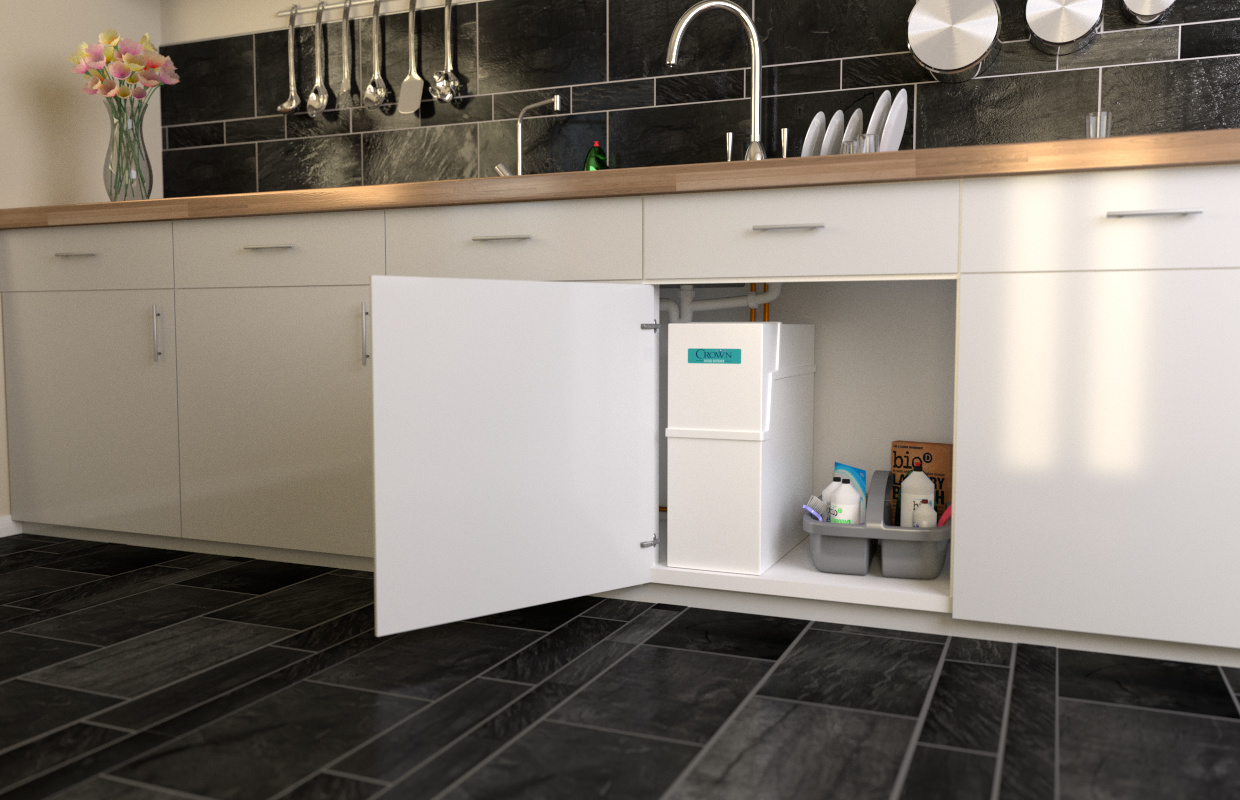
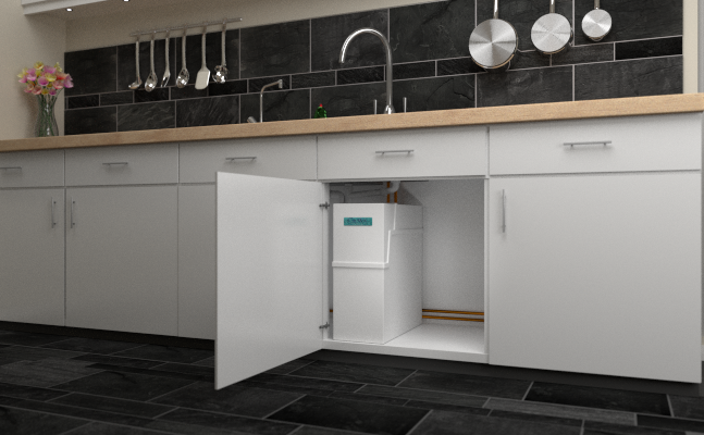
Hello everybody I’m doing some work for a product brochure/webpage, the page is very black/white with Aqua accents I’ve put together a kitchen scene with the product in a cuboard where it would live, and it looks very meh, beyond my student projects I’ve not much experience and I think I’ve reached my limits.
The image lacks pep/soul/pow/life, so I am seeking help and advice in any area you feel you can offer.
My thought on what to do next.
properly bump/texture the floor tiles.
maybe change lighting, but scared of blowing out the cupboards.
add in more kitchen clutter, though cabinet must remain obvious subject matter.
It might help people if you showed a screenshot of how you have your lighting set up now. Is this cycles or BI? Are you using anykind of HDRI environmental lighting? Are any suns being used. My forte is definitely not lighting, but I’m guessing changes there can get you closer to what you are trying to accomplish.
The changes you mentioned with the floor tiles, will also help for sure.
Most importantly since this is for a client and their product… Is that looking photorealistic to you… maybe you can also post a real life photo of the product.
Bring the product out into the room…sort of like a cool diagram…show some of the active filter or whatever inside the much larger model.
The product needs to dominate the room…with x-ray vision on for us the viewer…so you can still see a version of the product under the sink but the room version is the main focus.
clean up under the sink…yes it’s true to an under cabinet but make any pipes and such like go away or just be way more hidden.
Darken up the background to lead the eye to the product…seeing so much of the room gives it importance.
here’s a pic of the lighting set up. There is an hdri image background coming through the window on the right, it’s a black and white studio, there are also 6 little lights under the top cupboards which are just cubes with emission shaders but I don’t think they effect the overall scene much. I think I’ll make those round and pop a chrome fitting round them for some detail. and i’m using cycles.
Thanks for the ideas James_Z, the rest of the very long webpage has some exploded diagrams and annotations and cool bits which all came out really nice, which made me seek help with this specific image. The intention is to show how small it is that it will fit under a sink and waste trap in the average kitchen, though all the sales material from the competitors do remove pipes and such, it just seems a little missleading, though that’s marketing I guess.
Even if you’re modeling a housing environment somebody has to live there. All of these car and scene renders I notice might look cool but no people or animals ever seem to actually live in the environment. This can still work of course and i do think your scene is good, but maybe try doing an environment with more organic materials and less particle board with veneers.
Yes what he said. Add some dirt layers. Maybe tilt some of the handles. Anything to give it a little more life/story.
Floors benefit greatly with a little bump map.
Looks good already. Maybe you want to add some things. My suggestions would be everyday stuff like a bottle of dishwashing liquid, a board with seasonings, some hooks holding a soupdipper, a spatula…Some bottles of dye/domestos under the sink. Some kid’s drawing attached somewhere with a magnet…a calendar or a pinboard, stuff like that.
I don’t want do discredit anybody else’s idea but for a commercial use I would not necessarily add dirtmaps, just my own opinion. It sure is more realistic, but whenever I see kitchens or other rooms in ads, they look pretty much perfect and new when it comes to the surfaces/furniture…Again, just my opinion, no offense to what was said above.
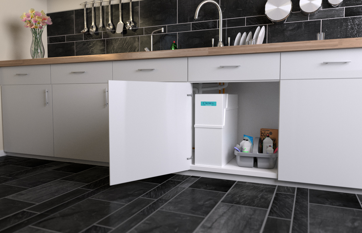
Thanks for The ideas everybody, I’ve got a new version with a some more detail in, any more suggestions would be welcome, especially in the lighting department.
thanks for the reply, I had to google mopboard, it’s a term I’ve never heard before lol we call it skirting board, anyhow the rest of the room has it joining the floor and walls, but it’s out of shot, the kick board under the cupboards is usually just clipped to the legs of the units in case you need to get underneath for any reason, sometime the pipes of this product are run under/behind cupboards so you might need access, here’s what it looks like with a black kick board though. oOh… there goes the graphics driver bye bye days work on Photoshop, why do I never save… managed to break a printer earlier too having a great day lol
Granted that your rendering looks quite realistic and well done, since you are looking for a more ‘living’ atmosphere, I would suggest a warm sunlight from the left (through the window), and maybe a lower diffuse light from mesh emitters (a little cold tone perhaps).
You could also cut away from view some part of the cabinet on the right, the flowers could have a more vivid color and could be bigger, and stand a little farther from the left margin, so to countering and balancing the product.
But I am not at all an expert of archviz, and I may be wrong.
I’d put in a blender (drum hit there). In all seriousness, a few more details to convey the idea this house has people in it. Have a pot on the stove, maybe? Some appliances, a few pieces of food lying around? Some kind of pot holder hanging from one of the cupboard door handles?
And definitely, have some stuff underneath the sink. One thing I look for in my advertising jobs is to give the sense that the product being displayed can be used inside my pre-existing life and it will not disrupt it at all. The space under my sink is atrociously cluttered with daily use items. Soaps, detergents, sprays, pots/pans, bowls and other detritus which gives my house the trashed, lived in feeling that it has. While you want the product to be visible, obviously, and the room to be neat and clean, it really helps the audience to get the sense that this item is useful when it is placed next to their other stuff. Right now, it may convey the idea to some that this item needs to have the entire cabinet to itself.
It would really sell the lived-in house idea. It’s starting to look a little less generic and sterile and more like a home.
Other than those suggestions, I’ve got nothing. It’s looking really great.
A warmer, yellowish sunlight cutting across the room would also greatly improve the warmness of the entire thing. Just some suggestions.
I’m no product or Cycles guru by a long shot. But, I will say I prefer the floor tile in post #1 because it leads your eye right to the product. (Center of Interest) Ditto for the under cabinet lighting where the round ones seem to busy. I would also lose the pipes since I would imagine product shots are a fantasy world pure and simple.
You have a millisecond to catch the viewers eye and maybe two more if you do. And, with that in mind you need more contrast. Way more contrast in my opinion with the highest contrast right on the product. Contrast seems to be a problem in Cycles and mostly using BI I have no idea why. Maybe those HDRI backgrounds? How about a real sunlight or is it a noise thing. Also Westerners like to see things going from left to right including shadows in my opinion. But, nice job and you are getting there for sure.
Many thanks for the suggestions, I’ll definitely try the lighting changes out, try and create some contrast and warmth, I’ll also try and use the tiles as suggested to draw people to the product again, though I’ll keep the new texture I’m sure I can arrange them to direct the eye better. I want to keep the pipes in just because it feels more honest and I’ll add in more cutter for the next version.
Without a doubt Dan is a talented CG artist. Obviously more then I am. But, one can only imagine in the same studio / agency they’re different opinions on anything including product shots.
And, commercial art is full of trends even as fine art is. I think Dan would agree on that. But, that being said the center of interest is still the unit you were hired to highlight. And, your job is to take away anything that doesn’t do exactly that. And, this is where we disagree. Dan has had success with the lived in approach. And, if I was working in the same studio I might have an entirely different approach. Well, that’s where an art director earns their money.
Personally I would like to see the product more detailed and lighter in value if that’s possible. With the creases standing out. In other words make the product the most detailed thing in the room. Even with more specular highlights then the real product has. Hey, it’s called truth in advertising. lol Dan that is a nice looking render there. Two people disagreeing about art. Imagine that.
@theoldghost: “All roads to Rome…” I believe is an old mantra that works. Another could be: “There is more than one way to skin a cat,” or, as Ben Kenobi said, “There are many other ways to kill a senator.”
These are good points. I wonder if it’s possible to do both. Such as, make the lighting highlight we’ve been suggesting hit only the product, while everything else is in non-sunlight? Just a thought. But yes, I agree with theoldghost. You can do it his way, too. Ah, options!
I think you made great progress with the last render!
And as far as I read the comments I can just agree, you have to bring life into the scene!
Instead of pure white lightning I recommend warm yellow to orange tones.
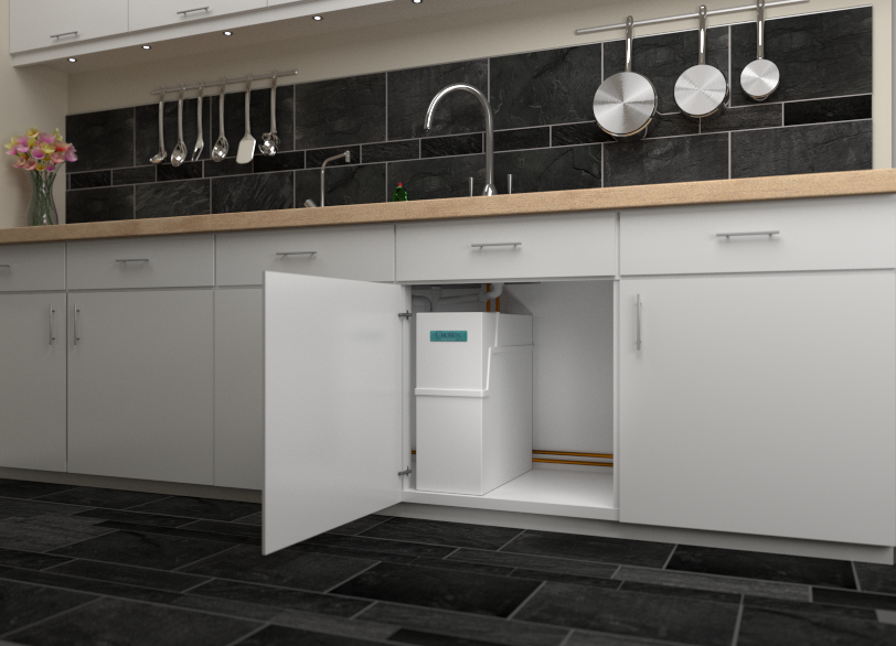
Hi everybody, here’s my latest iteration, messed with the lighting for a while, there’s now a yellowish window to the lest, a white light to the right about twice as strong. a spot on the product, and a couple of weird long window behind the camera, just to add a bit more variety. I’ve included an old render before a few tweaks just to see if people think it’s better without the 2 vertical windows.
I’d welcome any more feedback you guys could offer it’s been a great help so far. I know the product is loosing it’s prominence somewhat but I’m ok with that, there is the equivalent for 4 pages of image heavy webpage above focusing on just the product, so this is more to just show that it can fit un-obtrusively in a cupboard, plus I only have myself to answer to at the company, I’m in the delightful/dangerous position of being my own client.


 Another could be: “There is more than one way to skin a cat,” or, as Ben Kenobi said, “There are many other ways to kill a senator.”