Is there anything to improve? Thanks in advance for any comments or critique.

It’s a decent start, but I don’t think it quite matches the actual appearance. For example, the top seems a little too high above the monitor.
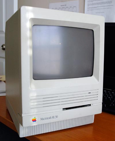
I think it might be a bit too angled also. The SE was, sort of, squarish.
Also…you’re missing that crappy old keyboard and mouse. LOL