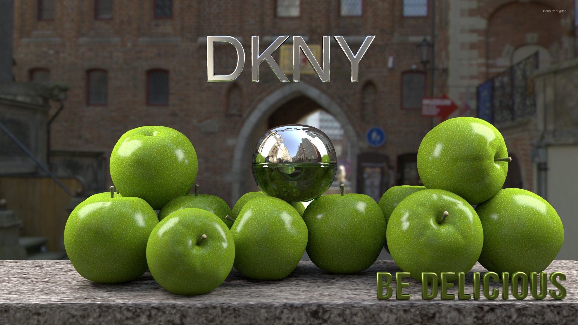
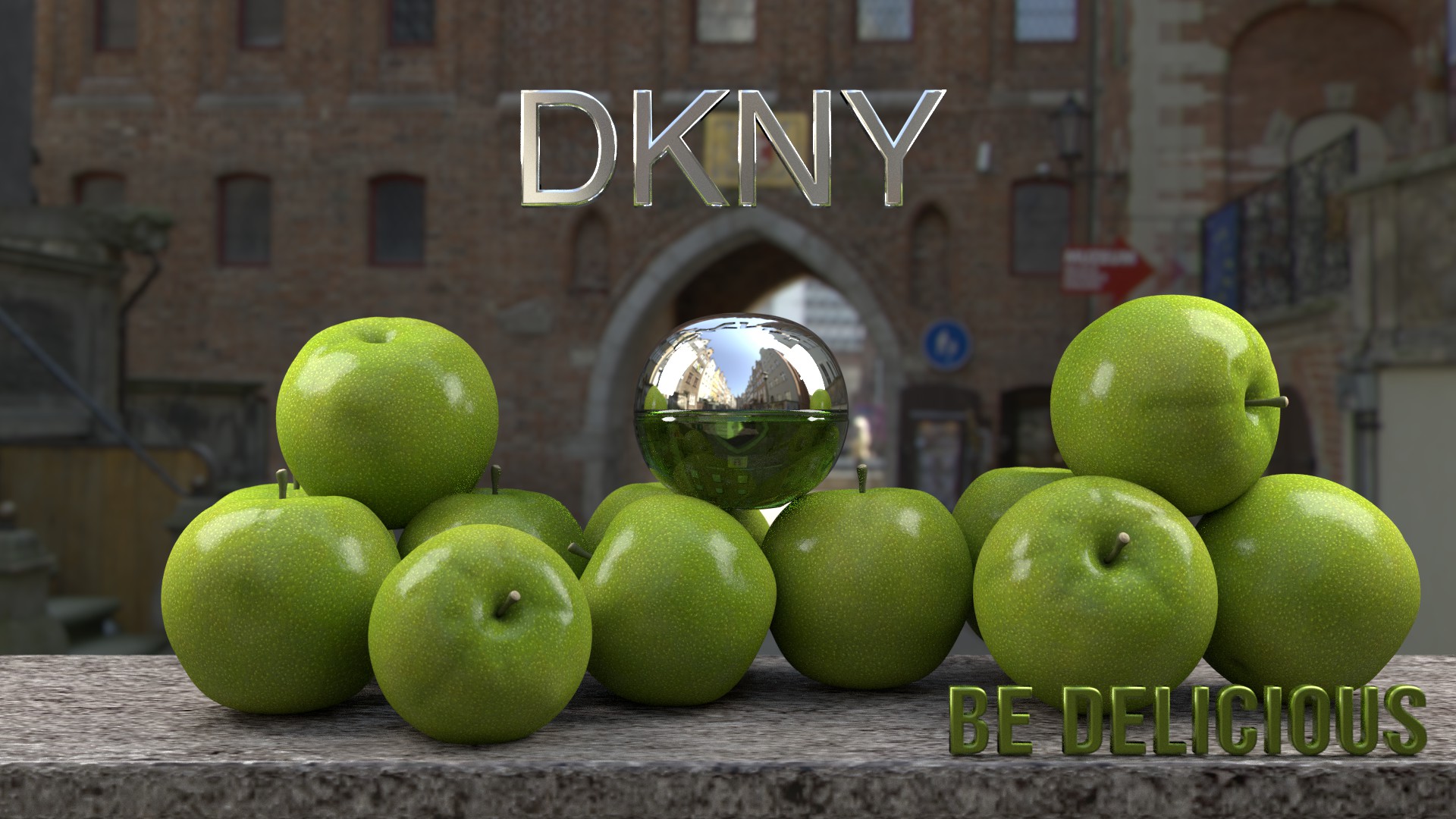
This is my interpretation of the “Be Delicious” campaign by DKNY.
My problems:
Couldn’t find a free HDRI of New York. Any repository for free HDRI’s?
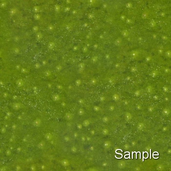
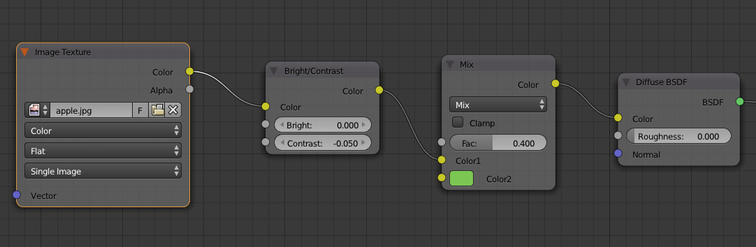
I want to create a proper texture for the apple. Any good tutorial?
I have two emitter planes but they can be seen in the reflection in the perfume bottle. Is there a way to keep just one object from reflecting another?
Adam Szablewski, yes, I could dim the light a little bit.
rally86, that is a good tutorial but it generates a uniform texture just like mine, I’m looking for something with variations in tone, darker crevices, etc.
Thanks lucblend, I’ve already seen a couple of those. I’ll check the others.
The big issue is the bump/displacement on the apple skin. It just jumps out and says “I’m CG”. Green apple skin is smooth, but these have bump that actually is closer to an orange. If it’s procedural bump just multiply it by a low number (.3 , .1, .01) If it’s a normal/bump map, turn the strength down. The good news is that all you have to do is decrease something you already have, not create anything new.
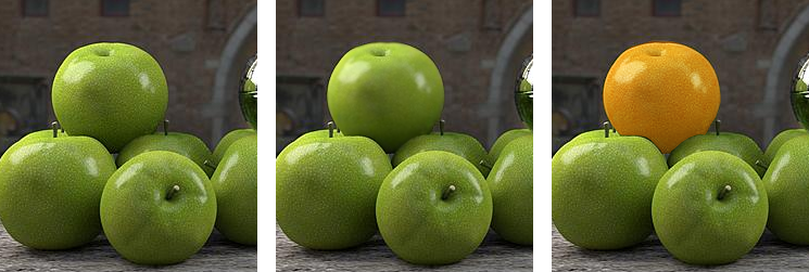
*Note the top apple:
Image 1) original
Image 2) Blurred to make it smoother (closer to a real apple) , of course you would turn down the bump to achieve this.
Image 3) Hue has been shifted to show how the skin bump is closer to that of an orange.
You can say whatever you want, that texture is making the apple look fake. A color map with exaggerated contrast does the same exact thing as bump. Go buy a green apple and photograph it, it won’t have that much contrast between the highs and lows, not even close.
I would try another less contrasted image texture, or at least use a mix rgb node to mix a pure green back in. Do a side by side comparison of your apples as is, and with this node setup mixing green back into the color of texture. Keep all your glossy nodes the same.