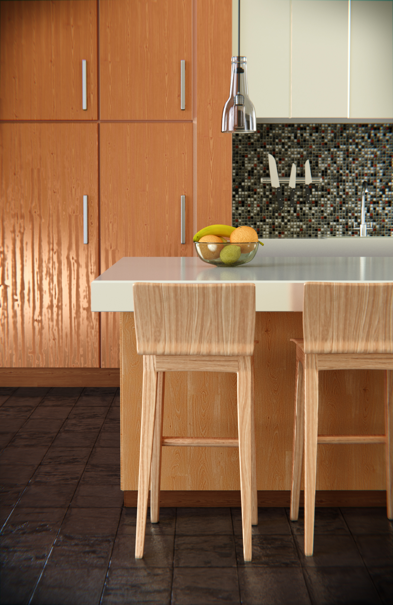
Not much to say really. It is my first architectural scene and would really want some feedback. For first time, i am satisfied, but overall i dont think it looks that great. What do you guys say?
I am most happy about the floor and the fruitbowl :eyebrowlift:
Rendered in Cycles 1500 samples with multiple importance - map resolution 256 HDRI
GTX 660ti 1300 x 2000
First off I think the overall image looks pretty good. The vignette however is a little strong for me, I might start by lightening up on that and making it a bit more subtle. The floor looks good and so does the glossy countertop, however I think that the specular reflection of the wood cabinets to the far left is wrong. It looks a little like plastic. Perhaps the bump is to strong?
Some person pointed out i should change the texture of the small tiles so you could see the knife-stand better.
I personally like the texture because it is a little bit random and since it have those few red ones it kind of breaks the image up and gives a little bit of spice.
Also, any tips for more photorealism?
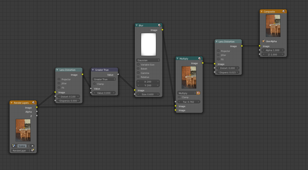
For the final image on the previous post i used this setup for the compositor. Nothing fancy. :eyebrowlift:
There have been a lot of architectural render this winter (In my opinion) soo many really good ones too, a lot of photo realistic ones. What is the secret? Is the material or render engine most important? Cycles, octane, vray, etc.
Also i saw a list where someone was speaking about general photorealism. He pointed out the most important keywords was lighing, DOF, Distortion and grading, do you guys agreed?
This is of course somewhat a matter of personal taste, but I for myself have never understood the need to willfully degrade image quality with lens distortion / chromatic aberration and the like to achieve “photorealism” (these effects certainly have their place in artistic and stylized looks, no doubt).
Photorealism = looking like a professional photograph, no? But lens distortion and especially chromatic aberration are results of cheap equipment, why would a professional photographer use that? Why would he/she want the image to look like an amateurish snapshot? It’s kind of ironic that many photographers would murder to achieve the clean look of CGI, while 3D artists on the other hand feel the need to integrate flaws into their renders to make them look “realistic”.
So I would agree to any of your keywords except lens distortion.
In your kitchen render for example the chromatic aberration is IMHO way too strong. Even amateur grade camera gear would not remotely produce so strong aberration in this situation. If at all, I would use this effect very subtly. Otherwise it’s even more of a giveaway for the CGI.
I agree that the knives need to stand out better, but instead of changing the tiles, have you tried changing the color of thehandles of the knives?
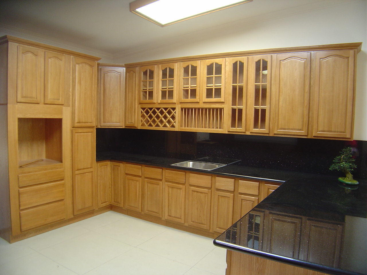
Also I still think your wooden cabinets could be improved by not including the wooden grain in the specular at all as the shininess comes varnish or oils lying on top of the wood not the wood itself. Here’s an example showing what I mean.
Other than these nitpicks I think the scene looks good!
You kind of blew my mind there. Never really tough of it that way. We make it less perfect, trying to make it perfect. :eek:
Thank you so much for that reply, it was really useful!
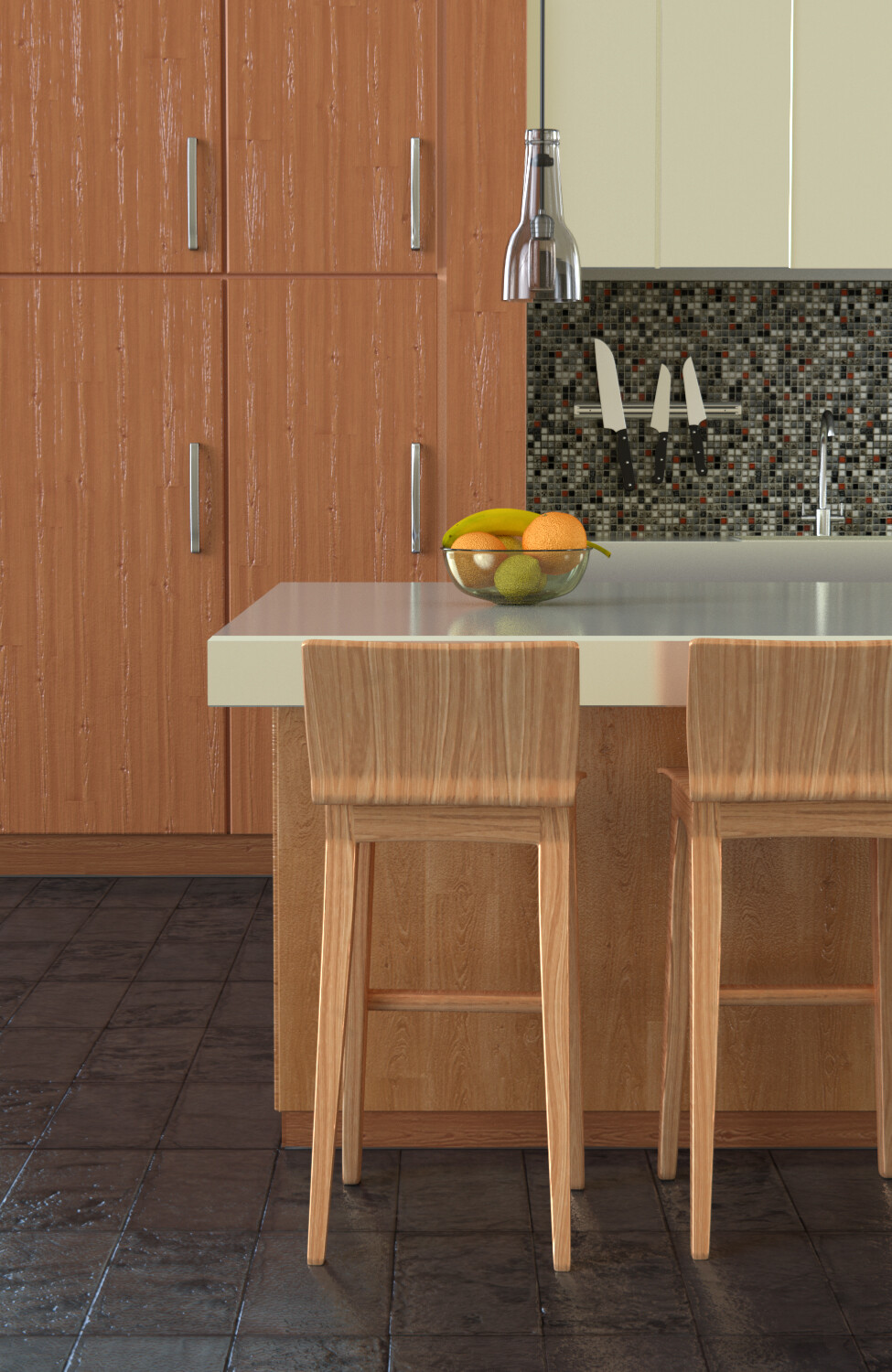
So I have changed some materials/composer and added a very small silicone strip along the bottom. (hope silicone strip is the right term, im Norwegian)
This is looking nice. To the above poster-the knives are held by magnetism. The floor is looking really nice, with that reflection. The banana is great. I think maybe the oranges have some issue with the displacement? Either way, you’ve done really well at this point. I think some new lighting (like trying volumetric) would really benefit this. Great job!
First off, I think your scene looks great. That said, I think the knife blades look a little flat (non-reflective). Additionally the fruit provides a nice focal point, but the knife blades against the tiled backdrop are distracting (to me). Perhaps a material with some more reflectivity, similar to the one on your faucet or cabinet handles?
My advice is to add grunge maps- dust and fingerprints, dirt, etc. Put them on everything, subtley, especially glassy and glossy stuff. Also, I think you should tweak the composition some. The border between the cabinet drawers draws attention away from the fruit. It’s right on the one-third mark, and it should be moved if possible. The fruit probably shouldn’t be in the center, either. But anyways, the texturing and modeling are great. This Is awesome overall especially after fixing the wood. I like how the lighting seems to come from big glass windows. It makes the room feel clean, spacious, and free.
For your first architectural rendering this is asstonishing.
But here some fixes I would do:
Making the wood texture of the cupboard a little bit bigger
Reducing the bump slightly on the cupboard
Decreasing the roughness from the knives to 0.0
Increasing the bevel-steps on the table to about 4 or 5
Partial I would agree but do it only reeeeaaaaally suttle because it is like a planned architectural photoshooting. And for those photoshoots they clean the whole house/room. If it would be an exterior shoot than no dought overall grunge and dirt would suit well.
But keep going seems to be a big potential in you.


