I think I am almost done, but I still think some things can be tweeked.

Very nice composition. Good luck. 
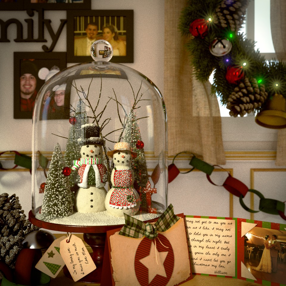
To my eyes, the snowman and especially the “snow” in front is just a whisper too “hot white.” In other words, in the darkroom right now I would be reaching for my dodging-tool to cool it off just a little bit. I’d probably dodge the spot on that ornament in the mid-left, although I wouldn’t touch the wedding-picture. (The photographer in that shot just caught the flash of another photographer who was taking pictures at the same time.)
It would be nice if there was some color coming through that window, since otherwise it threatens to be “the brightest part of the picture,” also in the corner of the frame, thereby tempting the eye to go “z-i-i-i-ip!” up and out of the shot. You need the window there since you need the wedding-picture (and a good, balanced left-to-right composition), but it’s fighting a little. I might dodge that, too.
All in all, an exceptional “photograph,” making very good use of refractions in the glass, and maybe just in need of (imho) a little “post.”
I love everything about this scene… I’m impressed with so many things you have done here. The wreath I think is great, perhaps colored lights, or more yellow in the lights. If there was anyway to put a touch of randomness to the pine needles coming out of the trees inside the globe I think it would further help sell the globe part. A nit picky thing are how the picture frames are actually touching each other, maybe a little space between them.
But once again you have put together a very inviting and warm scene. I’m going off memory here, but didn’t you do the Thanksgiving table not too long ago? This scene is every bit as good.
Nice job. Only comment would be to add a little curve to the cards, as in life they tend not to be that flat. Not a complaint though, just trying to be helpfull. Good Luck.
That’s a beautiful and photo realistic work of art! I have the most difficulty in making realistic materials, but you seem to have gotten them perfect! Do you have any tips on how you create such natural looking materials?
Sundialsvc4: Thanks for the comments/feedback. I love to hear this stuff. I agree the snow looks too white (hot). I was going for a bit dramatic lighting but it should go down a bit. I definently want yellowish snow to show some age to the globe. I have been looking for ways to tone down the light on the front bell but haven’t been succeful lately, luckily there is still some more time.
I might think about adding a tree or hints at green/snow on the outside. I don’t really like having just white/ blown out windows either.
What do you mean by “dodge”? Is it a post-pro term/technique, if so I haven’t heard of it and would love more info on it.
Thanks again!
Starfingers: Thanks! I completely forgot about that! If I am going for real-ism I better take care of that curve! Thanks again!
Harleynut97: I love your feedback because it all pertains to realism which is what I also go for! I think I might put some color to the lights, maybe some deep blues, greens and yellows. I see those colors on houses all of the time during Christmas. I will give it a try.
I struggled a lot with the trees in the globe. Here was my thinking: All plastic Evergreen trees that are in train sets, village sets, etc. have the same look. Tons of horizontal single layer branches with patches of snow. I wanted to stay true to that realism rather than realistic trees.
Hahaha, my wife said the exact same thing about the picture frames. I used our own picture from set for reference and she could instantly see the difference (and thats a huge problem!!) but we couldn’t put our finger on it for a while. Thanks!
I did do the Thanksgiving table! Thanks for noticing. Infact I have been putting together a handful of folksie scence from child-hood memeries.
Thanks! I will give it a try!
ItalianJoy: Thanks! Time is the best tip I can give. Each material I put together takes at least an hour to get right. Then as I go along through the scene, I end up changing a few to match the new materials and that process goes on until they are all cohecsive. I get a lot my knowledge from different tutorials put on by CG cookie and of course Andrew Price. I do my best to not copy their materials but to put my own folksie spin on it. Then I grew up with a folksie family with all kinds of nick-nacks around the house. Most of the time the materials come from memory but of course I use references to perfect them. One thing I suggest though: Everything must have some gloss, no matter how little or how rough. It helps breakup an even texture so not only are you getting light but reflection as well. Although the render times are crazy, especially on a laptop, it is worth it in the long run! I hope that helps :S Not used to giving tips.
Here is an updated version. Yes I know about the samples, it takes forever to render so I will take care of that tonight.

Wow that is looking great.
The colored lights on the wreath did make a big difference… what other changes did you make? This entry will surely be a strong contender.
Thanks! I added a paper chain in the back; got rid of the bell in front and put a paper chain; added curve to the photos; added christmas tree lights behind the camera; re-did the post pro glare. Most of those changes will be easier seen in a more final-ready render. I am getting 1 ready right now, will post in about 3 hours.