This may be a really weird question, but that is because i don’t know what it is i’m looking for… something’s missing and i’m not sure what it is.
I’ve been feeling down lately looking at other people’s work compared to my own. When i look at someone else’s render, whether it be cartoonish or realistic, the images really look like the characters are alive in their own world… where as when i render mine… it looks remains looking like just a render to me.
I suppose i can show you a few of my own renders to help give you an idea.
These are done in Blender Internal, but i feel like there’s still something i may be lacking. I’ve never been good with lighting and now these days i put on a sun with ray shadows and sky turned on with ambient occlusion.
Or is it just that i’ve been looking at my own project for so long now that all i can’t see the feel of the result?
In general, make the foreground more interesting and no blurry flat textures and if it’s so bright sun, more depth and variation to ground and trees
if the highlights make character’s face look like there’s ice cream on it, take them off
don’t make clothing shiny unless the purpose is to make it look like latex. Also a thick jacket with a hood on so warm day seems strange
horizontal line should be horizontal and not angled
view over long distances have atmospheric effect to them, making things less visible
trees cast soft shadows
camera effects: focus, vignetting
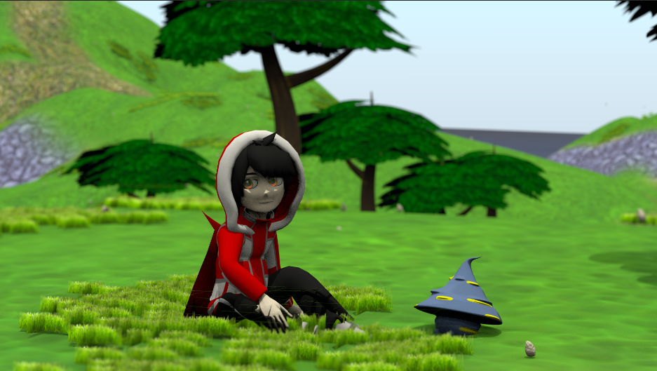
I did a quick doodle in Gimp where I tried to add those things in the image. Using mouse here and no skill so the end result is what it is, but perhaps it gives ideas
I feel almost dumbstruck at how much better that looks! That’s amazing the difference that made.
And with so many good tips too you seem to really know your stuff!
So all in all it seems i may want to re think the clothes, re texture the grass a bit or see if particle grass is possible for my project. (i don’t know how well it works with animation), learn some more about the camera for creating that atmospheric sort of look that make things a bit blurier off in the distance. So far the only way i know how to do that is with the Mist setting but its’s giving me trouble right now…
Soft shadows i’d have to look into as well because of my knowledge of lighting being behind the rest of my blender skills, look up about sky domes or HDRI maps, and figure out why that horizontal line is not horizontal. maybe the render distance wasn’t as high as it could have been.
But over all i’m really impressed and i’m happy to see one of my creations actually looking good for once through your Gimp work.
Often times i would look at other’s work and compare them to my own and i would be left feeling bad about it. But if i look at your wonderful editing i feel almost inspired to work more on it (:
JA12, that is some inspiring gimp work, how on earth did you create that realistic grass?
Razc, your at the point where you’re “almost there” you have the modelling skills obviously and your textures, while not mind blowing are certainly better than a lot of stuff out there. theres some learning ahead for sure but i can see a guy on the edge of becoming a quality artist. so yeah keep at it.
i would look at your textures, JA12 has given you some good guidelines already, but i see your textures remain flat. obviously you could go with some grass particles to bring your work to life, but you can also achieve a lot by using texture maps on your surfaces too. don’t just settle for using the procedural textures. add image textures, noise, make sculpted bumps and distortions into your surfaces and bake them into normal maps and displacement maps. dont be afraid to layer textures over each other and add your particles on top of that, anything you can do to create interest. without overdoing it. it could all go horribly wrong and leave you with a mess but dont be afraid to experiment.
Definitely don’t look at other artists’ work and get discouraged. Look at their work for inspiration, learning experiences, or tips to make your next render look better. Believe me, I did this at one point and it makes you not want to touch Blender again. After I refocused and saw that I could look at their renders as a way to improve myself, I started getting better at the realism. I still have a lot to learn, but I’m now encouraged to do better. One thing you should remember: no matter how good you get, there will always be someone better. Learn from them constantly to always improve.
Clothes are not that bad. The hood made it look like a winter jacket to me but that could happen. I have a pic of myself wearing warm winter clothes in an environment that makes it look like summer (bright sunlight too), but in reality it was way below zero when my friend and I were on the move that morning.
Yeah, particle grass might be a bit much but the point was to create some variety and interest on the foreground like others already mentioned.
Camera depth of field (DOF) makes the background blurred. Could check some tutorials on that. Sun lamp has soft shadows setting.
If you want to experiment with mist, here’s one tutorial that uses it.
If you haven’t already looked into render layers and compositing, those would give quite a lot of control over the elements in the scene and you could cheat more. Perhaps use a backdrop as background, add different effects/adjustments on different elements. Here’s one breakdown as an example
background effects: clouds (could also be in the bg image), adjusted saturation
middleground elements (hills)
middleground elements (trees)
foreground (grass)
foreground (characters)
final effects (vignetting)
Note that many elements separated in render layers wouldn’t probably look like that, it’s possible to put elements over each other and don’t always require masking. I just separated what I had in Gimp.
I didn’t I took someone’s render result from a realistic grass Blender tutorial, copied small rectangular patch, blurred the edges and then used that as a (clipboard) brush. I used a few of those and adjusted the brush size when painting from back to front. Rest of the variation comes from clone brush work, burn brush (shadows, darker areas), and a subtle vignetting effect.
Edit: forgot to mention, I used a smudge brush on the layer mask to get grass on the characters and make them appear like they’re sitting “in” the grass instead of just floating on it.
Still amazed at how easily JA12 was able to point out just about everything i needed to do xD
I still have a list of things to look up but so far i looked into Depth of Field in Blender and i think i’ve got it understood for the most part.
I fixed the shininess of the clothes. I guess i thought it looked good at one point but you’re right that it doesn’t really belong. I still want to maybe redo them because they actually don’t have textures at all rather then they are modeled with the typology so that regular materials could make the colors but i really need to quit doin that. And then along with that i want to look into how people stack up textures so that i could color the clothes, and then maybe put some cloth like patterns ontop so that it looks like it’s made of a cloth aswell.
Then i knew that Particle grass would probably too much to handle for an animation. so i thought i could make flat images of grass with transparency and have a hair particle system throw them all over the place. When i filled up alot of the area the renders got especially long and it didn’t seem as real as you would think. So i decided maybe i could have patches clump on in areas along the landscape. I tried turning on the normals for the texture on the island but i don’t think that helped out all that much.
Oh and i also made a particle system to throw little rocks all over the ground aswell but they seem to be acting a little funny at the moment.
The trees i may add some foliage around the bases of them or little mushroom like things into their mesh so that if i duplicate some trees around to fill the area, they will come with their own added detail for when they are in the foreground.
I still need to figure out the soft shadows, and i’m having trouble with a skybox/dome sort of thing. I’ve been looking into Skydomes and HDRI maps but i’m not exactly finding much. Is there a way to make your own Sky map or HDRI sort of thing with Photoshop? I was trying to make clouds in photoshop and import them into blender and try and do that thing where you take a picture of a mirrored ball in the middle of it all but… i found that i don’t remember all the details of that and it didn’t work right…
Lets see what else…
oh yes, i had just one more question.
You were right about how the snow jacket sort of thing doesn’t fit the rest of the area. Today here even in the desert where i live it was very cloudy and a tad bit cold as it was trying to rain. and it made me wonder, what would you have to add that would make an area look cold? Just a complete cast over sky and some slight blue lighting without shadows?
Thank you everyone (: even as it is right now i feel so much happier with my render
You’re all awesome (:
Yeah, it’s easy to make things look like they don’t belong there. Perhaps searching for some reference photos of places similar to this could help find out what things add variation.
Maybe but I don’t think they would come out with good enough quality. They could work as a light but to have a full sky rendered it would have to be high resolution and high quality. You could probably get away with just normal lights and put the background on a plane since there aren’t many reflective things in the scene. Rendering would be much faster.
If you plan to rotate the camera such that the sky have to be visible all around it, perhaps you could do that in another shot and create the sky just for that. But maybe someone more experienced can give better tips on how to do this.
Yes, cold colors can make the image feel cold but if you want to make the world inside the image look cold too, that is more involved task.
You would have to define what cold is first and then think about the location and the time of year. Also the time of day would help. This definitely requires reference images to make it very apparent because the viewer has only a limited view to the world you’re showing.
For places where there are freezing winters, cold weather and thick jackets (without actual freezing weather and snow) would mean it’s autumn or spring. A bit of cold is enough to scare the trees and they start to drop their leaves. Lots of leaves. Grass is more resilient but shows color changes in less dense areas and long grass gives up pretty quickly. Temperature changes mean humidity changes, so when temperature changes quickly and drastically where there is water, you get fog. It’s usual in the morning and evening.
Cold temperature in spring is more obvious since everything is crummy and very little new life is rising from the ground.
For the shadows… there are always some. Shadows are more localized with very diffused/ambient light. Perhaps check ambient occlusion.
Another important thing to keep in mind is composition. What feeling or emotion are you trying to convey? What is happening in this scene? Your shot is rather unbalanced, as there is a big white space in the upper right corner. That space could be filled with another tree or a cloud, or else you could rotate the camera down just a bit to cut some of it off. Composition is of course often one of the most important aspects of an image, so learning a little bit about that will certainly help to give your scene more life. Some ambient occlusion might help, because it’s currently a little hard to tell where the shadows are, and consequentially, where the light source is. If it’s an overcast day, i’d accentuate the cold and wet feel with darker and more muted/cool colors, much softer shadows, and some fog from a Z pass, all of which can be done in compositing. You’re doing great! Keep it up!
If you have a few spare hours, take a look at one of my old threads, where I struggled with exactly the same problem. Unfortunately, the tutorial I followed is no longer available, but there is a lot of discussion in the thread.
@Razc - Cold is a difficult thing actually - i know there is a cold in deserts during the night; i’ve been in places where all is green through out the year and some 8 deg C was most terrible cold one can imagine; bright sunshine does not make feel it in image i think.
I’d say tone down colors, make it closer to grays.
Flatten the lighting as well. For exterior scenes, the sun is at a lower angle in the colder months. Also, you could make the light more diffused for an overcast sky look. I would definitely look at summer month ref pics and winter month ref pics to pic out the differences. And like eppo said, desaturating the brighter colors could definitely give you that cold, harsh look.


 One thing you should remember: no matter how good you get, there will always be someone better. Learn from them constantly to always improve.
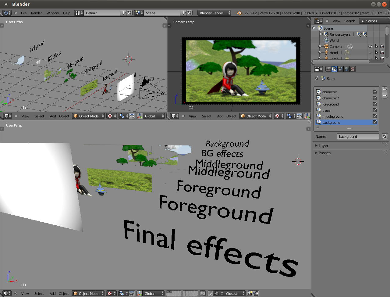
