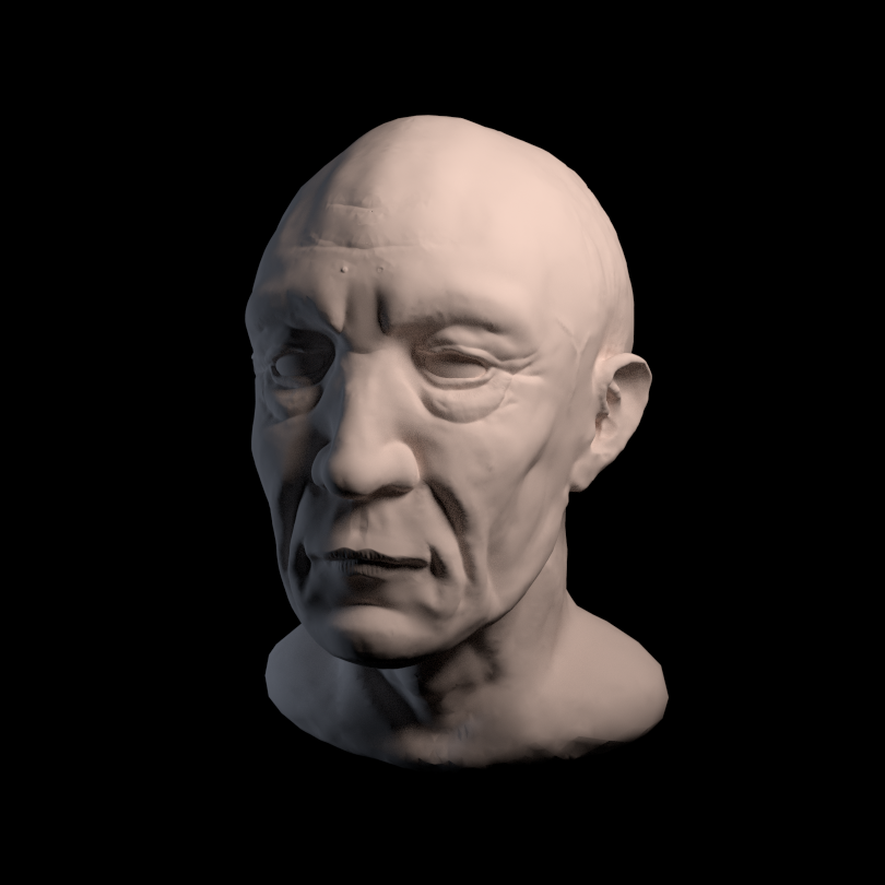
I just finished my first sculpt. I went through the Blender Cookie Human head modelling tutorial to get an idea of the general workflow, and also to see what the brushes may be useful for. Anyway, here is my effort:
I’ll have a go at a few more. Any obvious errors in terms of proportion, form, anatomy? I think the eyes look the most wrong to me.
this is a very good start for sculpting … things that are not coorect is the back skull is too small, the ears are too flat, they need more bowl shape. look at someones ears from backside and see how bowl they are… yes eyes,their problem is the inner side is not deep enough into the head (the eyeballs are too large) and i think, but hard to see from this view, the upperlid is not forward enough. when you look from side, you see that upper eylid and lower eylid form an angle that is slanted backwards, meaning the lower eye is further back… all these for helping your next sculpt, so you know where to pay attionn. yes, really, for a first sculpt very good work. with hair, two of the errors would not have been seen even! well done
edit: i do see another one the horizontal indent on the nose, is too high, it usually sits on the horizontal centerline of the eyes…
Thanks Doris, I found the process pretty fluid - the Blender people have done a good job with Dyntopo (as you had mentioned - the older subdivision method seemed like it would really detract from what I wanted to learn).
I’ve attempted to incorporate your suggestions into my first sculpt so that I could reinforce those ideas without having to think about all the other stuff that I’m still learning I don’t think I quite managed to to do them justice yet, I’m still spending a fair chunk of time working out which tool achieves what I’m trying to do…and rectifying my shaky lines that I draw with my track pad
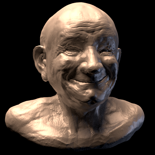
Attempt 2 - I appear to have added a few extra issues
yes, very good improvements. good idea to start a new one, it gives you possibility to repeat what you learned and try more. yes, dynatopo is really a great tool for sketching, and for learning sculpting. you will learn the brushes. my favourite is claystrips. i use that 90% of time while sculpting. next is grab tool… the others i only use rarely, and more toward the end of a sculpt, for cleaning up, making finer creases, ridges etc… but, that is personal preference, you might like other brushes better, depending on how you work on a sculpture. enjoy the journey!
Thanks Doris. I started a new one, with a similar theme, but with the addition of a particular expression (and minus a few teeth). I also switched off symmetry earlier in an effort to make him look a little more natural. I don’t think I quite captured the expression yet, looks a little too much like a grimace - the eyes don’t quite look like they are part of the smile to me.
I used the clay strips brush a lot more this time, and I can see how it is appropriate for something like this. I managed to create most of the shapes that I was aiming for just by using that (and a few grabs when I had the overall proportions significantly off).
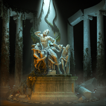
As some of you may guess, it’s heavily influenced by Franz Xavier Messerschmidt. As always, please feel free to let me know of any criticisms you may have.
Thanks. I did like it, but I have since seen far too many things that bug me about it. The neck tendons on the right do not look like they are under tension at all - I didn’t pay full attention to all the angles, it would make more sense if the curve was slightly concave. I forgot to redo the ear lobes, but that’s not the focus of the picture so it doesn’t matter too much. I tried to pay attention to previous mistakes to avoid them this time:
upper crease in nose at right height
back of head in proportion - though this doesn’t look great here
ear shape - I looked in the mirror and pulled this face and my ears became quite flattened so I don’t think they are too bad here.
inner side of eye socket - this is a little deeper than my first attempt, but the eyes are so different here that I think I introduce a whole list of additional issues.
-angle between upper and lower eyelid - Same problem as above - I couldn’t decide how this should look.
-flesh between upper eyelid and brow - Same as above.
Lights and shadow casting are just fine.
Great sculpting skills.
What Franz Xavier Messerschmidt is trying to achieve is a little different.
He had all this obsession with egyptian and roman art.
It looks like he was trying to solve a puzzle. Not just anatomy and passion, he wanted to express them through well defined geometrical forms.
Very difficult for me to explain it further.
The art of Messerschmidt has something common with the works of modern artists like HRGiger.
He carves wrinkles but they also look like following a weird grid. Almost a geometrical decoration.
Thanks Michalis, I think I see what you are explaining. There was something about Franz’s sculptures that I didn’t identify, I had problems comparing his work with live expressions (my own face and other examples!), there was something that was different between the two that I failed to understand - what you suggest definitely seems to complete that puzzle somewhat.
I should add that I didn’t intend to exactly copy his work, it was more that I wished to imbue my latest effort with some of the feeling that I got from looking at his work. Just a strong influence rather than a full critical breakdown of his style and building a new work entirely with that in mind. I’m sure there is more to learn trying to understand deeper layers of the artistic meaning behind a particular artists work…hopefully I will pick up on more of these things as time progresses.
Yes, when I loaded it into the scene I immediately recognised it from your metal horse scultpure! I did not mean to copy haha but the the few others I had were not ideal for this one. Inspiration for the dirty vertex shading came from Michalis’ bronze sculptures - that was the first time that I realised what it was and it piqued my interest with the shading/materials aspect of Blender. Another tool in the box…
The environment map reminded me that I had wanted to try and replicate how you did the shadows on the floor from your metal horse, maybe I will save that for another day since it is not too important for this one. I see that you posted the node set up, so I will try that later. I can see how this method combined with camera mapping (I supposed the invisible plane is camera mapped?) could produce some very nice looking results, animations especially.
Interesting render!
BTW, this is my studio on the background, not seriously LOL
I mean it is the first hdr I also used
I think it is not a real 32 bit hdri, just saying.
yes, michalis, the hdri is a free one, and (thus?) not the best quality. i like it however sometimes… matt, i do not know excately what camera mapping is, but yes there is a plane on the ground, rendered on an extra renderlayer, and also rendered all the shadows separately. then in composer, i used from the plane render only the shadows, not the plane itself, and after quite some fiddling i got it combined (now i rather do such in photoshop, since i know better how to acheive the effect there, but at this time, i once wanted do it “completely in blender” … yes, the metal horse i used this one…
I think you are right. If I recall correctly (no laptop access right now) it is just a JPG, which I assume means the dynamic range will be clamped to whatever the lower bit depth was? I used the technique in the link in order to fudge that to intensify the light areas. I have a few real HDR images too, which I will try out over the course of my next sculpt.
After reviewing the camera mapping that I had seen elsewhere, I think you may have basically figured out how to do it (or something very similar) on your own so camera mapping might just be the name that other people use for what you did (though typically with single images rather than HDRi environment textures). Here is a rather nice video demonstrating how single photos can be turned into a limited view 3D animation () of each photo. I wouldn’t have much use for it, perhaps just some short animations for presentational purposes. EDIT: here’s a tutorial, you see how it compares to your method.
Just a quick attempt at uploading a video. Not a particularly interesting one I just wanted to test another way to present a piece of work, it could work quite well with some more attention to the camerawork and lighting, but will stick to stills for the most part.
yes, matt seems very related to what i did… ah, video presentation is good, so i can really see (and almost feel) your sculpt… actually for a sculpture like this a presentation it on a neutral background would focus the viewer better on the sculpt when rotating. you can still use the hdri for lightning, just turn it off for camera view.
 … things that are not coorect is the back skull is too small, the ears are too flat, they need more bowl shape. look at someones ears from backside and see how bowl they are… yes eyes,their problem is the inner side is not deep enough into the head (the eyeballs are too large) and i think, but hard to see from this view, the upperlid is not forward enough. when you look from side, you see that upper eylid and lower eylid form an angle that is slanted backwards, meaning the lower eye is further back… all these for helping your next sculpt, so you know where to pay attionn. yes, really, for a first sculpt very good work. with hair, two of the errors would not have been seen even!
  the horizontal indent on the nose, is too high, it usually sits on the horizontal centerline of the eyes…
 I don’t think I quite managed to to do them justice yet, I’m still spending a fair chunk of time working out which tool achieves what I’m trying to do…and rectifying my shaky lines that I draw with my track pad