Hey all!
I recently posted this artwork in the WIP section (a big thank you to all the blenderheads for their valuable input there…), its my entry for the Blender Guru Competition.
Critiques extremely welcome 
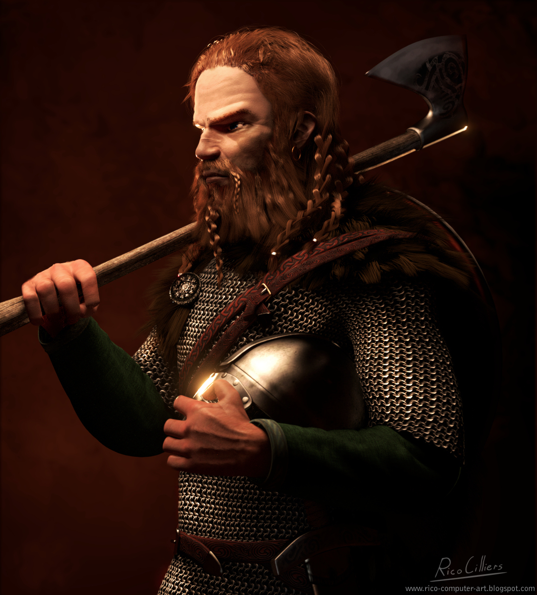
Thanx,
Guss
Hey all!
I recently posted this artwork in the WIP section (a big thank you to all the blenderheads for their valuable input there…), its my entry for the Blender Guru Competition.
Critiques extremely welcome
Thanx,
Guss
Amazing work:)
There are a few bugging things that you should correct to improve your character:
-The first thing is the chain mail, you should go a head and turn it in to a mesh instead of a simple texture. Blender Cookie have a great tutorial if your interested? I think it would take the model to a higher level of detail, the texture is quite repetitive and the lightning gets off a few places.
-The braids of hair is way to sharp. The small mustache braid seems good, but not the larger ones:)

-You should make sure the weight of things is correct. A shield is quite heavy, right now it seems like its made out of cardboard. The weight should push the supporting belt closer to his body, especially at hes shoulders. It seems like the fur is extremely stiff, it should have a nice pit to highlight the weight of the shield. Take a look at this: http://cdn.physorg.com/newman/gfx/news/hires/hydroelectri.jpg
-Left sleeve of the sweater goes through his hand, it doesn’t rely interact with his arm at all. Right now its hovering above his hand, It’s almost as if the sweater is a stiff pipe.
http://i00.i.aliimg.com/wsphoto/v0/356605878/Women-s-hot-selling-winter-font-b-knit-b-font-font-b-sweater-b-font-christmas.jpg
-The axe seems like a light close combat weapon. The balance point is on hes right shoulder, which makes the axe quite easy to hold in place. Right now he is leaning all his arm weight right on the shaft, he should be holding it.

![]()
-You should consider making tiny hair strains on his hands, it would really make a different:)
-The scar doesn’t really make any sense? The scar has most likely a curred in a sword fight. A scar should follow a more natural curve where the opponent’s sword hit. The scar should start at the other side of the nose, then make a gap and then continue on hes cheek. Tyrion Lannister in Game of Thrones makes a good example:
http://www.independent.co.uk/incoming/article8551286.ece/ALTERNATES/w620/Tyrion-Lannister.jpg
-You should add some variety on the skin texture, just look at a reference image of a real scar.

Again, great work so far:3
I think also his right hand holding the axe coukd be improved. Index and pinky fingers catch light as if they were too flat. Also at least on my hands in that angle I think I would see the valleys between the meta carpo phalangeal joints.
I wonder if adding the small hairs on his hands will make a difference that is visible or not.
@ Heinzelnisse,
Hey thanks for taking the time to crit man! I’ll try to get around to fixing all that stuff… 
@ tobbew
Thanks! I’ll work on the hands… BTW I have to go look up “meta carpo phalangeal joints” on wikipedia first  I’m not much of an anatomy guru
About the hairs on his face… I dunno. I could do a test render but… it might send my render times waaaaay up so yeah…
Nice work, hair especially looks awesome.
A couple suggestions:
Overall though, a lot of the above is nitpicks. You’ve done a great job on a lot of details, like the texture of the face and the patterns of the straps.
Good luck in the competition- this looks like it could be a pretty strong contender to me.
Amazing textures!
First. I’m not a really skillful artist myself but still I like to help. I’m still learing so I might make stupid mistakes and show my ignorance so please be forgiving.
I would like to see a more dirty and aged and used version of everything in here. The helmet for example is way too smooth.
The skin is way too even. I think you need to add some discolorations caused by exposure to elements like the sun, and age. Also add some wrinkles. Some fuzz on the face and hair on the hands and fingers would also help. For now, the skin is fit for a girl or a lawyer than that of a rough Vicking Warior.
The eye seems to be set way to deep into the skull. I’m not very much knowledgable in anatomy yet but from what I know, the eyes is not set that deep. Something is also funny with the ear. I know that the ear is a @*%$! to make but I think you need to improve it.
The strap is floating. It should have pressed down the fur on the shoulder and lay closer to the shoulder. This might mean a little “cheating” is required: say use two hair particle emitter for the fur to devide it on the contact area between it and the strap and paint over it in the post comp to correct errors.
A different pose perhaps? Something that is more… more active, more powerful, more dynamic, more viking-like. This pose is way too stiff and sedate for such a rough character. I don’t really feel the Viking. It lacks the punch.
Also add some more post work. Painting over the hair for example to make it less CGish. The braid straight out of Blender needs something to be desired. A photo background would also help though that might mean a different lighting. You could actually do a lot of correction and ‘cheating’ in the post work to help improve the image.
That is it for now. I wish you good luck.