Hi!
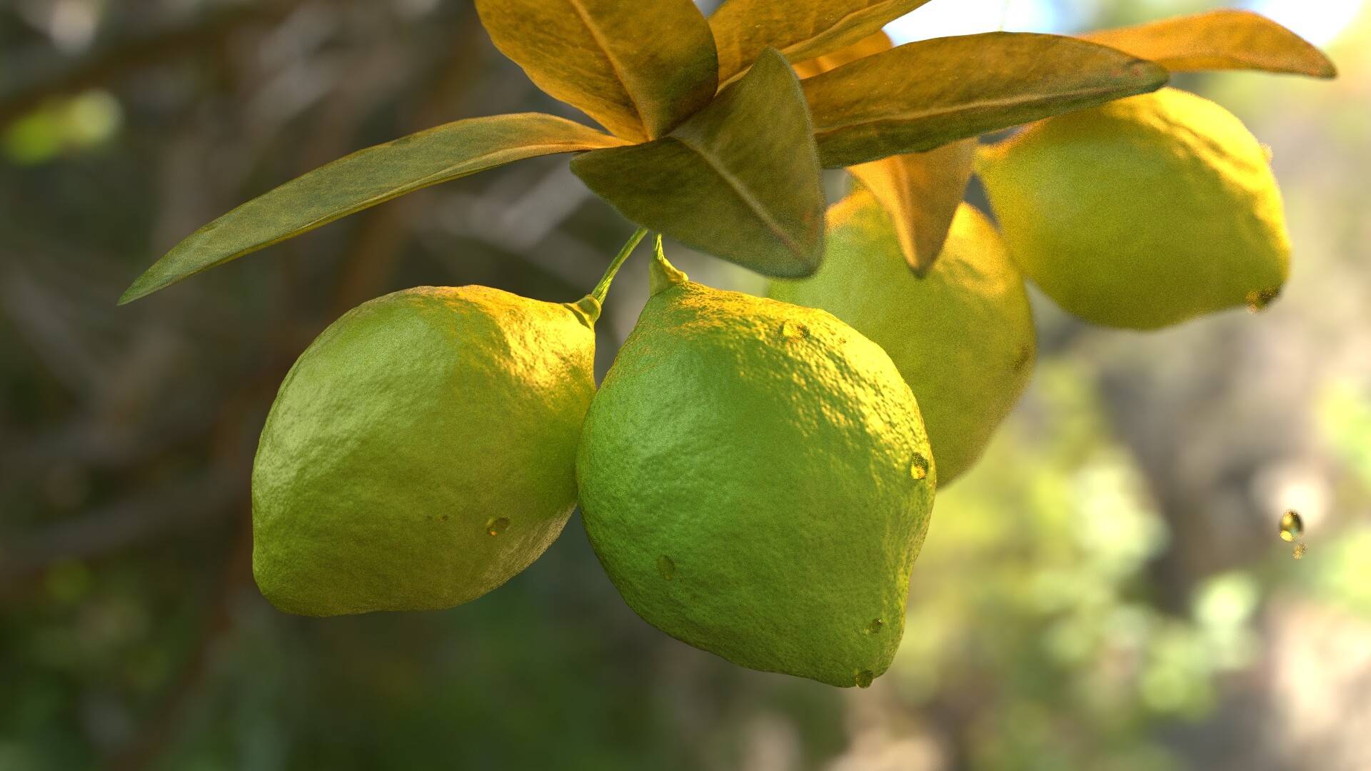
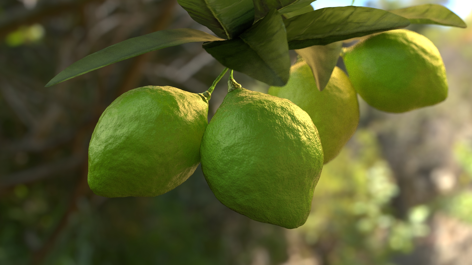
This is my next render (350 samples) :
Can you give me some feedback about this?
You can download the .blend file on blendswap;)
edit
Hi!
This is my next render (350 samples) :
Can you give me some feedback about this?
You can download the .blend file on blendswap;)
edit
The leaves look too rough. They also need more translucency. It’s also easy to tell that the lemons(?) in the back are just a copy of the ones at the front, you just need to rotate the back ones some.
Add maybe a branch too. Other than that it looks pretty good.
OK on leaves, and rotating the lemons in the back
IMHO, add some yellow to the lemons.
Nice job, indeed
Except for what has already been said, I think the leaves look too thin. Are they just planes or do they have thickness already? If not you could perhaps try a solidify modifier 
So, your suggestions:
-use translucency for the leaves;
-rotating these fruits (and yes Mister_Figgs, they are lemons!:yes:);
-rotating a branch too;
-and now, use the solidify modifier.
Ok, except the last one (because the render started before the advice), I follow them:
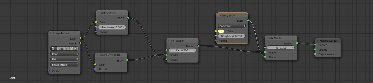
If someone can post a screen shot of a good cycles material I can use for the leaves, that will be great! Tell me if you improve the render.
Only two lemons in the scene would be better.
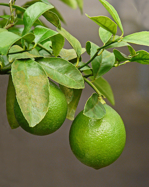
Here a reference image:
I would add more leaves; about the material of them i would bring down a little the translucency and add some glossy. A improvement to the scene could be to add (or let be visible) some branches, as now seems like all objects are “floating” in air.
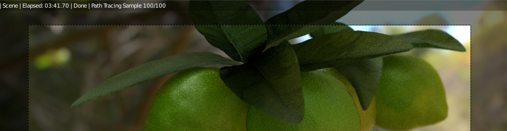
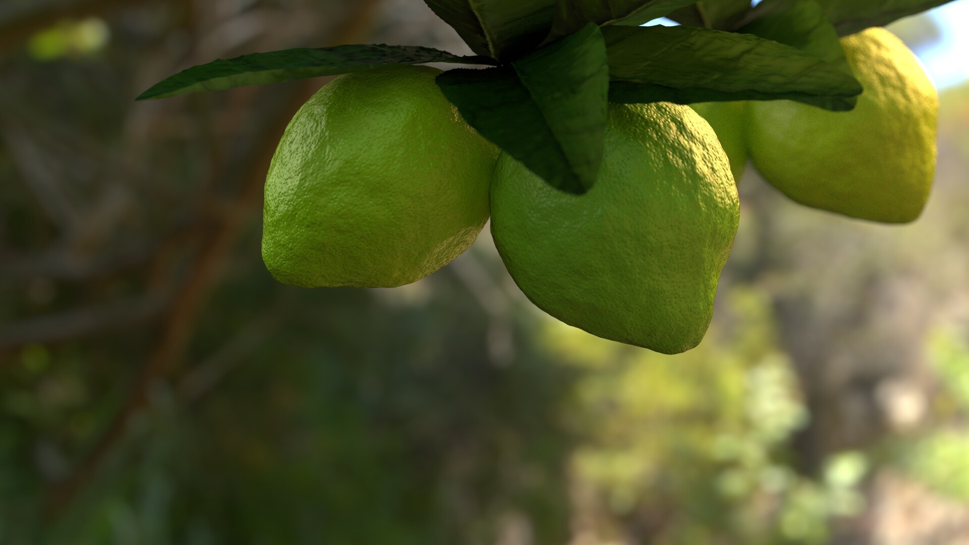
So, I tried to add some glossy to the leaves:
Now, I’m going to add the stems of each branches.
*to mik1190: thanks for the reference image!
Well, as a matter of fact, in the real world lemons often are green, and limes can be yellow. :yes: The difference is “FD&C Yellow #10.” :eek:
The “gloss” is a nice improvement to those leaves; it helps them to stand out better. There is a subtlety to the lighting and composition of this shot (it looks real, not like a supermarket). Keep working it.
If I were looking at a Polaroid of this shot in a studio (yeah, I’m dating myself …), I would do two things at this point:
I’d suggest working these in as a new render-layer, perhaps a separate render altogether, so that you can easily (and ex post facto) “tweak” the exact mix-down that you use here between these two visual elements. (I don’t know how much “compositing” is a factor in your present workflow.)