Hello guys! Can you please critique this scene.
I think it looks excellent and rather reminds me of the feeling I got when originally playing Myst many many years ago.
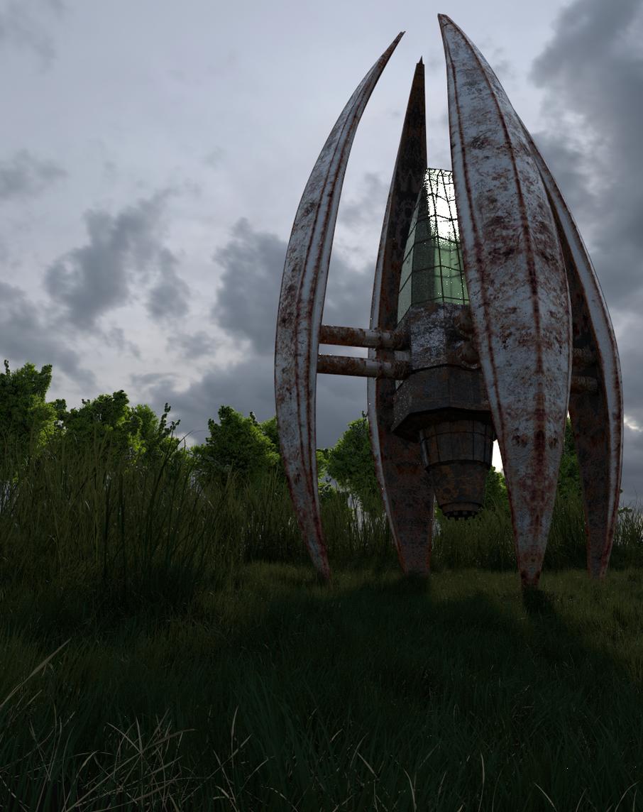
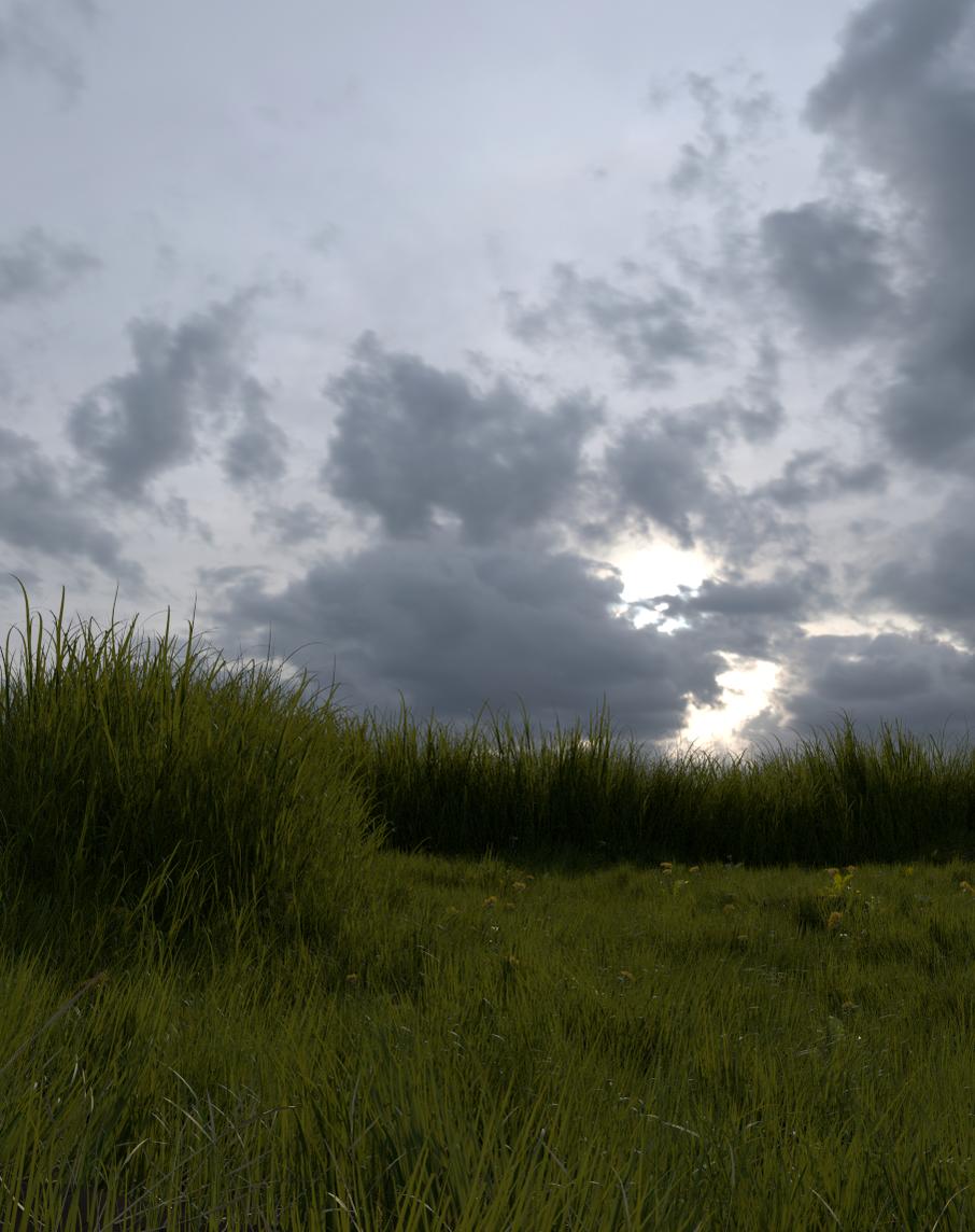
My Critiques are that based on the cast shadow, I expected to see some indication of the sun. Also I feel like the foreground is a bit lackluster. You needn’t draw from the focal point with anything major. Just some variety to the straight green grass like dandelions, clover, weeds, etc.
That kind of grass is something you don’t get out in fields. That’s the kind of stuff we plant in our yards because we have some strange aversion to anything that isn’t uniform and green.
Edit: Actually, now that I look at your image avatar I guess you probably weren’t alive in 1993 to play myst. The comparison probably doesn’t sound like a compliment, but it really is.
Yeah. I guess you’re right i’m still 13, but even if i’m quite young I need quite strong critiques. ![]()
My blender is now rendering the changed and adjusted grass separately from the trees and the spaceship.
Oh and by the way, I need to put in more nature, so can you help me on what plants can I use?
Wow, far better than my stuff at 13 for sure.
It looks like it could use a brighter sun light though, however, nice work!
That’s a pretty realistic grass scene right there. It can always be better, but I think your composition would be better improved by focusing elsewhere now. You can always come back to the grass later.
For example, the trees didn’t feel like a cohesive part of the scene and they didn’t really add anything of value. You might want to add some depth of field to blur out the trees or decide to make them more important looking/unique.
Another thing to consider is that the scene looks a little bit dead – that is to say that it could benefit from some fauna to go with the flora. Bugs, birds, etc. Don’t add anything too big or distracting; You already have a very strong focal point as it is. You just need a little more variety to bring it all together and make it feel like a convincing scene.
Also, I agree that the backdrop seems a little underexposed considering the amount of light that seems to be hitting the scene. Maybe brighten it up until there seems to be an appropriate light source behind those clouds. Alternatively, you can tone down the saturation of the rest of the scene and leave the background as it is.
I’m trying to achieve a morning lighting in this scene. How can I do that?
For one thing… morning lights as opposed to evening lights tend to be more orange as opposed to evenings more magenta or purple… so adjust some of the color tone slightly in that direction and you automajically get more of a general feeling of ‘morning’ light…
Having said this … I see your from Finland… depending on your location on the Earth this can change a bit… sunsets in Texas look very different than a Sunset in say Alaska… (I know… I have seen them from both locations) even a sunset in New Mexico which is not all to far from me relively speaking has a very different look…
Here’s a website with more info on it…
http://www.noupe.com/inspiration/sunrise-color-palettes.html
Also morings especially in a setting with this much plant life… will be wet with dew… as opposed to evenings which will be dry from the days solar heat… even when rainy… an evening will be drier than a morning…
search out some pics and study them closely… mainly by comparison… but even at that you may have to take your own pics and videos to see what the color schemes are…
nice work by the way…
Thanks! The thing is that I lived in Finland for the majority of my life and now I moved back to Brazil. But I still remember the sunset and the sunrise of Finland. 
Maybe this is a little better. I will adjust the sunlight and the shader of the white clovers that look very very grainy.

the grass is modelled? awesome 5*. i was thinking it was just another lame HDRI!
the main model though the texture is mirrored and is obviously the same texture on the pipes, as they are identically rusted! i suspect you are using a mirror modifier to create the model in which case a would consider applying the modifier, at least across the visible axis and re doing the UV unwrap. also rotate the uv’s on the pies to help randomise the texture there
You don’t want the sky to be blown out. I just meant a little brighter.
I think the foreground benefited overall from being brightened some, but at the same time you lost some of the contrast that made the image more appealing; I don’t feel like I’m standing under the immense shadow of that thing anymore. That was a major part of what gave the original it’s mood.
Keep on tweaking it.

I like the new flowers . The ivy I think needs work.
Overall it looks very good.
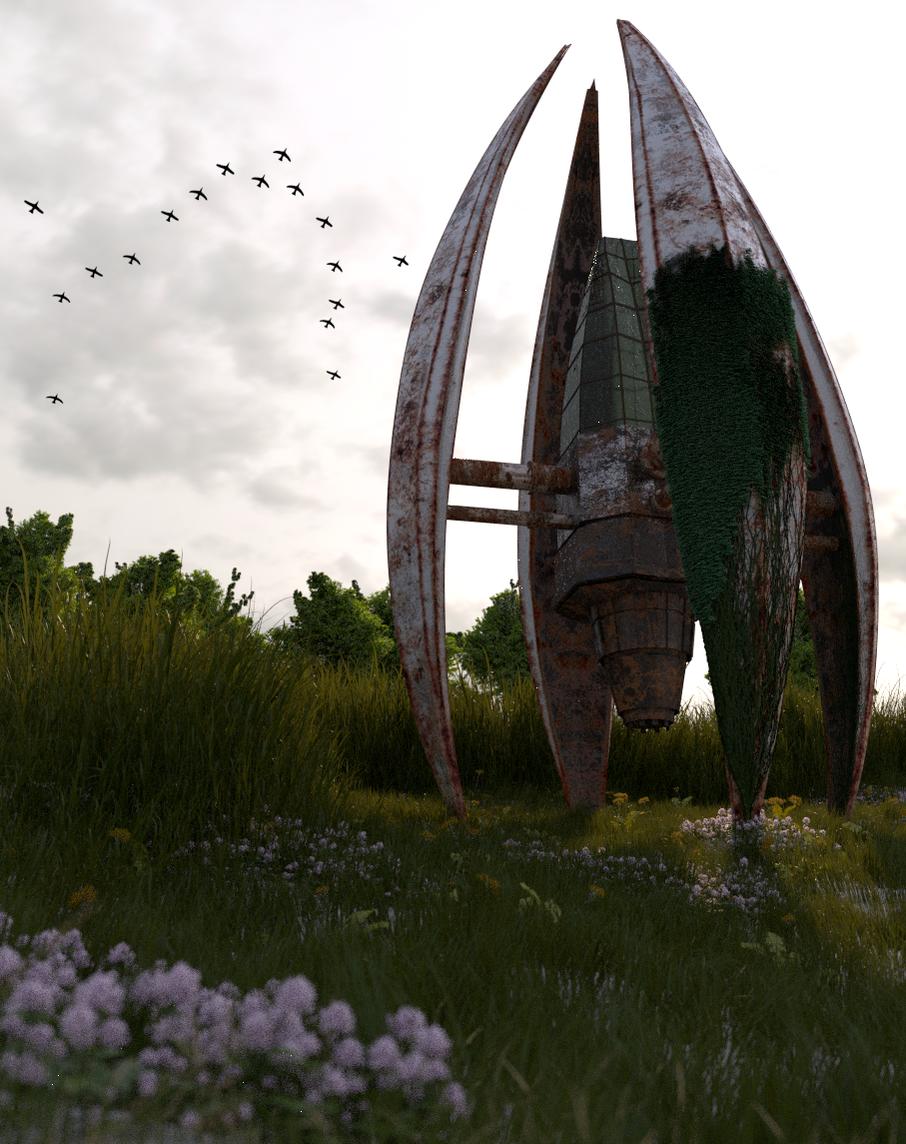
Nice scene,but I think those planes are superfluous as a scrapped place.
You’re making great progress! I can only suggest to adjust the birds in the background so they also appear behind the derelict structure to add that extra bit of depth.
Then your work would be right at home in the finished work section.
This looks very nice!
I think, don’t go too crazy with moss on the metal. Feels like there is a bit too much of it.
But overally, looking awesome!
I like it,I think compositionally,you need crop the bottom,and add more to the top,I found that when looking at images,adding space above helps create the illusion of scale/size in the object.You can see this in arch-viz work.
I did a mock up in photoshop.You could keep flowers there,but I just cropped it real quick to give you an idea.
[ATTACH=CONFIG]245630[/ATTACH]
however you may need to add something in the top left of the image to keep the viewer “in” the composition,even if its like a cloud or something.I could use some some depth aswell.
Without a doubt #15 is your best render yet.
@Silkroadgame: Those aren’t planes. They are birds.
There are a few things, though about the changes that you’ve made so far. For one, it seems like something has changed about the density of the grass – I’m seeing the ground plane through the grass, which would be okay if it wasn’t white.
Also, the birds look a little tacked on in the sky. I think the reason for this is that they repeat too much. I’m only seeing 2 or 3 unique birds. Try reducing their numbers or varying them more.
Lastly the vines are out of place because vines just don’t grow like that. Vines grow to cover just about everything. They wouldn’t just pop out of nowhere to attach to one leg. They’d overgrow the entire thing. In my opinion you should have some of the vines draping down from the main structure and crawling up each leg and decrease the density some. It really does look a little like moss at this density and you wouldn’t get moss in a sunny field like this.
Again, subtlety is best. Don’t overdo it, but I think the vines were a good addition that needs to be played with. As for ng-material’s suggestion, I think that a little more sky (I’d like to see more blue in the sky too just for comparison) would be nice espcially if you’re going to add birds up there.
Have fun.